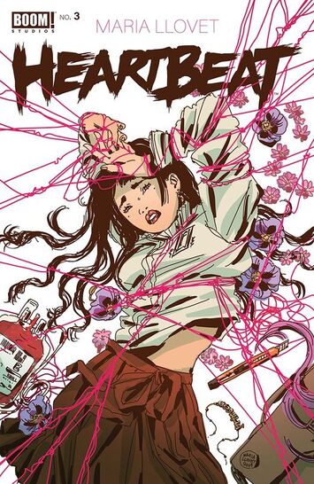
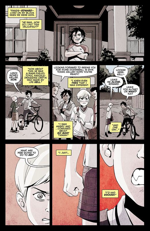
READING WITH A FLIGHT RING
  • About
  • reviews
  • Contact
  • Cosplay of the Day 2
  • Company News
  • Entertainment Section
  • Convention News/Updates
  • original artwork
  • My Best Books of the Week
  • Cosplay of the day!
  • FCBD
  • Interviews
  • Webcomics

Today's reviews!

Reviews for 19-12-21 
​Reviews for 18-12-21 Reviews for 17-12-21 Reviews for 16-12-21
​Reviews for 15-12-21 Reviews for 14-12-21 Reviews for 13-12-21
​Reviews for 12-12-21 Reviews for 11-12-21 Reviews for 10-12-21
​Reviews for 09-12-21 Reviews for 08-12-21 Reviews for 07-12-21
​Reviews for 06-12-21 Reviews for 05-12-21 Reviews for 04-12-21
​Reviews for 03-12-11 Reviews for 02-12-21 Reviews for 01-12-21

Facebook Link

Heartbeat #3

1/28/2020

0 Comments

 
Picture
Heartbeat #3
Boom! Studios 2019
By Maria Llovet
Lettered by Andworld Design
Translated by Andrea Rosenberg


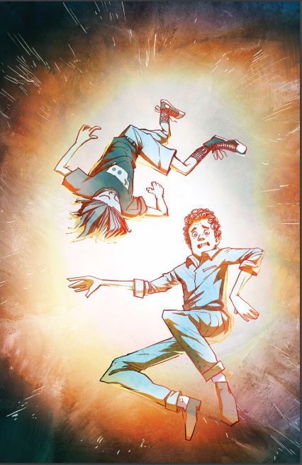
     After a thrilling encounter with Donatien, Eva finds herself becoming more interested in his macabre tastes. As the murderer draws her deeper into his world, what parts of herself is Eva willing to give up to get closer… and will she miss them when she’s done?

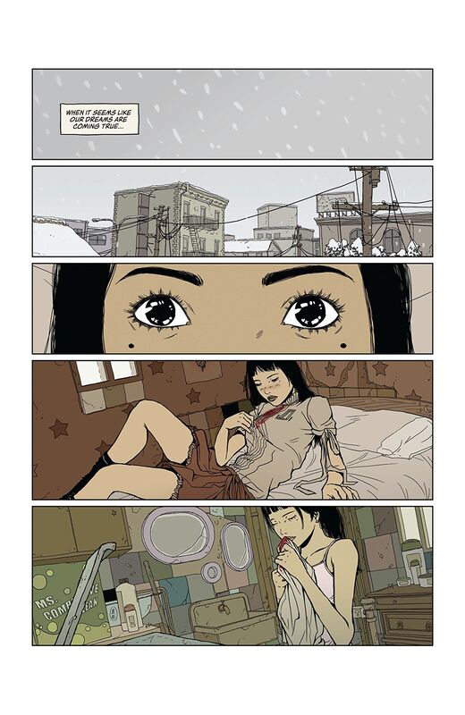
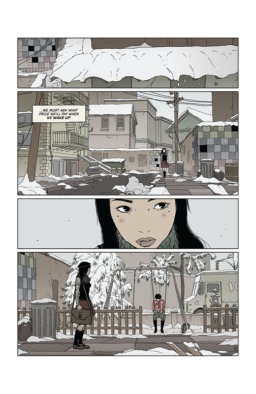
     Honestly I am not sure how something can be so hauntingly beautiful and completely morbid at the same time. Eva is a young girl who grew up poor alongside her two best friends who were anything but. One discarded her as she got older the other never noticing her unrequited love. Now did she harbour this dark secret desire for the darker things or was it that she saw what Donatien had done and that fuelled her morbid curiosity? As her attention towards him didn't start until she saw her former friend dead in his arms and yet now she pushes Mack away from her knowing that she has the power to ease his pain. This is as dark and twisted a teenage telenovela if there ever was one.

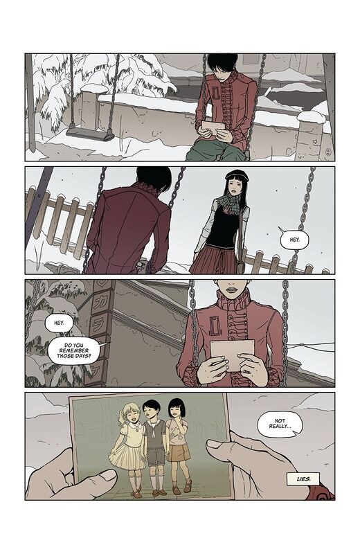
     I have the utmost respect for Maria, not only because she's writing and illustrating this but because of the way her mind works. I feel like I am caught up in this teenage girls fantasy and she isn't even aware of what her feelings even are. It is this crazy, mystifying and enthralling tale of Eva trying to find herself. The story & plot development we see through how the sequence of events unfold as well as how the reader learns information is presented extremely well. I like how we see these events and how each of the characters have their own agenda oblivious to those around them. The character development we see here are is phenomenal and the only one whom we are still left wanting to see more of or about is Donatien. The pacing is great and as it takes us through the pages revealing the twists and turns along the way help to create a fabulous ebb & flow.

     I am so engaged in this book and in ways I was not expecting. While Mack is looking at an old picture I see siblings alright just not the ones that are. So that Maria manages to really get the reader involved in this book beyond that which we expect just reinforces how well layered and complex that this book really is. That this is more than simply a pretty package and so much depth to it is one of those rare things that captures you mind, body and soul.

     The interiors here are absolutely lovely. The fashions that we see are phenomenal and honestly I want that jacket Mack is wearing. The overall imagery of what we see here and the fact that these boys are incredibly androgynous is shockingly appropriate. The linework is exquisite and how we see the varying weights being utilised to bring about the attention to detail that we see so gorgeous. How the backgrounds are utilised and how we see them utilised in the composition within the panels show depth perception, scale and an overall sense of size and scope to the book. I am in love with everything we are seeing here and the library the fashions even the sex scenes of budding adolescents all have this really beautiful, sensual quality to it that's rather quite astonishing. The colour work too adds this air to the story as well that I appreciate. Nothing is bold nor bright but everything here has this whole muted feel that is marvellous.
​

     The way that this story keeps moving forward and keeps the reader involved, invested and engaged raises the bar on storytelling.
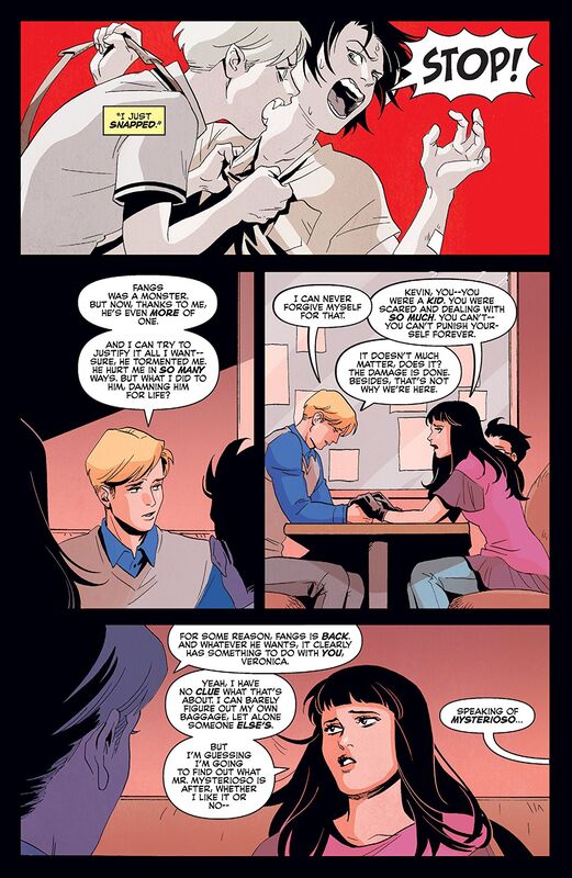
0 Comments

Heist or How To Steal a Planet #3

1/27/2020

0 Comments

 
Picture
Heist or How To Steal a Planet #3
Vault Comics 2019
Written by Paul Tobin
Illustrated by Arjuna Susini
Coloured by Vittorio Astone
Lettered by Saida Temofonte


     Glane and the gang shift the heist into high gear, but there’s a few bumps along the road—like a highly-trained bird, some even higher-trained assassins, and a group of Glane lookalikes with murder on their minds. Luckily, Glane has a master plan that involves… two drops of red ink? Huh? How’s THAT going to work?

     Oh Paul how I love the work that you do! In all seriousness this is way beyond a hoot and a holler as I the whole concept is so out there that I am surprised it is even a real thing. Glane goes away for his crimes and then gets out and with a huge price on his head puts together a crew of the very folks that hate him, one more than the rest, and they are going full steam ahead with stealing the planet. It sounds crazy and it is, however, the way this being written is so damn brilliant that if this crazy then sign me up because I don't want to be sane.

     I love the way that this is being told. The story & plot development we see through how the sequence of events unfold and how the reader learns information is laid down to perfection. To see how the various moving parts are being put into play and with the Crows and those are out there to collect the bounty of Glane's head has the layering to make things feel more interesting. The character development is utterly phenomenal! Each character has some time spent on them so that we see their personalities continue to emerge with each appearance. Plus seeing how they act and react to situations and circumstances they find themselves in speaks volumes about them as well. The pacing is superb and as it takes us through the pages revealing the twists and turns along the way helps to create such a nail-biting ebb & flow to the book.

     While we spend so much time with the adults here following them through seemingly impossible encounters and moments that only a master thief could possibly think of doing it's Brady who remains my favourite character. While he may think of himself as the Artful Dodger he's more Oliver Twist and that has this innocence surrounded by that shell he projects and his own smarts, street and otherwise, are greatly underrated. He's the ward that Glane never knew he wanted or needed in his life.

     The linework that we see throughout his book are bloody effin brilliant! There are techniques being utilised so that it has more of an old school feel to it, like the old House of Mystery genre of books and yet thanks to what we see is so current in it's tone and feel. The attention to detail that we see through how the varying weights of the linework are being utilised makes me happy, so very happy. The way that we see backgrounds here as well, though never enough of them, as the work within the composition inside the panels to bring us this depth perception, scale and that overall sense of size and scope to the book is marvellous. The utilisation of the page layouts and how we see the angles and perspective in the panels show this absolutely masterful eye for storytelling. The colour work is divine. How we see the various hues and tones within the colours to create the shading, highlights and shadow work show some incredible understanding of how colour should work. Whether it's colour blocking or gradation of however we see the walls and floors versus the clothing and hair is dynamic.
​

     The way we see the little scams being done and not just by Glane and his crew but by all the different folks out for his head show some real knowledge of grift's, scams and how how to get away with murder in ways that show us Paul leads a double life or he's done some astonishing research, or quite possibly both. With the strength of the writing and just how damn good the interiors are keep bringing a spotlight on Vault Comics as they continue to support creators like Paul who want to tell this seemingly epic story's.

0 Comments

Shapes #3

1/27/2020

1 Comment

 
Picture
Shapes #3
Cave Pictures Publishing 2019
Written by Jason Brubaker
Co-Written by Rick Rekedal
Illustrated by Jason Brubaker
Coloured by Jason Brubaker & Adrian Amarteifio
Lettered by Simon Bowland


     SYNOPSIS:
     In the middle of science class, Tripp sees something truly strange outside the window: a Verm, a viral worm recently unleashed by Blackhat in his favorite video game. As the virtual and real worlds merge, Tripp manipulates the Shapes that make up the universe to battle the Verm. Joined by Zeno and bully-turned-buddy Chaz, Tripp searches for answers while trying to stay out of trouble with the principal.

     I was so surprised when I read the first issue of this and in such a good way. Rick created such a marvellous idea and concept here and the way it is being executed has been utterly sensational. This is in a unique position where adults can relate in a fashion since they grew up with old school Atari and video game arcades and their kids well they don't leave the house they are glued to their video games so for the same yet different reasons this is an all-ages title that can be a bonding experience between the generations not to mention it is perfect for that device free table.

     The way that this is being told is sensational! The story & plot development that we see through how the sequence of events unfold and how the reader learns information is really presented nicely. There are moments throughout the story that really take you by surprise and with how the utilisation of technology can come to Tripp's aid. I really found myself kind of thinking hmm okay I hadn't thought of things going in this direction. Which of course shows how good the writing is. The character development continues to show how the kids grow, change and evolve through how they act and react to the situations and circumstances they find themselves in. The pacing we see is superb and as it takes through the pages revealing the twists and turns along the way helps to create this entertaining ebb & flow to the book.

     I am really impressed with this book. It has a surprisingly familiar concept but the way it's being told and executed is what makes it completely unique and original. While films like War Games or the Last Starfighter paved the way I have to say that this incredibly well suited for the times we live in.

     I am also impressed with the interior artwork here. Since it is an all-ages title I can let certain things go and yet the way we see faces and facial expressions here is absolutely delightful. They add that extra layer of characterisation that words alone can't do. I am super fan of the backgrounds we see being utilised and how they work within the composition inside the panels. We get some great depth perception, scale and that overall sense of size and scope to the book. The creativity and imagination we see is stupendous and while I have no idea what's going on but the amount of tardigrades I have seen in comics lately makes me so happy, and if that isn't some kind of version of one then whoopsie. The colour work we see here is also rendered really well. The colour blocking we see is phenomenal and the way that the various hues and tones within any given colour are utilised to create the shading, highlights and shadow work is rather impressive.

     I am enjoying that I cannot predict what's going to happen fully, I mean sure we're being led to a few conclusions but other times what we see is surprising. So that we are pretty much kept on our toes for what comes next is incredibly enjoyable. Cave Pictures Publishing is quietly, maybe too quietly, putting out some very strong and entertaining books and you should be looking for them or having them ordered.

1 Comment

Monster Planet #3

1/27/2020

0 Comments

 
Picture
Monster Planet #3
Zenescope Entertainment 2019
Written by Joe Brusha
Illustrated by Sergio Ariño & Julius Abrera
Coloured by Maxflan Araujo & Fran Gamboa & J.C. Ruiz
Lettered by Taylor Esposito of Ghost Glyph Studios


     Blair Spencer and her team have formed an uneasy truce with the monsters led by the vampire lord Xavier Drake, and just when it looks like they may escape Chicago and complete their mission to find a cure for the virus, they find a new enemy standing in their way. Spencer is starting to realize that neither the reptilian creatures they face or the monsters of legend they fear are the real threat...and that the thing she should fear the most is her own species.

     At this point I feel as if this could be one heck of a franchise. There are aspects of this that could be explored and it almost feels as if it could like the Walking Dead and Fear the Walking Dead in some manners. I like that grandiose feel of the series so far. The opening here is really very nicely done and while they are fixing the transportation it gives Blair a chance to think back which shows us our first good glimpse at the fall of New York City. It is also this part that makes me want to see more of how all this happened to begin with.

     I am a tad impressed with Joe's writing thus far, usually by now I start to see the cracks in his ability but I am more than pleasantly surprised by what I am seeing here. The story & plot development that we see through how the sequence of events unfold as well as how the reader learns information is laid down really well. While there are the usual mistrust and animosity between the groups that is something that of course will remain. Though in all honesty vampires need humans so why wouldn't they be in favour of a cure? The character development that we see is nicely done as we get to see more and more revealed about these characters. There also are those hints that there is something deeper than what we are seeing on the surface. The pacing is really solid and as it takes through the pages revealing the twists and turns along the way things definitely take the odd turn or two. All of this works together to create a really interesting ebb & flow to the book.

     Overall I really am enjoying the interiors here though there are some glaring discrepancies in some of the body proportions. When we see the vampire Eva her breasts that are exposed on the inside do not match the globes under the bustier and it looks bad. I am not a fan of having so many artists working on a single issue it doesn't match up from one portion to the next. Now that that is out of the way the utilisation of the page layouts and how we see the angles and perspective in the panels show some solid eyes for storytelling. That we see backgrounds utilised extremely well, that hall of dead monsters for example, really do create this fantastic depth perception, scale and overall sense of size and scope. The colour work is really something nice to see though and that has a more uniform appearance throughout and to see how the various hues and tones within the colours create the shading, highlights and shadow work is something special.
​

     This world, this concept and the various factions that now inhabit this world is really something special to see. The world that Joe came up with here is something amazing and it has this complexity and layering to it that begs to be explored further. As this doesn't fit into regular continuity within the Zenescope Universe it does build a new offshoot of one and the potential that I see here is unlimited!

0 Comments

Angela Della Morte #3

1/27/2020

0 Comments

 
Picture
Angela Della Morte #3
Red 5 Comics/Stonebot Comics 2019
By Salvador Sanz


     Angela Della Morte has become the most important prisoner of the Fluo Government. But the Devil is with her... transforming her. So, why are they keeping her alive?

     This is such an amazing book and Salvador should be fast becoming a household name. That he is able to do everything that we see is utterly fabulous as it means that literally everything we see is there for a reason. To be able to bring your own vision to life like this without worrying that someone might miss something is commendable. Plus the overall uniqueness of the story concept itself is just another notch on the lipstick case. The way the reader is brought into the story and how engaged they become as they try to figure out not only what kind of science is being utilised but what is happening with Angela as well is the pièce de résistance.

     The way that this is being told is genius to me. The story & plot development we see through how the sequence of events unfold as well as how the reader learns information is laid down perfectly. This issue in particular has such a different look and feel to it that we've not seen in the previous two and this adds another level of excitement. The character development we see through the dialogue and how the character act and react to the situations and circumstances the find themselves in. This is most noticeable in Angela herself as you'll see when you read this. The pacing is superb as it takes us through the pages revealing the twists and turns along the way that keeps us mystified and intrigued the entire time. With all of this working together it creates this great ebb & flow to the book as it also highlights how well it is structured.

     I think the fact that we've been set on the moon thus far makes this a change of pace in an exciting kind of way. Part of me wishes we'd stayed on the moon because that setting was so cold, sterile and outright hostile and it fit with everything we were seeing. So by moving the focus we get a brand new avenue of focus and it throws everything the reader has thought they've known which is kind of bloody brilliant.

     I am in love with the quality and level of the work on the interiors here. Seeing the lush green jungle and the texture in the fauna is simply stunning to behold. The linework is exquisite and how we see the varying weights utilised to being about this level of attention to detail is mindbogglingly good. If you need proof there are plenty of examples of delicate lines being seen as strong like the wire in the fencing. The way we see how essential the backgrounds are to the storytelling and how the work in the composition in the panels to show depth perception, scale and that overall sense of size and scope to the book is so well rendered. The utilisation of the page layouts and how we see the angles and perspective in the panels show this sensational eye for storytelling. The colour work is just divine as we see all these hues and tones within the colours, especially the greens, to create the shading, highlights and shadow work. There are definitely times when things are way creepy thanks to the “lighting” and then there's this overall sense of danger and unease as well which is thanks to how we see the moment.
​

     This is beyond amazing to me. The originality, uniqueness, verve, talent and ability that we see on display only strengthens my belief that Red 5 is one of today's hottest company's for some truly exceptional storytelling.

0 Comments

John Constantine Hellblazer #3

1/26/2020

0 Comments

 
Picture
John Constantine Hellblazer #3
DC Black Label 2019
Written by Simon Spurrier
Illustrated by Aaron Campell
Coloured by Jordie Bellaire
Lettered by Aditya Bidikar


     John has found the cause of the magical madness slaughtering gang members on Peckham Rye...and it’s just one guy! How hard can it be to stop him? Well, when the gangs get involved and the source of his power becomes clear, the answer turns out to be “Near impossible, actually!”

     There are few characters who I will follow as religiously as I do John. Hero, opportunist, anti-hero there are so many different ways to describe him but most of all he's never lied about who he is. Well maybe to himself from time to time but he'll tell you he's not a bloke to trust more often than not and that honesty along with his lack of gender preference in his sexual partners are to admired. Simon really does hit that latter on the head here with his description of who taught him BSL and honestly I want to see more of that relationship heh.

     So John is back and he's a young bloke again though I wouldn't say his mind is as young as his body is. This is like a second chance for him and he's been given that by an older version of himself so I am not entirely sure what kind of muckity muck magic is going on here but I am not going to question it and it is no more difficult to wrap the mind around then any other option in his arsenal of demons, gods and angels that could've done the same thing. The only thing or person I am going to miss is Chaz and that in all this “rebirth” that he wasn't a part of things well that's a little sad.

     I am enjoying the way that this is being told. The story & plot development we see through how the sequence of events unfold and how the reader learns information is laid out exceptionally well. As John tries to work out his new surroundings and new characters are introduced and older ones making their presence known we are really getting a chance to see how John operates. The character development is phenomenal and seeing how the characters act and react to the situations and circumstances they find themselves in shows us the true measure of their character. The pacing here is amazing and as it takes us through the pages revealing the twists and turns along the way we see how it all works together to create this solid ebb & flow.

     I am a huge fan of Aaron's work, always have been and always will be. His imagery is a thing of beauty and with Jordie's colouring that first splash page that we see is one of those that should make the most memorable images you've ever seen. The linework is exquisite and how the varying weights are utilised to bring us this level and quality in the attention to detail is just mindbogglingly good. The utilisation of the page layouts and how we see the angles and perspective in the panels show such a masterful eye for storytelling. In a modern world where folks think artsy is a style it's artists like Aaron who know that it's detail in what we see that keeps us coming back for more as we appreciate this kind of talent. Jordie's understanding of colour and how hues and tones within the colours should be utilised to create the shading, highlights and shadow work. Not just that either but how a white hot flame will cast that orange glow is bloody brilliant.

     Nat is now freelancing with John and he's recruited himself a driver and new bestie in Noah who speaks through BSL only, or the notepad hanging round his neck. John's life is half orchestrated and half luck mixed with his screw ups so that the odds may be forever in his favour. This first little arc I this run has done wonders to establish a supporting cast that I hope won't be transient or lead to their premature deaths. Now that we've had that peek behind the curtain I can't wait to see what these folks have in store next and how the old man Constantine figures into all of it.

     The writing and the interior artwork are such high calibre quality makes this is the kind of comic book that we want to see more of out of DC, Black Label or no.

0 Comments

American Jesus #2

1/26/2020

0 Comments

 
Picture
American Jesus #2
Image Comics 2019
Written by Mark Millar
Illustrated by Peter Gross
Coloured by Jeanne McGee
Lettered by Cory Petit


     Hidden from danger, the Messiah was born and raised behind the walls of a compound -- surrounded and worshipped by followers of the church. As she gets older, and with no sign of the 'powers' she was promised, the reluctant teen prophet rejects her parents, God, and the teachings of the church. She breaks free, not knowing the soldiers of the Antichrist are hot on her heels.

     Last issue we saw the kids run away after discovering that Luciana was pregnant, by immaculate conception. I love how Mark's mind works as he isn't one to shy away from things that others would be fearful of. Case in point the Antichrist brigade, or whom we see as the New Messiah as both are almost stereotypical and not in the best of lights. Still for me it has a ring of authenticity to it that's hard to deny and if you think about it stereotypes have been created for a reason, usually because they based upon facts. So that by already going against the grain and having the New Messiah, for here on out known as Catalina, born in the United States I am loving how we see how far Mark is willing to go to stretch preconceived notions.

     Mark is a master storyteller of that there is no doubt. Love him or hate him there is absolutely no denying that he understands how to craft a story. The story & plot development that we see through how the sequence of events unfold and how the reader learns information is laid down with delightful expertise. Now that it's eighteen years later, yes skipping the growing up process makes a lot more sense to me, and Catalina is of legal age to leave of her own free will all hell, literally, is going to break loose. The character development here couldn't be any more spot on. Catalina has expressed how she feels about this place and her supposed role in all this which makes her infinitely more interesting already. The others we see fit into a wide range of emotional ranges, emotional for the reader and ranging from like them to absolute distrust of them and these are the ones we've met. We haven't met the old, male, white privilege Texans who use the bible as a shield for hatred and bigotry yet. The pacing is phenomenal and as it takes us through the pages revealing the twists and turns as it helps create the ebb & flow of the book is simply marvellous.

     Peter's work on the interiors here simply stunning. The linework is mindbogglingly good and the techniques we see in how they are utilised pull upon a nice array of knowledge for how to illustrate and create art. That Starry Night homage on the first page to the firing range and bank of monitors and how we see the rain falling from the sky this showcases true talent, skill and ability in visual storytelling. I love seeing the attention to detail here and for the most part the way backgrounds are being utilised is as effective as it gets. We see depth perception, scale, the overall sense of size and scope to the book as well as just enhancing what we see and these are all things that backgrounds are essential for. The colour work is beautiful here as well. Seeing how the various hues and tones within any given colour are utilised to create shading, highlights and shadow work and the leaves in the trees of the shades of dirt showcase this magnificently.
​

     We all know I am a huge Millar fan at this point and that's because I appreciate how his mind works and what is able to do with words. That he is also willing to take risks that will make some outraged and is nonplussed by it helps me respect his fearlessness even more. This is what storytelling is for, to challenge what we know, engage our minds and take us places we never would have imagined on our own.

0 Comments

The Visitor #2

1/26/2020

0 Comments

 
Picture
The Visitor #2
Valiant Entertainment 2019
Written by Paul Levitz
Illustrated by MJ Kim
Coloured by Ulises Arreola
Lettered by Simon Bowland


     Chaos strikes the Big Apple as The Visitor targets a group of revolutionary international scientists!

     I was loving the idea behind this last issue and with this one I am over the moon for it. Paul has gone above and beyond what I was expecting of him here and has created something intriguing, mysterious and incredibly intelligent. There are a number of things going on here and they all tie together and yet we are still largely unaware of what roles they play and why things are actually happening. So this is one those times when Ms. Dauber is a character you can relate to as she's the voice of how we all feel reading this. That she is this integral character in the story and she's an integral voice for the reader at the same time is something I really don't think I have seen before. She voices her concerns and her desires to do her job better by trying to get the information that keeps us glued to the story.

     I really do believe that with such amazing character development we see here that keeping us all in the dark about what's going on is a feature that really is the hook for the reader. The way that we see the characters act and react to the situations and circumstances they find themselves in is how we see them grow and evolve as people. This allows us to gauge the characters and either trust them or think they are hiding something and that's kind of ominous. The story & plot development here through how the sequence of events and how the reader learns information is done in a very different and unique way. The pacing is great and as it takes you through the pages and reveals the twists and turns along the way it really creates a strong ebb & flow for the book.

     A part of me feels like this would make a great procedural show on like Netflix as it has all these elements to it that thrills the reader and frustrates them in equal parts. These are necessary qualities to possess if you are going to engage your audience and boy is the audience, in this case the reader, engaged. Paul is doing something I haven't seen before and I am completely digging it.

     The interiors here are quite spectacular. The linework we see is superb and and how the varying weights are being utilised to bring out the attention to detail that w see is utterly marvellous. The style to is this more streamlined, Americanised, manga and that is mixed with the way we see the city and all the modern elements of buildings. The utilisation of the backgrounds and how we see them in the composition in the panels help to bring this depth perception, scale and an overall sense of size and scope to the book. The utilisation of the page layouts and how we see the angles and perspective inside the panels show this marvellous eye for storytelling. The colour work that we see here is beautifully rendered. I like the way we see the various hues and tones within any given colour utilised to create the shading, highlights and shadow work.
​

     There really is this array of unique personalities in play here and they all seem to work against one another keeping you guessing at who's doing what or who's behind the shenanigans. We are right beside Dauber with what know and learn so yeah this is one of the best crafted stories I have read of late.  ​

0 Comments

The Kill Lock #2

1/25/2020

0 Comments

 
Picture
The Kill Lock #2
IDW Publishing 2019
By Livio Ramondelli
Lettered by Tom B. Long


     Bonded by their Kill Lock, four robots search for a cure—a way to live, and die, independently. Their only clue is a bot known as The Axial, supposed to be a creator of the Lock and keeper of its secrets. Of course, the first thing they have to do is find her… without getting themselves killed!

    I can't believe that I wasn't sure about this when I first heard about it. I find myself so involved, invested and thoroughly engaged from the start and I simply do not wish the story would end. Part of me feels like this is a RPG game, kind of along the lines of Warhammer, but it has a definite spin on that and with the four of them it's almost like they represent the four elementals of wind, air, earth and water. Sure they have four very different personalities and they could be representative of something else along those lines but honestly I rather like how I think of them.

     I have mad respect for Livio as he is pretty much doing it all here and he's doing it with such aplomb. Anyone who can write and illustrate their own work is someone that not only deserves that respect but when it's done at a level we seeing it done here well it just means he's turning a corner in his career. With his work on Transformers Galaxies and this he has vaulted himself into must follow creator whether it's just for his artistic prowess or for his writing. He has opened up a world of storytelling to me in realms I never would've though I would look twice at.

     I am such a huge fan of the way that this is being told. The story & plot development we see through how the sequence of events unfold as well as how the reader learns information is laid down with such finesse. I have to say that we see a lot happening and it almost feels like it's happening quickly but it's really not and I am thoroughly impressed with how the pacing moves us through the story here. The character development is phenomenal as well. It is very easy to understand The Artisan and The Wraith and what drives them so to see The Laborer in the spotlight and The Kid and why they are so protective of him is actually heart warming. The pacing really is that good and as it takes us through the pages revealing the twists and turns helps to create this fantastic ebb & flow to the book while also highlighting how the book is structured.

     These interiors are beyond stunningly gorgeous. His digital artwork is so damn impressive it's what got me to get my Transformers series. The way we see the linework and how the varying weights are being utilised to create and spotlight this level and quality of attention to detail is mindbogglingly good. The composition inside the panels and how we see backgrounds utilised in them to show depth perception, scale and the overall sense of size and scope to the book. The utilisation of the page layouts and how we see the angles and perspective in the panels show a masters eye for storytelling. Then there is the colour work here. Now all the training in the world doesn't give you the raw talent to know how colour works like he does. To see flames, fire and destruction and from the white hot centre to the reds, pinks and magenta's in that level of heat and then to see the greens, yellows and greys in the clouds around that, this shows that kind of mastery over colour that is rare to see at this level. The hues and tones within the colours and how they create the shading, highlights and shadow work here leaves me gobsmacked.
​

     I really hope that this is the first in a series of arcs that Livio has planned for this series. I really think we are only just scratching the surface on who they are and what they are capable of. This is the beginning of some dysfunctional family that if they learn to truly work together will be capable of literally anything they put their minds to. While this may have themes running through it that almost feel familiar what Livio has managed to do is create something wholly unique and all it's own that captures the mind and imagination is some incredibly strong and powerful ways.

0 Comments

Vampironica New Blood #2

1/25/2020

0 Comments

 
Picture
Vampironica New Blood #2
Archie Horror #2
Written by Frank Tieri & Michael Moreci
Creative Consultant: Jesse Goldwater
Illustrated by Audrey Mok
Coloured by Lee Loughridge
Lettered by Jack Morelli


     Previously...
     Veronica Lodge is back home in Riverdale, back to living the normal teen life she had before an all-out war with vampires and werewolves ate up her time. However, returning to “normal” means that she’s still a vampire, just like her parents Hiram and Hermione and her ancestors before her, dating all the way back to the earliest vampire in Riverdale: Sir Francis Lodge. Veronica’s doing her best to come to terms with this news, but she doesn’t have time to dwell on her situation—there are more vampires in Riverdale now, namely the nefarious Fangs Fogarty and—much to Veronica’s surprise—Kevin Keller!

     While I am still waiting to see whatever happened to Afterlife with Archie I will more than happily keep this series in my embrace while I wait. Also finally seeing Kevin taking a larger in one of these makes me happy in ways you'll never realise. That he's a vampire is cute and that growing up being both gay and a vampire oh yeah that had to be hard and well there are so many things one can say about all that but I will restrain from that. Still I am absolutely in love with this book and now that we're back from the Werewolf world things are heating up.

     I am a huge fan of the way that this is being told. The story & plot development as seen through the sequence of events unfolding as well as how the reader learns information is exceptionally well done. There are a few moving parts happening within the story and to see them all at various stages of development is fascinating. Even more so since this only a four issue arc, which means hopefully some will be spilling over into the next arc. The character development is as good as it gets and the way we learn about these characters, who and what they are, who is listening to whom and meeting the new characters all have this great amount of characterisation so that we want to see more of them. The pacing is superb and as it takes us through the pages and reveals the twists and turns we are kept riveted in place because it's like if you move you'll miss something. Yes it's a comic, you can take it with you but that feeling is definitely there. The overall structure of this book and how we see the whole ebb & flow of the book showcases the talent, skill, ability, imagination and creativity of the guys minds.

     I think that the interiors are absolutely smashing! The linework is amazing and how we see the varying weights being utilised to bring out and highlight the attention to detail is lovely. The faces and facial expressions are so evocative as they appear on the verge of manga to me. While I will always want to see backgrounds being utilised what we see is extremely well done and the way they work in the composition inside the panels bring out the depth perception, scale and overall sense of size and scope is spectacular. More so once Ronnie and Dilton go exploring. The utilisation of the page layouts and how we see the angles and perspective in the panels show a superb eye for storytelling. The colour work is rather lovely as well. I like how we see the shading, highlights and shadow work here with the various hues and tones. The special attention paid to the underground yeah, good golly this is bloody brilliant work.
​

     This is what comics are all about. Being transported to another world and putting a twist on familiar characters and thus creating something new and exciting to it. I want to live in this version of the Archie multiverse because honestly as much as I love the original this is far and away the most exciting and romantically evocative version we have ever seen. ​

0 Comments
<<Previous
Forward>>

    Archives

    December 2021
    November 2021
    October 2021
    September 2021
    August 2021
    July 2021
    June 2021
    May 2021
    April 2021
    March 2021
    February 2021
    January 2021
    December 2020
    November 2020
    October 2020
    September 2020
    August 2020
    July 2020
    June 2020
    May 2020
    April 2020
    March 2020
    February 2020
    January 2020
    December 2019
    November 2019
    October 2019
    September 2019
    August 2019
    July 2019
    June 2019
    May 2019
    April 2019
    March 2019
    February 2019
    January 2019
    December 2018
    November 2018
    October 2018
    September 2018
    August 2018
    July 2018
    June 2018
    May 2018
    April 2018
    March 2018
    February 2018
    January 2018
    December 2017
    November 2017
    October 2017
    September 2017
    August 2017
    July 2017
    June 2017
    May 2017
    April 2017
    March 2017
    February 2017
    January 2017
    December 2016
    November 2016
    October 2016
    September 2016
    August 2016
    July 2016
    June 2016
    May 2016
    April 2016
    March 2016
    February 2016
    January 2016
    December 2015
    November 2015
    October 2015
    September 2015
    August 2015
    July 2015
    June 2015
    May 2015
    April 2015

    RSS Feed

    Categories

    All

    RSS Feed

Powered by Create your own unique website with customizable templates.