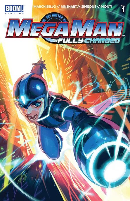
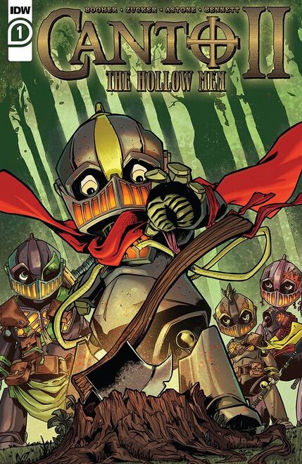
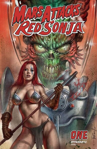
Mega Man: Fully Charged #1
Boom! Studios 2020
Written by A.J. Marchisello & Marcus Rinehart
Creative Consultant Joe Kelly
Illustrated by Stefano Simeone
Coloured by Igor Monti
Lettered by Ed Dukeshire
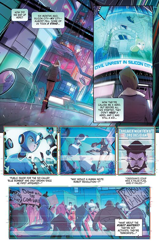
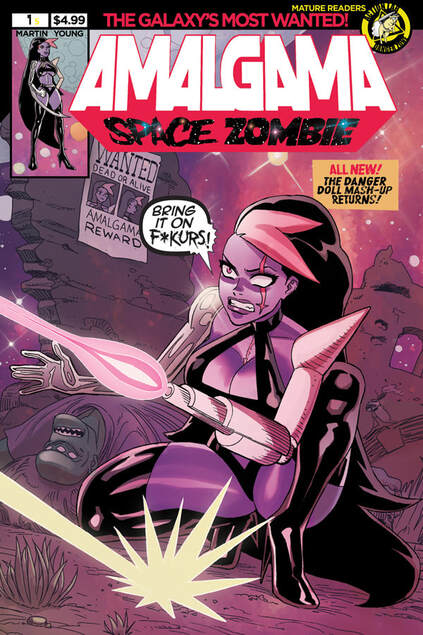
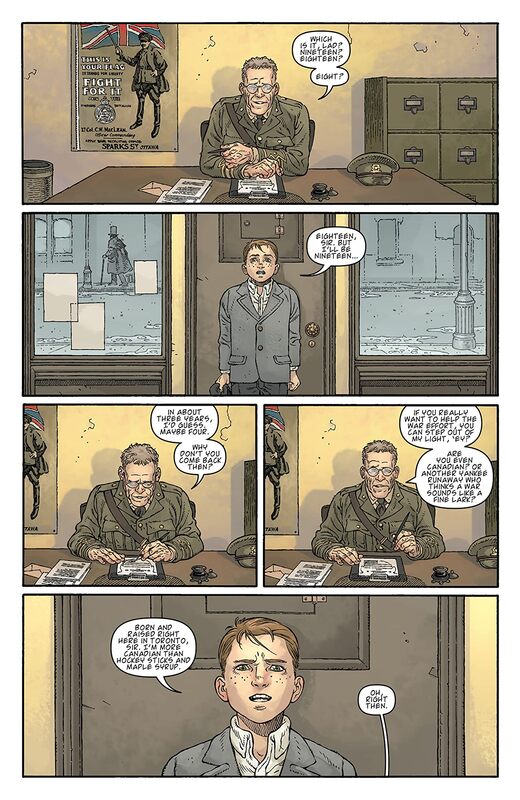
It's a new beginning for the worldwide culture phenomenon featuring heroes like Mega Man, Rush and Dr. Light trying to save Silicon City from the villainous forces of the Robot Masters, set in the world of the Mega Man: Fully Charged TV series. After Mega Man's father Dr. Light is kidnapped, a shocking truth rocks Mega Man's world as it seems the Robot Masters know more about his secret history than he does. When Mega Man's forgotten memories of the brutal human/robot war are triggered, our hero is left to question just who he is and if he can trust anything or anyone -- including the man he calls father.
This is my very first exposure to Mega Man and I have to say that this is something I thoroughly enjoyed. Now mind you I don’t know about his past but I am presuming that this is unlike anything in the franchise that has come before. I think that's a safe bet at least in my limited knowledge. To me this has a few elements to it that I find appealing in different ways and that I get a vibe from Speed Racer and various Animes that I have seen take this to a place where it leaves the all-ages behind and becomes this amazing story that I wasn’t really expecting to see. If you think Mega Man is a kids book, well think again there’s a sophistication to this that you aren’t going to want to miss!
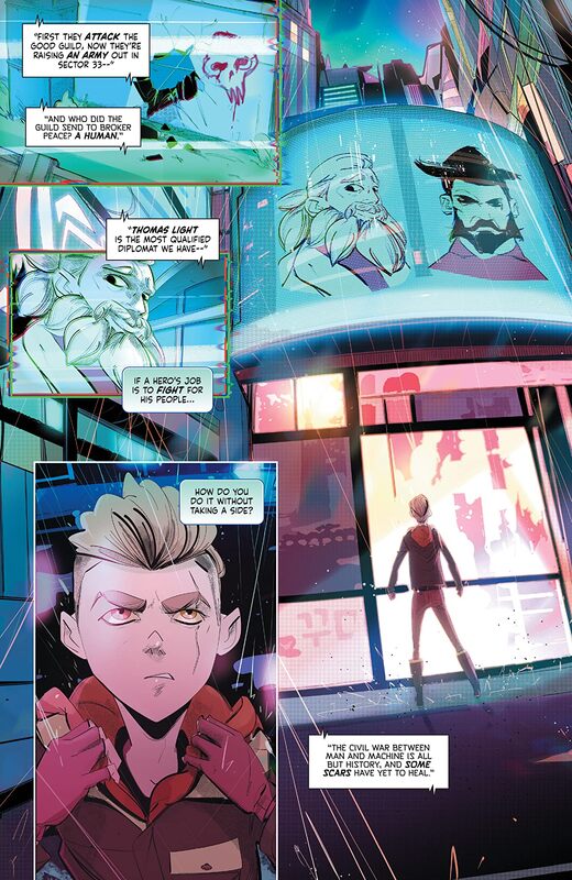
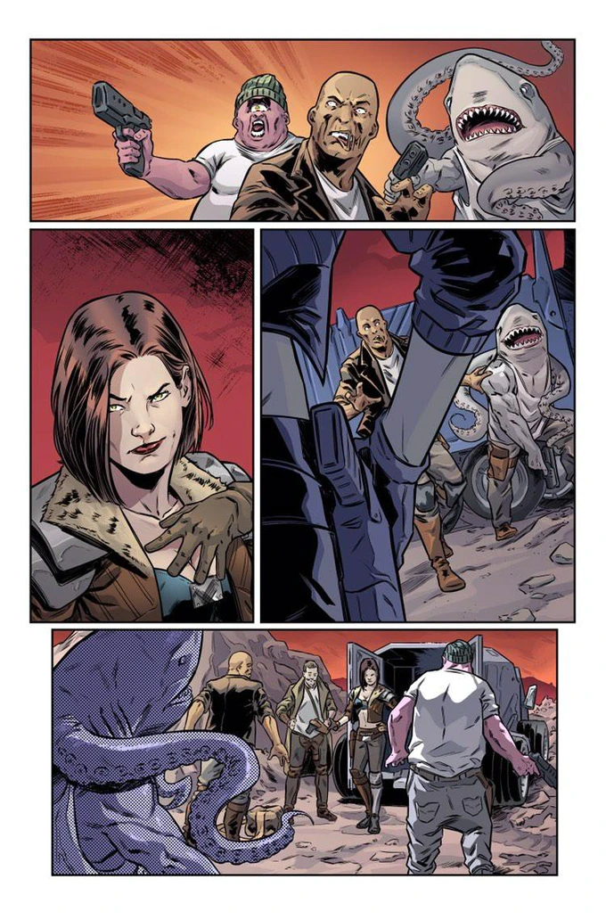
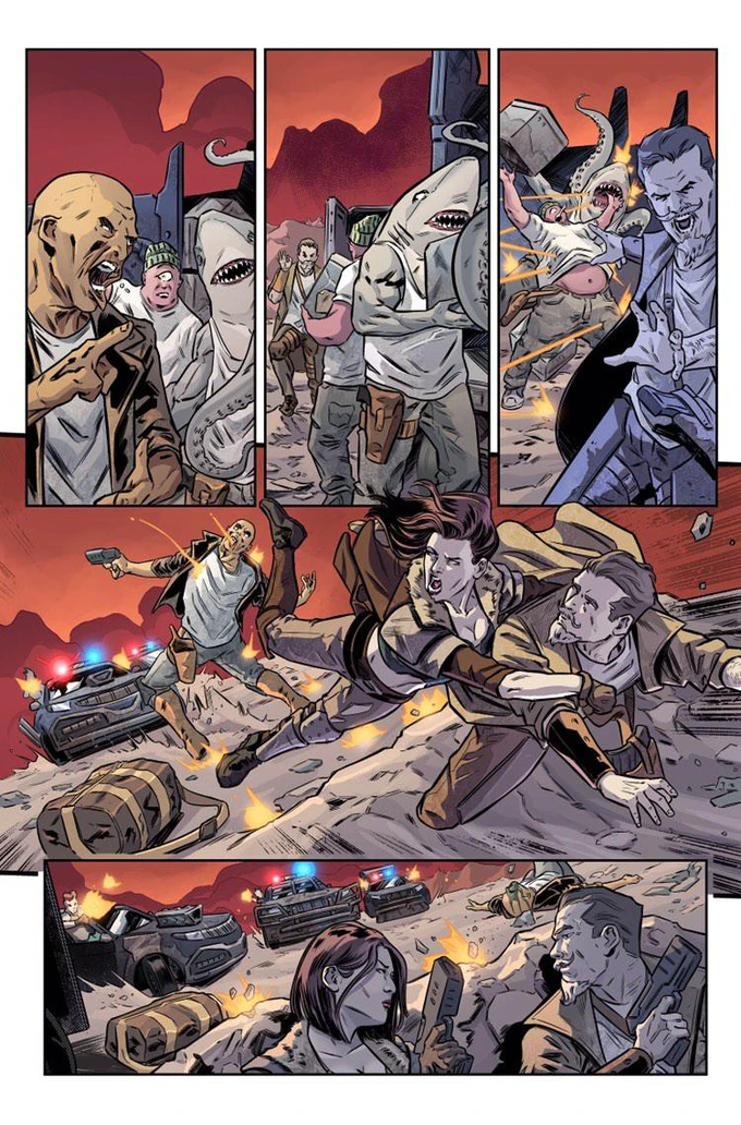
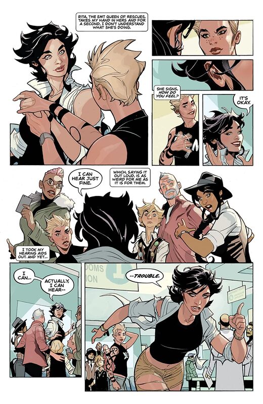
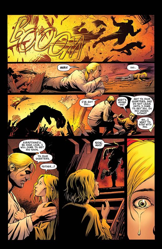
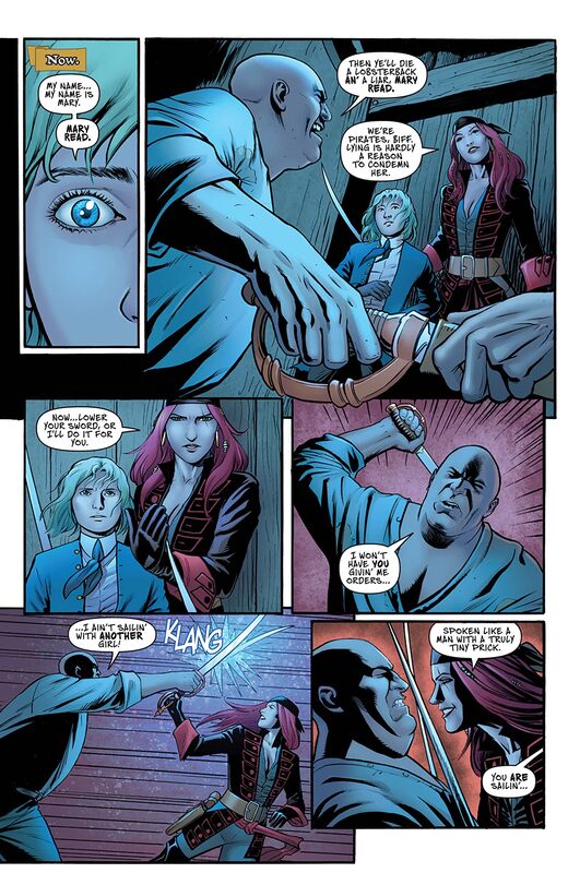
I love the way that this is being told. The opening is fantastic as it kind of catches us up with everything that he’s been through up till now. This is smartly done and really allows the reader to understand the world as it stands, up to a point. It draws the reader in as it captures the imagination beautifully. The story & plot development we see here through how the sequences of events unfold as well as how the reader learns information is presented extremely well. The character development is great and it gives the reader a sense of who they are and where they could, I repeat could, go. It is just enough to set the change for some major revelations and changes and it’s so amazingly well done. The pacing is superb and as it takes us through the pages revealing the twists & turns along the way it is easy to see how everything works together to create the story’s ebb & flow.
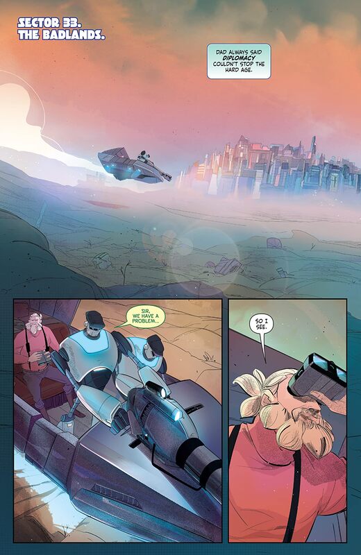
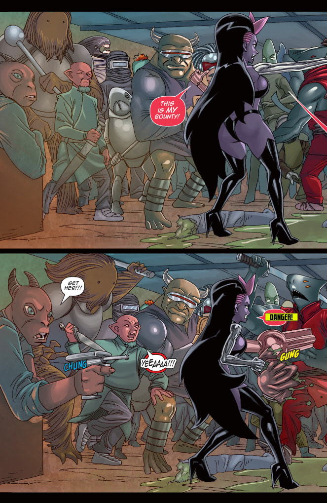
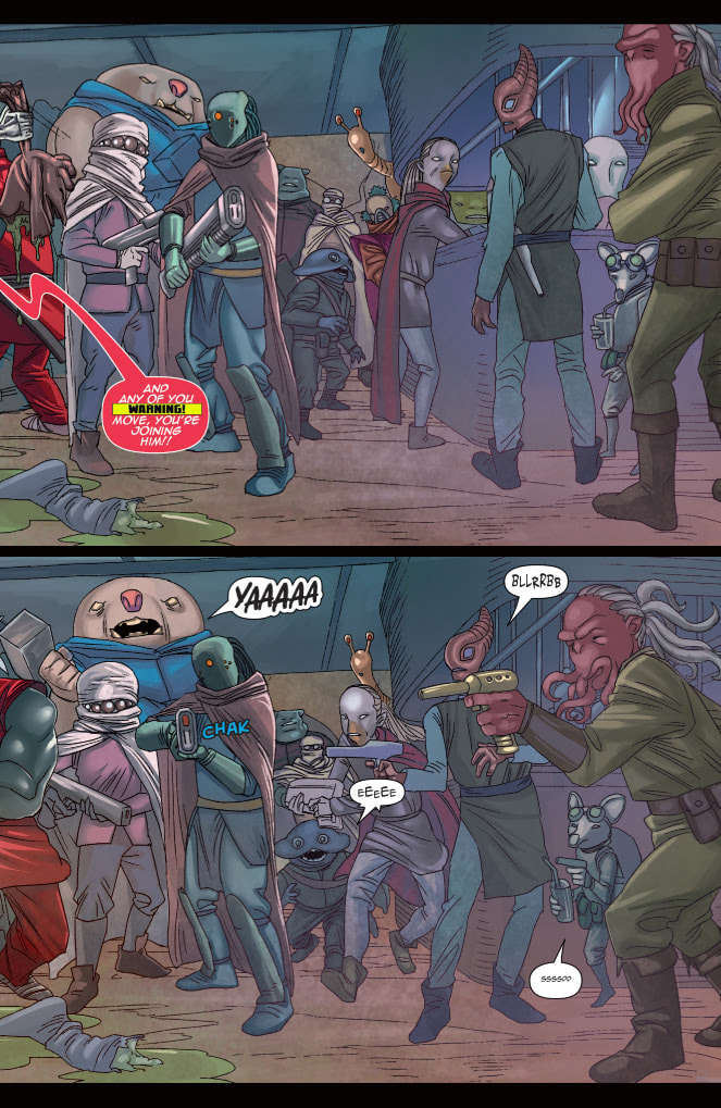
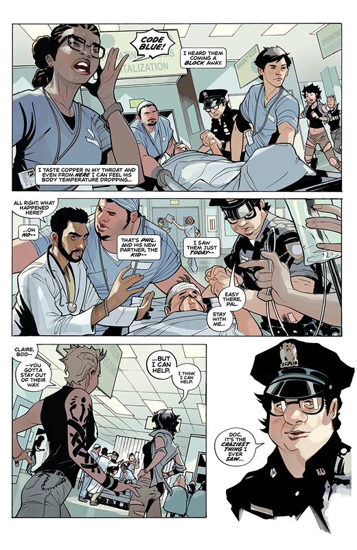
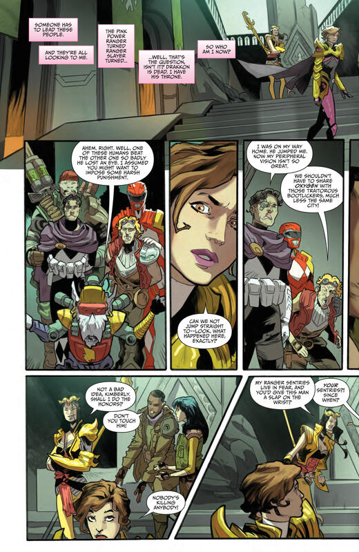
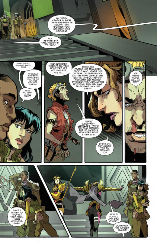
The interiors here are fantastic! What we see is this upgraded manga style of art that really suits the story perfectly. The linework is fabulous and how we see this through the varying weights and techniques being utilised to really bring about the attention to detail is utterly marvellous. The utilisation of the page layouts and how we see the angles and perspective in the panels show a stupendous eye for storytelling. How we see backgrounds being utilised throughout to not only enhance the moments and show off this world but it also brings us some nice depth perception, a sense of scale and the overall sense of size and scope to the story. The colour work is absolutely divine! How we see light utilised to create motion and other effects is truly magnificent to see here. The various hues and tones within the colours being utilised to create the shading, highlights and shadow work is exemplary. It showcases this amazing eye for how colour works, how it can be utilised outside the norm and it really enhances how we see the story.
This really is a true treat to read. If you are looking for something that will knock your socks off with how the story is layered and how we see the development in action then look no further because this is going to be the year's hottest surprise hit!
Boom! Studios 2020
Written by A.J. Marchisello & Marcus Rinehart
Creative Consultant Joe Kelly
Illustrated by Stefano Simeone
Coloured by Igor Monti
Lettered by Ed Dukeshire
It's a new beginning for the worldwide culture phenomenon featuring heroes like Mega Man, Rush and Dr. Light trying to save Silicon City from the villainous forces of the Robot Masters, set in the world of the Mega Man: Fully Charged TV series. After Mega Man's father Dr. Light is kidnapped, a shocking truth rocks Mega Man's world as it seems the Robot Masters know more about his secret history than he does. When Mega Man's forgotten memories of the brutal human/robot war are triggered, our hero is left to question just who he is and if he can trust anything or anyone -- including the man he calls father.
This is my very first exposure to Mega Man and I have to say that this is something I thoroughly enjoyed. Now mind you I don’t know about his past but I am presuming that this is unlike anything in the franchise that has come before. I think that's a safe bet at least in my limited knowledge. To me this has a few elements to it that I find appealing in different ways and that I get a vibe from Speed Racer and various Animes that I have seen take this to a place where it leaves the all-ages behind and becomes this amazing story that I wasn’t really expecting to see. If you think Mega Man is a kids book, well think again there’s a sophistication to this that you aren’t going to want to miss!
I love the way that this is being told. The opening is fantastic as it kind of catches us up with everything that he’s been through up till now. This is smartly done and really allows the reader to understand the world as it stands, up to a point. It draws the reader in as it captures the imagination beautifully. The story & plot development we see here through how the sequences of events unfold as well as how the reader learns information is presented extremely well. The character development is great and it gives the reader a sense of who they are and where they could, I repeat could, go. It is just enough to set the change for some major revelations and changes and it’s so amazingly well done. The pacing is superb and as it takes us through the pages revealing the twists & turns along the way it is easy to see how everything works together to create the story’s ebb & flow.
The interiors here are fantastic! What we see is this upgraded manga style of art that really suits the story perfectly. The linework is fabulous and how we see this through the varying weights and techniques being utilised to really bring about the attention to detail is utterly marvellous. The utilisation of the page layouts and how we see the angles and perspective in the panels show a stupendous eye for storytelling. How we see backgrounds being utilised throughout to not only enhance the moments and show off this world but it also brings us some nice depth perception, a sense of scale and the overall sense of size and scope to the story. The colour work is absolutely divine! How we see light utilised to create motion and other effects is truly magnificent to see here. The various hues and tones within the colours being utilised to create the shading, highlights and shadow work is exemplary. It showcases this amazing eye for how colour works, how it can be utilised outside the norm and it really enhances how we see the story.
This really is a true treat to read. If you are looking for something that will knock your socks off with how the story is layered and how we see the development in action then look no further because this is going to be the year's hottest surprise hit!
 RSS Feed
