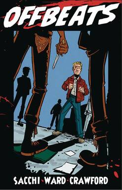
Offbeats #1
Antarctic Press 2019
Created by Tom Sacchi & John Ward
Written by John Ward
Illustrated by Giles Crawford
Coloured by Dan Thompson
Lettered by Henry Barajas
It's Tintin meets Tarantino in this 1950's crime noir! A young man tries to save a woman from a vicious street gang, but ends up needing to be rescued by a petty crook who introduces him to a whole new world!
I have said this days ago but really it applies all the time, Antarctic Press is home to some spectacular, diverse and interesting stories and I am so glad I am into them big time! It’s past due but so as long I got there that’s all that matters right? So what stands in your way of finding out for yourself why I can’t stop raving about the books they are putting onto stands? No more excuses, step out of that comfort zone and see what else is out there you might just surprise yourself!
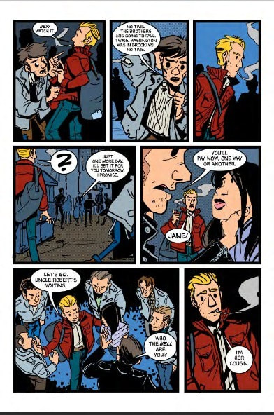
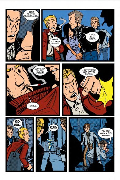
I have no idea what the hell is going on here and I LOVE IT! The opening is interesting and I really love the way these guys manage to do the narration with the imagery because it leaves an impact on you. This segues into meeting Jim which has this extremely smooth, think glass you can’t tell is there, feel and flow to it. Though I am not surprised since I really enjoyed his work on Scratcher. I really do like how the ebb & flow of what we see, learn and get to know here through the books structuring. This is why I love comics, this is not quite a slice of life book though it has some elements to it and it’s certainly not a coming of age story either and yet because of the way we start this that’s the immediate vibe you get. It is super strong and well done and it sucked me in straight away.
I do like that this is the 1950’s as period pieces allow for some added flavour and colour. By this I mean that life was different then, smoking was something almost everyone did, the clothes, the clubs and the social dynamics make for a kind of set pattern and it’s nice to see how John takes that and sculpts and moulds into something uniquely his. Also another aspect is the language here and the slang or whatnot that you’d find then and it really goes that extra mile in terms of authenticity.
The interiors here are delightful and while it does somewhat feel like some old newspaper strip comic art it takes on the presence of the story making it so much more. It is pretty odd too because this isn’t the kind of work I would go for and yet it really does feel charming and interesting. Giles found a way to take the work and make feel like it belongs in this style of story and that’s pretty amazing to me. The colour work too is more solidly packed in and not so much gradation or shading so you really do get the overall comics strip feel. The utilisation of the page layouts and how we see the angles and perspective in the panels show off this really good, solid and strong eye for storytelling. So the way that backgrounds are utilised is great to see and how they enhance the moments makes me happy.
We kind of get an inkling of what is going on here but that’s just it, an inkling. I say this because hints and encounters of the characters that are introduced give off this amazing intrigue vibe but don’t reveal all that much. This is great because it keeps me reading, riveted and wanting to see and know more. The overall, all around creativity and imagination that is on display here is utterly marvellous, this is the kind of story that envelops you in it’s web and you don’t want to leave.
Antarctic Press 2019
Created by Tom Sacchi & John Ward
Written by John Ward
Illustrated by Giles Crawford
Coloured by Dan Thompson
Lettered by Henry Barajas
It's Tintin meets Tarantino in this 1950's crime noir! A young man tries to save a woman from a vicious street gang, but ends up needing to be rescued by a petty crook who introduces him to a whole new world!
I have said this days ago but really it applies all the time, Antarctic Press is home to some spectacular, diverse and interesting stories and I am so glad I am into them big time! It’s past due but so as long I got there that’s all that matters right? So what stands in your way of finding out for yourself why I can’t stop raving about the books they are putting onto stands? No more excuses, step out of that comfort zone and see what else is out there you might just surprise yourself!
I have no idea what the hell is going on here and I LOVE IT! The opening is interesting and I really love the way these guys manage to do the narration with the imagery because it leaves an impact on you. This segues into meeting Jim which has this extremely smooth, think glass you can’t tell is there, feel and flow to it. Though I am not surprised since I really enjoyed his work on Scratcher. I really do like how the ebb & flow of what we see, learn and get to know here through the books structuring. This is why I love comics, this is not quite a slice of life book though it has some elements to it and it’s certainly not a coming of age story either and yet because of the way we start this that’s the immediate vibe you get. It is super strong and well done and it sucked me in straight away.
I do like that this is the 1950’s as period pieces allow for some added flavour and colour. By this I mean that life was different then, smoking was something almost everyone did, the clothes, the clubs and the social dynamics make for a kind of set pattern and it’s nice to see how John takes that and sculpts and moulds into something uniquely his. Also another aspect is the language here and the slang or whatnot that you’d find then and it really goes that extra mile in terms of authenticity.
The interiors here are delightful and while it does somewhat feel like some old newspaper strip comic art it takes on the presence of the story making it so much more. It is pretty odd too because this isn’t the kind of work I would go for and yet it really does feel charming and interesting. Giles found a way to take the work and make feel like it belongs in this style of story and that’s pretty amazing to me. The colour work too is more solidly packed in and not so much gradation or shading so you really do get the overall comics strip feel. The utilisation of the page layouts and how we see the angles and perspective in the panels show off this really good, solid and strong eye for storytelling. So the way that backgrounds are utilised is great to see and how they enhance the moments makes me happy.
We kind of get an inkling of what is going on here but that’s just it, an inkling. I say this because hints and encounters of the characters that are introduced give off this amazing intrigue vibe but don’t reveal all that much. This is great because it keeps me reading, riveted and wanting to see and know more. The overall, all around creativity and imagination that is on display here is utterly marvellous, this is the kind of story that envelops you in it’s web and you don’t want to leave.

 RSS Feed
