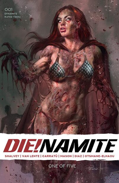
Die!Namite #001
Dynamite Entertainment 2020
Written by Declan Shalvey & Fred Van Lente
Illustrated by Vincenzo Carratù
Coloured by Kike J. Diaz
Lettered by Hassan Otsmane-Elhaou
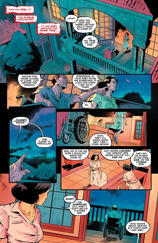
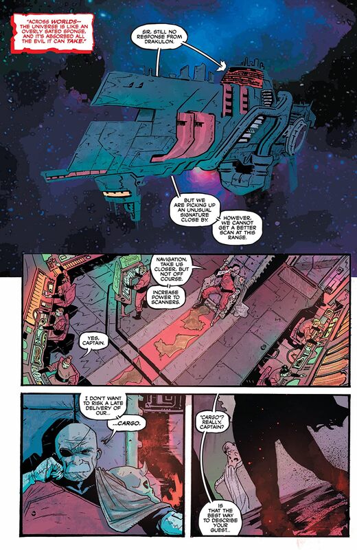
In the shadowed alleys of 1930s Chicago, GREEN HORNET and KATO hunt the nefarious criminal element plaguing their city. They soon discover a mysterious danger that threatens Earth itself! Meanwhile, VAMPIRELLA hurtles through space on a Drakulon ship, desperate to uncover a dark mystery…
Well now this isn’t what I thought it would be and it’s so much more than I could have hoped for. Okay So this issue doesn’t actually have Green Hornet and Kato in it that’s okay because it always makes me thrilled to see Peter Cannon Thunderbolt! Though in all honesty I thought DC had the rights to him but shh I won’t say nothin because I love him as a character and what has been done with him at Dynamite. I think this cast that we are seeing here is amazing and it took me a little by surprise that this was going in the direction it does. I mean I guess October is the month to do that to your characters as it’s all the rage and I was almost sure that this trend was dead.
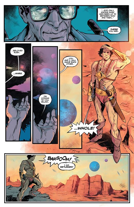
I am a huge fan of the way that this is being told. How we see the story & plot development constantly moving forward through how the sequence of events unfold as well as how the reader learns information is presented extremely well. Each segment or vignette showcases how the characters of the Dynamite Universe are going to become involved and none of it is going to be what you expect. The character development is sensational, John’s is beyond amazing and that nurse that’s my favourite part. How we see the characters act and react to the situations and circumstances really helps in showing who they are. The pacing is superb and as it takes us through the pages and deeper into how these characters are introduced to what is happening it is a hell of a ride. How we see this whole book structured and how well everything works together to create the story’s ebb & flow is really expertly done.
I like the mix of characters that we see here. Peter being one of my favourite characters but the opening here stole the show for me. That is a brilliant way to get the reader engaged in the story and it could be a hook for a whole story arc all it’s own.
The interiors here are magnificently rendered! The linework is great and how we see the varying weights and techniques being utilised to bring out the detail work is amazing. You would never know that there was not more than one person working on this with seeing different styles in different segments. The way that backgrounds are utilised here is great and they do more than enhance the moments but bring some wonderful depth perception, sense of scale and that overall sense of size and scope to the story. Seeing John leap that’s always a joy. Visually there is so much to take in and we never ever get bored for even a moment. The utilisation of the page layouts and how we see the angles and perspective in the panels show some really strong, talented eyes for storytelling. The colour work also is gorgeously rendered. How we see the various hues and tones within the colours utilised to create the shading, highlights and shadow work is beautifully rendered. Also i like seeing the myriad of techniques in laying down the colour and the effects that bring about.
It seems that right now company crossovers are in full swing or about to be launched and for me I’d bank on this one being the most interesting of them all. This is smartly written and gorgeously illustrated and how the layers of story within the story really make this seem more complex and thrilling.
Dynamite Entertainment 2020
Written by Declan Shalvey & Fred Van Lente
Illustrated by Vincenzo Carratù
Coloured by Kike J. Diaz
Lettered by Hassan Otsmane-Elhaou
In the shadowed alleys of 1930s Chicago, GREEN HORNET and KATO hunt the nefarious criminal element plaguing their city. They soon discover a mysterious danger that threatens Earth itself! Meanwhile, VAMPIRELLA hurtles through space on a Drakulon ship, desperate to uncover a dark mystery…
Well now this isn’t what I thought it would be and it’s so much more than I could have hoped for. Okay So this issue doesn’t actually have Green Hornet and Kato in it that’s okay because it always makes me thrilled to see Peter Cannon Thunderbolt! Though in all honesty I thought DC had the rights to him but shh I won’t say nothin because I love him as a character and what has been done with him at Dynamite. I think this cast that we are seeing here is amazing and it took me a little by surprise that this was going in the direction it does. I mean I guess October is the month to do that to your characters as it’s all the rage and I was almost sure that this trend was dead.
I am a huge fan of the way that this is being told. How we see the story & plot development constantly moving forward through how the sequence of events unfold as well as how the reader learns information is presented extremely well. Each segment or vignette showcases how the characters of the Dynamite Universe are going to become involved and none of it is going to be what you expect. The character development is sensational, John’s is beyond amazing and that nurse that’s my favourite part. How we see the characters act and react to the situations and circumstances really helps in showing who they are. The pacing is superb and as it takes us through the pages and deeper into how these characters are introduced to what is happening it is a hell of a ride. How we see this whole book structured and how well everything works together to create the story’s ebb & flow is really expertly done.
I like the mix of characters that we see here. Peter being one of my favourite characters but the opening here stole the show for me. That is a brilliant way to get the reader engaged in the story and it could be a hook for a whole story arc all it’s own.
The interiors here are magnificently rendered! The linework is great and how we see the varying weights and techniques being utilised to bring out the detail work is amazing. You would never know that there was not more than one person working on this with seeing different styles in different segments. The way that backgrounds are utilised here is great and they do more than enhance the moments but bring some wonderful depth perception, sense of scale and that overall sense of size and scope to the story. Seeing John leap that’s always a joy. Visually there is so much to take in and we never ever get bored for even a moment. The utilisation of the page layouts and how we see the angles and perspective in the panels show some really strong, talented eyes for storytelling. The colour work also is gorgeously rendered. How we see the various hues and tones within the colours utilised to create the shading, highlights and shadow work is beautifully rendered. Also i like seeing the myriad of techniques in laying down the colour and the effects that bring about.
It seems that right now company crossovers are in full swing or about to be launched and for me I’d bank on this one being the most interesting of them all. This is smartly written and gorgeously illustrated and how the layers of story within the story really make this seem more complex and thrilling.
 RSS Feed
