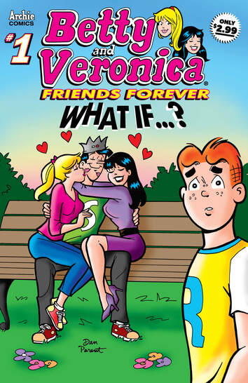
Betty & Veronica Friends Forever in What If....? #1
Archie Comics 2020
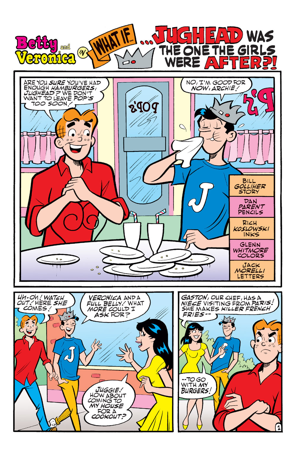
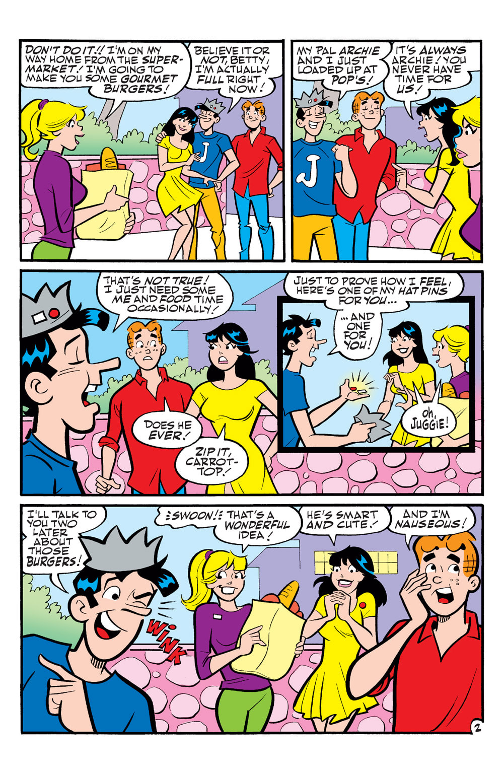
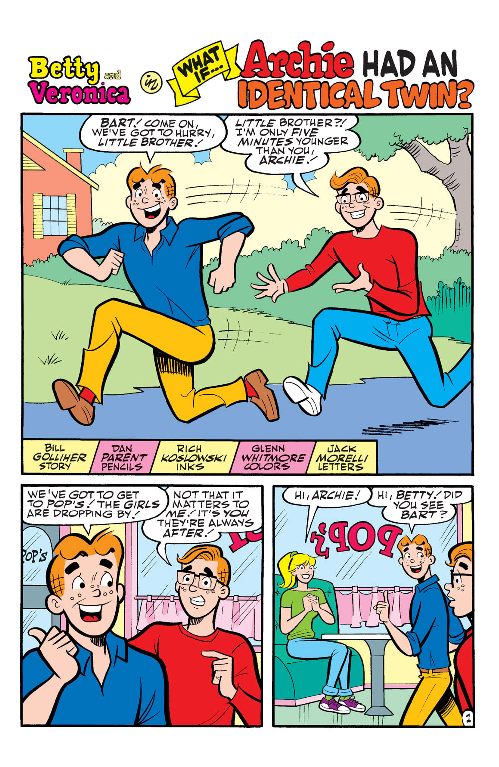
Written by Bill Golliher
Pencilled by Dan Parent
Inked by Rich Koslowski
Coloured by Glenn Whitmore
Lettered by Jack Morelli
What if Betty was the rich debutante and Veronica was the regular girl-next-door? What if Archie had an identical twin? Consider these and more zany options as Betty and Veronica ponder wild and out-of-this-world scenarios!
I absolutely adore this! I keep saying time and time again there's nothing quite like seeing the original Archie gang having wacky adventures. There is no way that even on chilly winters day that you can succumb to the blues if you have this with you. This is a feel good, put a smile on your face all-ages book that the whole family can enjoy. Leave it on the sink in the bathroom so everyone in the house can read it, then over dinner talk about it. This is what device free meals can start off with and from their it's everyone's day and what's been going on. Reading really is fundamental and it is a gateway to discussion and learning and that's what I see and feel when I read these books.
I think that the fact that there are four complete stories here and each one is unique different and almost precisely what we all ask ourselves at one point or another. Also I have mad respect for Bill and his talent and ability to create such full and complete short stories like these. I mean it takes something special about being able to tell a story that both is complete and makes you want to see more. Even if these vignettes are one and done they still serve to capture the readers' imagination and in their own minds create more tales in this setting. Imagine that creating stories that the reader takes and runs this creating in their minds more and more, I would say that's some master class storytelling.
The one that I think is the most humorous and it's one where the girls don't know the other is a witch. As if having Sabrina being one isn't enough now Betty & Veronica too it really was a hoot and holler to read that one. My favourite was Archie and his twin but its too bad that after what happened that Bart wasn't really into Kevin instead because that's the only it could've been better. I have to say this too and that's watching Archie's face throughout the book was interesting as his facial expressions and the lettering let you know a few things about him you don't normally associate with him but makes complete sense.
I love Dan Parent and his artwork. His pencils with Rich's inks and Glenn's colours is what makes this so classic and yet modern at the same time. The linework is strong and stead and delicate when it needs to be showing how by utilising the varying weights you can create such attention to detail. The utilisation of the page layouts and how we see the angles and perspective in the panels show this masters eye for storytelling. We see some great depth perception, scale and even that overall sense of size and scope to the stories thanks to how we see the composition inside the panels. I love seeing backgrounds and Dan really understands how to utilise them here to their fullest and it just makes me happy like a kid. Glen is one of those rare colourists whose work can never be called into question. He has this innate understanding of how make colour work and while there's really no shading, highlights or shadow work in the characters yet when we see the glass top table and it's gradation his work just becomes that much more impressive.
Everyone involved with this and the entire Friends Forever line of books needs some kind of award for their contribution to not only comics, but to teaching, learning and creating an environment where this is why we have device free meals. This is brilliant work from top to bottom and that includes Jack's lettering.
Archie Comics 2020
Written by Bill Golliher
Pencilled by Dan Parent
Inked by Rich Koslowski
Coloured by Glenn Whitmore
Lettered by Jack Morelli
What if Betty was the rich debutante and Veronica was the regular girl-next-door? What if Archie had an identical twin? Consider these and more zany options as Betty and Veronica ponder wild and out-of-this-world scenarios!
I absolutely adore this! I keep saying time and time again there's nothing quite like seeing the original Archie gang having wacky adventures. There is no way that even on chilly winters day that you can succumb to the blues if you have this with you. This is a feel good, put a smile on your face all-ages book that the whole family can enjoy. Leave it on the sink in the bathroom so everyone in the house can read it, then over dinner talk about it. This is what device free meals can start off with and from their it's everyone's day and what's been going on. Reading really is fundamental and it is a gateway to discussion and learning and that's what I see and feel when I read these books.
I think that the fact that there are four complete stories here and each one is unique different and almost precisely what we all ask ourselves at one point or another. Also I have mad respect for Bill and his talent and ability to create such full and complete short stories like these. I mean it takes something special about being able to tell a story that both is complete and makes you want to see more. Even if these vignettes are one and done they still serve to capture the readers' imagination and in their own minds create more tales in this setting. Imagine that creating stories that the reader takes and runs this creating in their minds more and more, I would say that's some master class storytelling.
The one that I think is the most humorous and it's one where the girls don't know the other is a witch. As if having Sabrina being one isn't enough now Betty & Veronica too it really was a hoot and holler to read that one. My favourite was Archie and his twin but its too bad that after what happened that Bart wasn't really into Kevin instead because that's the only it could've been better. I have to say this too and that's watching Archie's face throughout the book was interesting as his facial expressions and the lettering let you know a few things about him you don't normally associate with him but makes complete sense.
I love Dan Parent and his artwork. His pencils with Rich's inks and Glenn's colours is what makes this so classic and yet modern at the same time. The linework is strong and stead and delicate when it needs to be showing how by utilising the varying weights you can create such attention to detail. The utilisation of the page layouts and how we see the angles and perspective in the panels show this masters eye for storytelling. We see some great depth perception, scale and even that overall sense of size and scope to the stories thanks to how we see the composition inside the panels. I love seeing backgrounds and Dan really understands how to utilise them here to their fullest and it just makes me happy like a kid. Glen is one of those rare colourists whose work can never be called into question. He has this innate understanding of how make colour work and while there's really no shading, highlights or shadow work in the characters yet when we see the glass top table and it's gradation his work just becomes that much more impressive.
Everyone involved with this and the entire Friends Forever line of books needs some kind of award for their contribution to not only comics, but to teaching, learning and creating an environment where this is why we have device free meals. This is brilliant work from top to bottom and that includes Jack's lettering.
 RSS Feed
