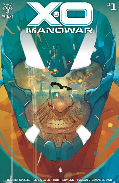
READING WITH A FLIGHT RING
  • About
  • reviews
  • Contact
  • Cosplay of the Day 2
  • Company News
  • Entertainment Section
  • Convention News/Updates
  • original artwork
  • My Best Books of the Week
  • Cosplay of the day!
  • FCBD
  • Interviews
  • Webcomics

Today's reviews!

Reviews for 19-12-21 
​Reviews for 18-12-21 Reviews for 17-12-21 Reviews for 16-12-21
​Reviews for 15-12-21 Reviews for 14-12-21 Reviews for 13-12-21
​Reviews for 12-12-21 Reviews for 11-12-21 Reviews for 10-12-21
​Reviews for 09-12-21 Reviews for 08-12-21 Reviews for 07-12-21
​Reviews for 06-12-21 Reviews for 05-12-21 Reviews for 04-12-21
​Reviews for 03-12-11 Reviews for 02-12-21 Reviews for 01-12-21

Facebook Link

X-O Manowar #1

3/26/2020

0 Comments

 
Picture
X-O Manowar #1
Valiant Entertainment 2020
Written by Dennis “Hopeless” Hallum
Illustrated by Emilio Laiso
Coloured by Ruth Redmond
Lettered by Hassan Otsmane-Elhaou


     Torn from the past and bonded with a living alien armour, will X-O Manowar become the hero the world needs? As a futuristic force arises to destroy the planet, only this ancient warrior king has the courage to stand against impossible odds!

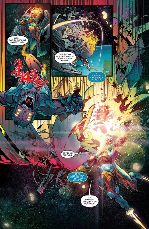
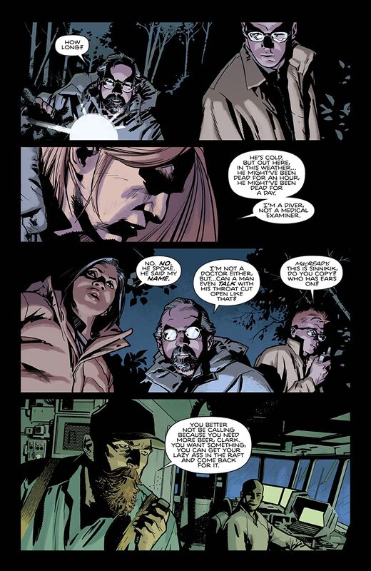
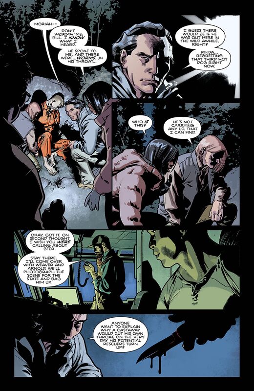
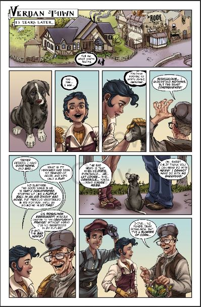
     I think that this is the way this book should be addressed. After all Aric is from a time and place far removed from now and his skills, knowledge and way of life is so different than ours is now that it's only natural he feel like a man out of time. No more Visigoth's trying to take land to create their nation again, no being in the grip of a government organisation or hounded by the other in this super-hero community. Just he and Shanhara trying to make it in this world together and making a ton of mistakes along way because Aric just doesn't understand how to get by in today's world.

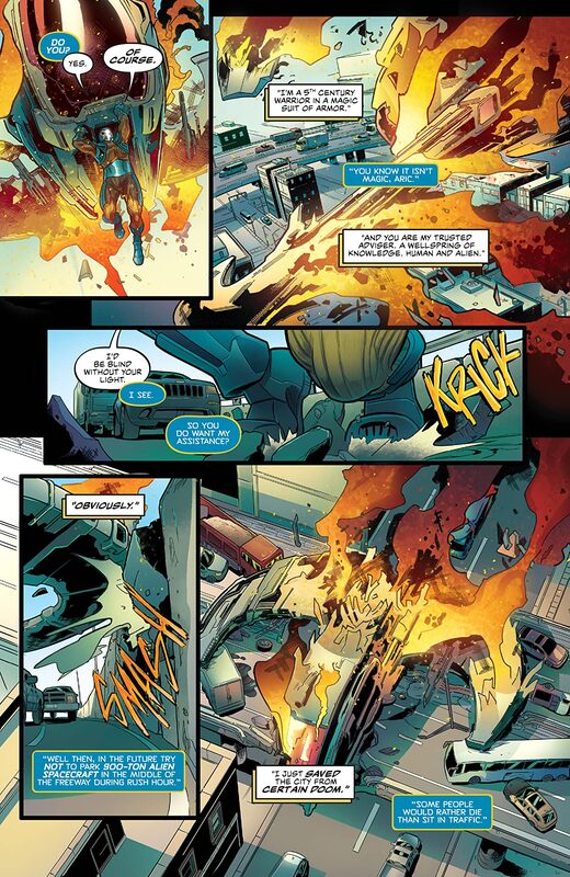
     I loved the series when he was in space and on a planet he knew nothing about but learned about how things were there as he went. This is the same principle but it's set here on earth and with what folks in this day and age of building you up then pulling you down for no discernable reason is something that it already looks like Dennis is going to tackle. The story & plot development that we see here through how the sequence of events unfold as well as how the reader learns information is being presented beautifully. The character development is amazing as is the character introductions as they just happen to be of a populace that most of the city would rather forget. Though never underestimate the power of the little people for their numbers are huge. The pacing here is sensational and the way it takes us through the pages revealing the twists and turns along the way helps to create the books overall ebb & flow.

     I also like seeing how the media is portraying Aric as well. By now we all know that there is no longer unbiased reporting and it's the most sensational headlines that will catch the reader or viewers eye. So thus the age in which we live is highlighted even further by seeing the accuracy with which the media covers him.

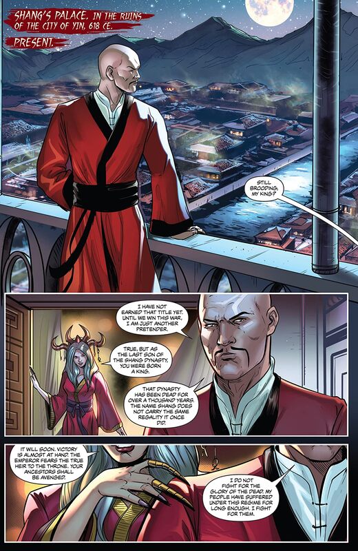
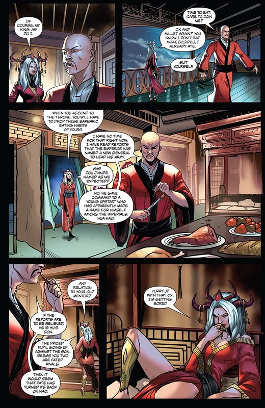
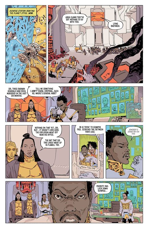
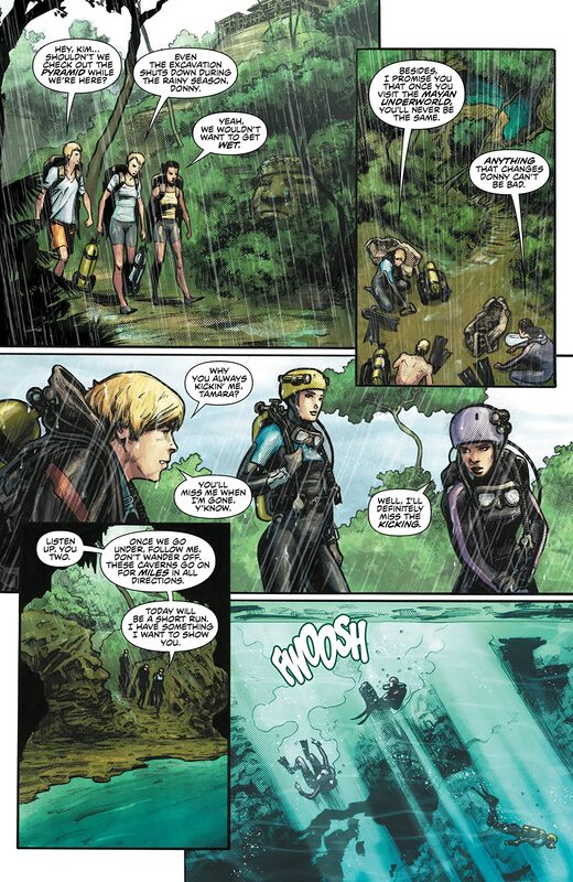
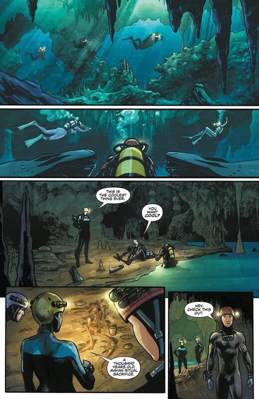
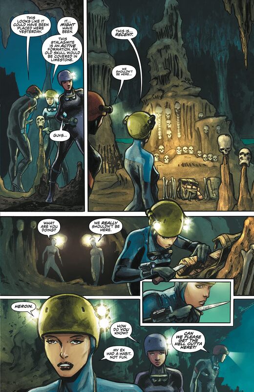
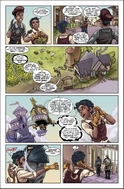
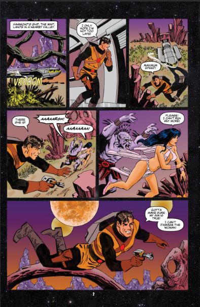
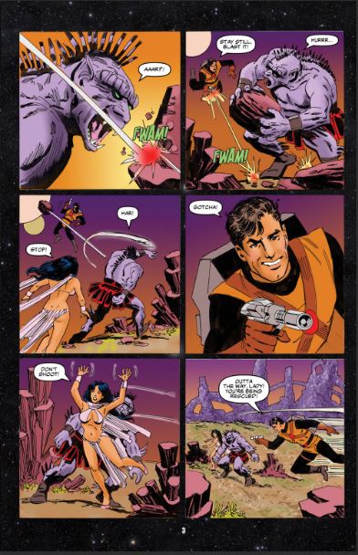
     The interiors here are mindbogglingly well rendered. The linework that we see with how the varying weights are being utilised to bring out this attention to detail is sublime work. It isn't just the linework that brings out the detail as Ruth shows with her colouring here as well just the opening page alone where she lines his musculature in the arms and chest and such make for such a powerful impact upon what we see. The way that backgrounds are utilised and how they work within the panels bring us this superb depth perception as well as this great sense of scale and the overall size and scope to the book. I touched upon the colours earlier but honestly what we see is stunning. The way that we see the myriad of hues and tones within the colours and how they are utilised to create the shading, highlights and shadow work is gorgeous. There is a real expertise in how the colours go beyond what we expect to see and how the full scope of what colours are created is truly astounding.
​

     The lettering we see is amazing as well. Hassan doesn't get as much credit as he deserves as he can showcase the foreign, see alien, language, the differences in Shanhara and Aric not to mention the humans. It is essential to how we see the story itself unfold. Once again Valiant showcases why it is among the best company when it comes to revitalising and maintaining these iconic characters time and time again. This has me excited for Aric and his new adventures that have yet to be chronicled.  ​

0 Comments

Shang #1

3/26/2020

0 Comments

 
Picture
Shang #1
Zenescope Entertainment 2020
Written by Nick Bermel
Illustrated by Daniel Mainé
Coloured by Grostieta & Maxflan Araujo
Lettered by Carlos M. Mangual


     PART 1 OF 3
     Before Shang was the mentor to the Guardian of the Nexus, bear witness as his past is finally revealed! The war for the Imperial throne is coming to an end. Shang, the last of his dynasty, seemed nearly invincible until a new general was chosen to lead the Imperial army. As these two strong forces race towards their inevitable clash, sinister forces plot to defeat them both.

     I love this for a number of reasons but chiefly among those is that it features a MAN! Zenescope has made it's name on T & A sure but it's become so much more than that so to see a series based on a male character is phenomenal! It isn't' only that this features Shang but it also introduces us to another character who makes their Zenescope debut here. The creativity and imagination in the creation of this historical fiction is something Nick has accomplished with such aplomb.

     I like the way that this is being told. The story & plot development we see through how the sequence of events unfold as well as how the reader learns information is really rather well presented. There are plenty of those moments you don't expect to see and the revelations are rather welcome as it fools you until they happen. The character development here is really quite interesting. When you go through the story and more layers to the characters are revealed things get more and more interesting and complicated which is precisely the kind of layering that we want to see. The pacing is superb and as it takes us through the pages revealing the twists and turns along the way it works with everything else to create this really dynamic ebb & flow for the book. It also highlights the way the book is structured and helps you appreciate the talent Nick has as a storyteller.

     I am enjoying this a whole lot more than I had originally anticipated, which of course I was already expecting a lot. There is something about historical fiction as a genre that we don't really see in comics, though you could argue the whole medium is exactly that, which just really kind makes this more interesting. There have been so many dynasties in that region and so warring between them that this could have taken place at any time back then and it's that kind of engagement into the story that I like to see the writer lead the reader into doing.

     I am a fan of the interior artwork here. The linework is bloody amazing and how we see the varying weights utilised to bring out the attention to detail is so well rendered. It isn't only in the characters, whose posture and the way the hold themselves is phenomenal, but the detail we see in the backgrounds as well is something special. The distance makes those lines seem softer and less in focus and that's not an easy to feat to accomplish. The way the backgrounds work within the composition in the panels bring some great depth perception, scale and that overall sense of size and scope to the book. The utilisation of the page layout and how we see the angles and perspective in the panels show a strong, talented eye for storytelling. The colour work we see here is really nice as well. The way that the multitude of hues and tones within the colours are utilised to create the shading, highlights and shadow work is beautifully rendered.
​

     This is a stunning book my friends. There is intrigue, battles, romance and action all set in a time where honour and your name spoke volumes. I am thrilled with the way that this book is being done from top to bottom, the writing, interiors and the lettering work in concert with each other to showcase why Zenescope sneakily got into real super-hero style comics!

0 Comments

Cat Shit One #1

3/25/2020

2 Comments

 
Picture
Cat Shit One #1
Antarctic Press 2020
Written & Illustrated by Motofumi Kobayashi
Translated by Jacob Yomtobian
Translation Check by Sakari Boström


     Kobayashi Motofumi Kobayashi's renowned war manga, filled with painstaking detail, returns to the printed page, but at full comic size for the first time ever! In this semi-fictionalized rendition of the Vietnam War, Sergeants Perky, Rats and Botasky comprise the special forces unit named Cat Shit One, risking their lives daily in re-con patrol, jungle ambushes, tactical assaults, rescue operations and more. These soldiers may look soft, but their combat tales hit hard!

     My first thought after finishing this issue was damn it's a perverted version of Watership Down, and I mean perverted in the best possibly of ways. Between the language, violence and how you see the characters here and feel for them the more we get to know them it is without a doubt the second most powerful piece of work featuring Rabbit that I have ever had the pleasure to read. Then when you factor in that it's basically a history lesson of the Vietnam War, yes War not Conflict, as seen through the eyes of Motofumi and it goes to a whole new level of amazing. I wanted to see what this was about because let's face it Cat Shit One is the kind of title that makes you immediately curious about what's inside.

     The second thing that comes to mind is how mindbogglingly awesome these interiors are. I mean the linework is exquisite in ways I wasn't prepared for in what I thought was a Manga but then again never ever think you know what something is. After all Akira was detailed too. From the era's clothing, military gear and the way we see the world, maps and all we see a complete world here and it's all visual. This could be told without words the work is that strong. Sure the words help and it gives us so much more context but I'll be damned if the illustrations aren't strong enough to carry this alone. The strength of the linework and how the varying weights are utilised to create this level and quality of attention to detail shows such a marvellous strong and steady hand. The utilisation of the page layouts and how we see the angles and perspective in the panels show a masterful eye for storytelling. The way we see backgrounds being utilised and how the work within the composition of the panels brings this brilliant sense scale, depth perception as well as that overall sense of size and scope to the book.

     How we see this being told is amazing. The story & plot development that we see through how the sequence of events unfold and how the reader learns information is presented beautifully. The character development is phenomenal and the way we see the characters act and react to the situations and circumstances help shape who we see them as. Also that in such a short amount of time that we become so invested in these characters is a testament to how well this is being written. This is far from a straight up revisiting of the war itself as Motofumi is infusing life into these characters and doing so in a way that strips away the racial stereotypes and shows the horrific realities of war.
​

     I will continue to scream from the rooftops about the quality of work that comes out of Antarctic Press and why you need to be paying attention to this! I know this has been around for a while but to see it in this format in North America this way is bloody marvellous. There is a beauty and grace to the way we see this that balances itself out against the way war is depicted. I think this is what the medium of comics was made for.

2 Comments

Killing Red Sonja #1

3/25/2020

0 Comments

 
Picture
Killing Red Sonja #1
Dynamite Entertainment 2020
written by Mark Russell & Bryce Ingman
Illustrated by Craig Rousseau
Coloured by Dearbhla Kelly
Lettered by Hassan Otsmane-Elhaou


     In order to become queen, Sonja The Red had to defeat an evil emperor. But that emperor had a son. And that son will do ANYTHING to exact his revenge...even if it means embracing horrible magics he does not understand.

     There is nothing than seeing a book that has you excited then reading it and wondering what in god's happened here. There are a lot of different takes on Red Sonja and while the interpretations aren't always going to please everyone this for me felt like a bad Caillou episode. The story is amazing but Craig's style of artwork does not belong. From missing faces, backgrounds and decided lack of intensity this to me is more kids book at the library than it is a comic featuring Red Sonja. I was distracted throughout and I felt like this was going to be a book in the first part until I realised that the entire issue was rendered this way.

     I was taken with the opening where we see the Emperor talking to his son about untying the knots. I thought that was a great way to not only keep his child informed, involved and understand the severity of what is happening but to see this kind of vengeance instilled in him was an interesting kind of warped. Then we see the assemblage of characters that he draws around him and I gotta say I was intrigued. Though this children's illustration really distracted from paying too close attention to the story.
​

     This is the shortest review I have ever done. I say this because the story is strong, has some very interesting elements to it and that ending we see is sensational but I can't get past the interiors. I am glad I haven't been to the store to pick this up because now I won't. I have long praised Dynamite and their ability to put creators on the right projects and this time I just don't see the reasoning. This bugged me, when we see this guy with the arrow knocked and we see his hand holding the bow that the hell is that hand, is it a hand? It looks nothing like it should. I got to stop because Craig isn't a bad artist he just isn't the right one for this in my opinion.  ​

0 Comments

Tartarus #2

3/24/2020

0 Comments

 
Picture
Tartarus #2
Image Comics 2020
Created & Written by Johnnie Christmas
Created & Illustrated by Jack T. Cole
Lettered by Jim Campbell


     “HOMEGOING”
     Tilde’s on the run from an empire. Klinzu has a date in a war zone. Their plan, a fiery escape to the most dangerous place in the galaxy: Tartarus.
     Includes “LIFE,” a new backup story by STEPHANIE COOKE and MEGAN HUANG, exclusively in single issues.
Oh last issues double sized madness was a stellar introduction to this world, universe or whatnot and it's continuing onward here in ways to exceed what we've already seen. If I am going to be completely honest I am still a little bit lost at times here but then again I think that's part of the mad genius behind this. It is like wait, what, hunh, how, when and we keep reading to discover those answers and more. I am so fascinated and invested in this already and I have to say that the more we see the more I want to see and that's what good storytelling is supposed to do.

     I think the way that this is being told is exceptionally well done. I like how this issue we are seeing more of the surrounding area before the reports have come in on what has happened and who it is they are pursuing. That we are getting the opportunity to see more of this system being explored and fleshed out is sensational. The story & plot development we see through how the sequence of events unfold as well as how the reader learns information is presented beautifully. The character development here is interesting as well and I look forward to Tilde's continued growth and evolution the more she learns about herself. The pacing is great and as it takes through the pages revealing the twists and turns along the way it helps to bring the books structure as well as it's ebb & flow to light.

     There is this great way that the name of the series, the mythology of its meaning and how it plays into where they are here. That we see such a play on words and with all the meanings and the way it is incorporated into the story and at it's essence, it's core, it really resembles Dante's nine rings of hell. I love the symbolism that we see throughout the book and how the characters interact with one another their talents and the way that all seem to fit into this Shakespearean style drama that we see playing out before our eyes.

     The interiors here are so gorgeous. Which in a lot of ways in an understatement. The linework is exquisite and how the varying weights are utilised to bring out this level of attention to detail is utterly marvellous. Also with this much detail we see how Jack has such a strong and steady hand. With the backgrounds as detailed as they are and how the work within the composition in the panels bring this insane depth perception, sense of scale and the overall size and scope to the book. The utilisation of the page layouts and how we see the angles and perspective in the panels show a masterful eye for storytelling. The colour work we see is beautifully rendered. How we see the various hues and tones within the colours create the shading, highlights and shadow work is so beautiful to see. I mean the colour palate here is exquisite with how the pastels really pop.

     The layering and directions we see the story being able to take open up so many possibilities all of which are exciting, fresh and different than what we're used to seeing. This is what the power of storytelling holds, a way to open up new doors to adventure in ways we'd never have thought possible.

0 Comments

Alienated #2

3/24/2020

0 Comments

 
Picture
Alienated #2
Boom! Studios 2020
Created & Written by Simon Spurrier
Created & Illustrated by Chris Wildgoose
Coloured by André May
Lettered by Jim Campbell


     After outcast teens, Samuel, Samantha, and Samir, find an adorable but dangerous alien creature in the woods and name him Chip, they bond over their shared secret. But as the pressures of hiding an actual alien mount, they each begin to fantasize about how to use Chip's strange powers to improve the world -- starting with their current lives.

     Geez I really am enjoying the heck out of this book! First Samuel's little video blog thing, what are those Vlogs, and his woke attitude is fun, and funny because it's interesting to see how kids think they know but really they don't. I think we were all like that when we're in high school at some point, thinking we're grown but we have barely begun. Simon captures this beautifully within the first two issues here and I have to say I find this so darn interesting with how it is being told. Also this is what grabs you, draws you in and generates that interest factor that holds you in it's sway.

     I really am a fan of the way that this is being told. The story & plot development we see happen through how the sequence of events unfold as well as how the reader learns information is presented beautifully. I think the way that we are seeing the kids go through their day and have to handle their new pal is one of the more unexpected elements here. This also heads us into the character development which is extraordinary really. Teenagers are complex humans in that transitional state between childhood and adulthood so to see how the act and react to the situations and circumstances really help to show us who they are at their core. The pacing is superb and the way it takes us through the pages revealing the twists and turns along the way helps to create the books ebb & flow.

     The whole idea here is great and how we are seeing come to life is really quite brilliant. There is something about being able to play god that comes with a heavy price and the more the kids use Chip in this way the more he gains power and the more dire the situations with the kids become. The way that this is seen by the reader is extraordinary and with the visuals the story becomes beyond intense and into a world where nothing is certain. I couldn't ask for more than what we've got here and I love every single moment of it.

     The interiors here are so damn delightful. The way that we see the linework is amazing and wit the varying weights utilised to bring out the attention to detail shows this gorgeous, strong and steady hand. Now the sequences where we see the whole troubled youth are all those kids gay? I mean it sure looks like it but nowadays one can never be sure. I would love to think that's the norm in schools these days, being able to be who you are without worry it's a nice thought. One of the things I adore about all this is seeing Chip and how the creativity and imagination that Chris has and André utilising colours this way I mean it's stunning. The two-page spread and the pin-up show just how brilliant and mindbogglingly good these interiors are. With the way we see backgrounds being utilised and how they work within the composition in the panels show depth perception, scale and this overall sense of size and scope of the book. The colour work and how we see the various hues and tones within the colours utilised to create the shading, highlights and shadow work is utterly gorgeous. Seriously the way these colours swirl and shine leave me breathless.
​

     This has so many layers to the storytelling and with each of the three Sam's. Of course there's Samuel as well whose mother is a police officer. Oh I cannot wait for next issue to see the outcome of how this issue ends because that is going to be drama thrilled. What these folks are doing is creating a book that's as much entertainment as it a temporary escape from reality. Thoughtful, engaging and over the top science fiction at it's best and I like how it fits in the genre in a way we don't normally see.

0 Comments

Predator Hunters III #2

3/23/2020

0 Comments

 
Picture
Predator Hunters III #2
Dark Horse Comics 2020
Written by Chris Warner
Illustrated by Brian Thies
Coloured by Wes Dzioba
Lettered by Michael Heisler


     The Hunters team is in Belize, where they have an acrimonious meeting with the newly arrived Russian team that is after the same quarry. Fortunately, an unexpected player from Dark Horse's very first Predator series is there to prevent bloodshed. Meanwhile, the Predators are busy racking up a body count in the jungle!

     God this is an amazing book. I mean I know that Chris knows this like few others do but honestly I wasn't expecting anything as good as is. The opening is bloody brilliant, literally and I really like the way it continues to demonstrate how active in this area the Predator's are. Which is really only natural considering that the are is full of drug cartels who have weaponis galore as they protect their area and their product. This lends itself to the Predator's beautifully since they see the weapons and those that wield them as potential kills to boost their own reputations. I like it, if you attack or show yourself with a weapon of some sort you're toast if not your left relatively alone.

     The way that this is being told is utterly fantastic! The story & plot development that we see through how the sequence of events unfold as well as how the reader learns information is presented exceptionally well. Just how things come at the reader and how this creates the flow of the story we get everything we need for the moment and a glimpse at the shitstorm to come. The character development is marvellous and I love the posturing and agonistic behaviour that we see and this is what we're going to remember later when it all hits the fan. It'll be interesting to see how their personalities change. The pacing is crazy good and as it takes us through the pages revealing the twists and turns along the way it works with everything else to create this beautiful ebb & flow.

     This is what I love about comics. Time is never a factor and stories can be placed anywhere within a franchises timeline. While the Alien franchise is stellar stuff and I generally tend to stray away from the VS. I do like the mainlined series like this. This just feels right and it's hard to explain but you know it when you experience it.

     The interiors here are sensational! The underwater scenes in the opening really look like something off the National Geographic Channel programming. The creativity and imagination that we see is mindbogglingly good and then of course to make this as eerie as it can be it's crazy good. The way that we see how backgrounds are utilised and how they work within the composition of the panels to bring us this amazing depth perception, sense of scale and the overall size and scope to the book is phenomenal to see. The utilisation of the page layouts and how we see the angles and perspective in the panels show such an amazing eye for storytelling. The colour work we see here is divine stuff. How the hues and tones within the colours are utilised to create this level of shading, highlights and shadow work is mind blowing. The work we see shows someone who understands how colour works, how there are some unusual tones within them that we don't normally think about. It's simply beautiful stuff.
​

     This is everything we want to see in a Predator series. It has the Predator's out and about wreaking havoc and those who think they can stand up and take em. The tomfoolery in how they behave and that we see such chutzpah is rendered amazingly well. With layers in the storytelling and a simple complexity in how it's all being built this is a sure fire must have!

0 Comments

Plunge #2

3/23/2020

0 Comments

 
Picture
Plunge #2
DC Comics Black Label 2020
Written by Joe Hill
Illustrated by Stuart Immonen
Coloured by Dave Stewart
Lettered by Deron Bennett


     After discovering a corpse upon the Sinnikik Atoll, Moriah Lamb leads a team to hunt for other castaways, while Gage Carpenter begins the exploration of the ghost ship Derleth. But there’s something down there in the icy darkness of the Arctic sea, something that doesn’t want to be found. And it isn’t any safer on land. There are things waiting for the search party in the mountain caves, things that were once human...and aren’t quite any longer.

     So at the end of last issue and finding that dying inmate is where we pick up here. I really like the way that this is being told. Joe understands how things work in storytelling and to make this feel as close to film or a mini-series (television) means getting the pacing we see to be completely on point. Thus it doesn't feel like there is a lot of time for the characters to gather their wits while everything around them continues to spiral out of their control. It has this element to it where it feels right, real and natural and that's the kind of storytelling that we crave.

     The story & plot development that we see through how the sequence of events unfold as well as how the reader learns information is presented to the reader perfectly. Honestly I don't want to know what is going to happen next, let us learn alongside the characters unless of course it builds the tension and suspense further. Like seeing them being watched but not know who, what, why or the how of it all. The character development we see here is fantastic and I really like how we see them act and react to the situations and circumstances they keep facing. This is constantly changing who they are and honestly I am waiting to be surprised by someone whom I immediately disliked or thought was useless and so far Joe's writing one of the more intriguing and interesting books out there. The pacing is superb and as it takes us through the pages revealing the twists and turns along the way we are getting on hell of an ebb & flow to this book.

     I am loving every moment of this. There are so many elements here that keep things moving and taking the ordinary into the extreme by circumstances that are man made in their origin. This isn't a thing where it's hey look monsters, no what we see is environmental damage on a scale that has genetically changed the species in this isolated place and thus creating new lifeforms that we have never experience.

     Stuart is slaying the interiors here. The linework is mindbogglingly exquisite to say the least. How we see the varying weights being utilised to showcase the attention to detail and his creativity and imagination is sublime. If you haven't seen this yes then shame on you because it is my humble opinion that this is the best work Stuart's ever shown us. With his portfolio that's mighty impressive for me to say. The way that backgrounds are utilised here and how they work within the composition in the panels to bring us the depth perception, scale and that overall sense of size and scope to the book we see is utterly marvellous. The utilisation of the page layouts an dhow we see the angles and perspective in the panels shows a masters eye for storytelling. The colour work here is gorgeous and how it's rendered to heighten the mood and atmosphere of the book is beautiful stuff. I like the way that we see hues and tones within the colours to create the shading, highlights and shadow work. Dave shows off why he's as much a master of colour as Stuart is linework and imagery.

     The is the next evolution in the horror genre in the comics medium. From the days of The Witching Hour and Ghosts to this it is high time that we got the same kind of excitement and thrill out of horror comics again without all the gore and guts. Hitchcock said that the audience can come up with scenarios far scarier than anyone and so he never showed the deed. For me this is where DC is shining brightest with the Black Label line of books.

0 Comments

Dragon Whisperer #1

3/22/2020

0 Comments

 
Picture
Dragon Whisperer #1
Red 5 Comics 2020
Written & Lettered by Alex De Luca
Illustrated by Glen Fernandez


     In a world of clockwork and steam, cursed airship captain, Alexander Faulk, endures his centuries-long quest for an end to his torment: a Dragon! His ceaseless pursuit bears scarce reward, that is until Faulk discovers the bridge between the world of man, and the world of monsters. Her name is Rosalinda Eberhardt, and she is the Dragon Whisperer.

     The world needs more books like this. This is cute, fun, tragic and an all around just entertaining book. The opening is intriguing and it makes you want to know what else is happening. It is strong and beautifully rendered which is exactly what a first page should do. So this does raise a number of questions which we also need or want to see answered and how it all factors in which is kind of exciting. So yeah the first page alone sets the stage for the type of story and adventure that we are going to find here and I adore that.

     The way that this is being told is really rather well done. The story & plot development that we see through how the sequence of events unfolds as well as how the reader learns information is presented exceptionally well. I wasn't expecting to find how Rosalinda ends up where she does but I have to say it was far more entertaining a take on that which I have not seen before. It was not heavy handed and it was kind of accepted far more than I would have thought. The character development that we see is intriguing to me. I get why we see some motivations and how her usefulness is seen but when the Captain does his reveal that kind of stark honesty is so refreshing. I love the way we're learning about these folks. The pacing is great and while things seem to happen quite quickly it doesn't detract from getting from point A. to B.. The way that we see all of this working together to create the books overall ebb & flow which is utterly delightful.

     I have said repeatedly that Red 5 is a company you should have on your radar. This is yet another example of the fact that they know what is good and what to get behind. If you have the opportunity, now that majority of us are stuck at home, I highly suggest you check this and the rest of their inventory.

     The interiors here are rather lovely themselves. I really like the linework we see and how the various weights are utilised to bring out the attention to detail. For majority of the pages the attention spent on the background detail is superb! I love how it looks and how we see them within the composition of the panels to create this nice depth perception, scale and the overall sense of size and scope to the book. Also hella impressed with how we see just the linework in the flashback sequence because that is bloody killer! The utilisation of the page layouts and how we see the angles and perspective in the panels show this utterly marvellous eye for storytelling. Then there's the colour work that we see and it's gorgeous! The softness we see in places is divine and then the myriad of hues and tones within the colours utilised to create the shading, highlights and shadow work here is beyond what I could've hoped for.
​

     While this may be a tale of Rosalinda coming of age in this world and learning whom she and cannot trust it is also an extremely wonderful story of just finding yourself and your purpose. The backdrop is just an added layer of awe and wonder.  ​

0 Comments

Planet Comics #1

3/22/2020

0 Comments

 
Picture
Planet Comics #1
Antarctic Press 2020
Spurt Hammond
Written by Sean Russell
Illustrated by Mike Vosburg
Lettered by Nikki Powers
Space Sucks
Written by Mark Fenton
Illustrated by Brian Rogers
Lettered by Wes Locher
Subterfuge
by David Hutchison


     Just in time for its 80th-issue anniversary, Planet Comics is blasting off once again, with a system of stellar stories to celebrate! Sean Russell and legendary comics artist Mike Vosburg deliver the derring-do of Spurt Hammond: Planet Flyer as he strives to save a stranded princess from a pursuing beast. And Mark Fenton and Brian Roger show what happens when a malfunction occurs at an orbital prison housing highly dangerous criminals, threatening the world below.

     Normally I am not a fan of anthology series, however. If they feature a continuous strip then that is another story for me. With the introduction of these three stories is sensational and it makes me want to see more. Also I really like the fact that there are three stories here instead of four as it gives each story that extra page count. So if these are going to be monthly features I am completely and totally going to be into this.

     Now I am one that loves being surprised and I was totally surprised by the opening story here. I really thought this was going to be something that it wasn't and that alone thrilled me beyond belief! The twists and turns that happened throughout the story were done perfectly and keeps the reader on the edge of their seats wonder what could possibly happen next. It was fun, thrilling and takes what we expect to see out of “old school” space adventures into something new, fresh and completely different and I have to say I want to see more of this from these guys. It was definitely a highlight story and a strong one which to open up with. The interiors here are fantastic as well. I love the creativity and imagination we see in the backgrounds of the planet and how our two main characters are portrayed as fine specimens of humanity. Really is just what I expect to see.

     The second story here is one that has a really premise that makes us want to see more. I would like to see where this is going because the way this one was kind of crammed between the others didn't really give us enough of a look at it. Though what we do see is extremely well presented and while the art is more fine line drawing that doesn't stop the interiors from being sharp as heck. Also I like the take on the villain here as well, though I do wish it felt more like an enclosed space to give this a more claustrophobic feel. Though I would like to see what Space Ranger Pace is going to do or encounter next. I feel like there is something behind what she was doing on that ship anyway as she cut them off with a clear signal. So I am waiting patiently to see what she's really up to.

     The final story here is one that I love seeing. It has this complete steampunk kind of feel from a time when Steampunk wasn't a really a thing. Like 20,000 Leagues Under the Sea kind of look, tone and feel to the story. This kind of classic science fiction storytelling just inherently makes me one happy camper. I grew up with the older versions of that and others in the genre before special effects got to where they are today so it really reminds me of my childhood and much happier times. The art here is great when it comes to the diving suits and uniforms or the outside of their ship but inside I wish we'd see more backgrounds to really showcase that they are in tight quarters. After all if they are in a submarine style ship then we should feel that. Otherwise I am really excited about the prospect of what this represents.
​

     This showcases that you can do an homage to the past while it keeping extremely modern at the same time. Each one of these stories represents a different aspect of the space opera genre of the past and each one has those elements that make them beautifully unique. This for me is pure gold!

0 Comments
<<Previous
Forward>>

    Archives

    December 2021
    November 2021
    October 2021
    September 2021
    August 2021
    July 2021
    June 2021
    May 2021
    April 2021
    March 2021
    February 2021
    January 2021
    December 2020
    November 2020
    October 2020
    September 2020
    August 2020
    July 2020
    June 2020
    May 2020
    April 2020
    March 2020
    February 2020
    January 2020
    December 2019
    November 2019
    October 2019
    September 2019
    August 2019
    July 2019
    June 2019
    May 2019
    April 2019
    March 2019
    February 2019
    January 2019
    December 2018
    November 2018
    October 2018
    September 2018
    August 2018
    July 2018
    June 2018
    May 2018
    April 2018
    March 2018
    February 2018
    January 2018
    December 2017
    November 2017
    October 2017
    September 2017
    August 2017
    July 2017
    June 2017
    May 2017
    April 2017
    March 2017
    February 2017
    January 2017
    December 2016
    November 2016
    October 2016
    September 2016
    August 2016
    July 2016
    June 2016
    May 2016
    April 2016
    March 2016
    February 2016
    January 2016
    December 2015
    November 2015
    October 2015
    September 2015
    August 2015
    July 2015
    June 2015
    May 2015
    April 2015

    RSS Feed

    Categories

    All

    RSS Feed

Powered by Create your own unique website with customizable templates.