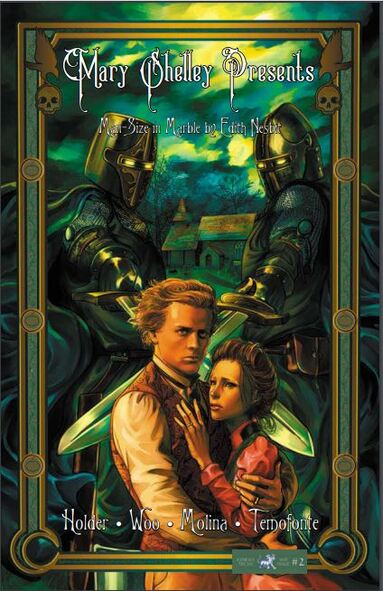
Mary Shelley Presents #2
Man-Size in Marble by Edith Nesbit
Kymera Press 2018
Written by Nancy Holder
Illustrated by Amelia Woo
Coloured by Sandra Molina
Colour Seperation by Alejandro García
Lettered by Saida Temofonte
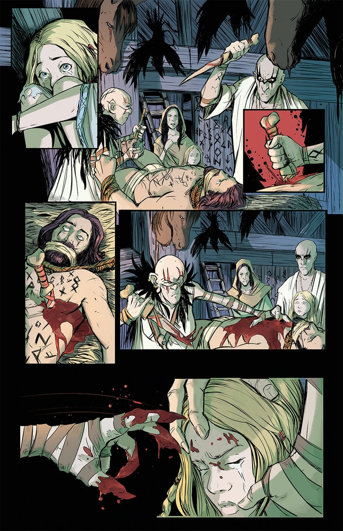
A young pair of newlyweds settling down into a small cottage in a quiet village are looking forward to a pleasant, pastoral life. The husband dismisses a superstitious maid’s tale of an ancient curse concerning the local church’s marble statues, statues who come to life each year on All Saint’s Eve to wreak revenge. But then, one fateful night…
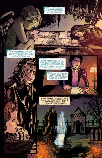
I am a fan of this series. I am thankful to work with some wonderful PR people who send me series like these that I doubt I would have heard of otherwise. I am very thankful that this is one of the series that was brought to my attention too. Women who tell the stories that women of the past told before it was common or considered decent to tell them is empowering in any number of ways. For me this is just a stunning example of storytelling and it thrills me to no end that such a hauntingly beautiful story can be brought to life. There is also something inherently creepy about different era's in European history from the stories we have heard and yet combine the power of ones own imagination with folklore and legend and we tend to find ways to scare ourselves.
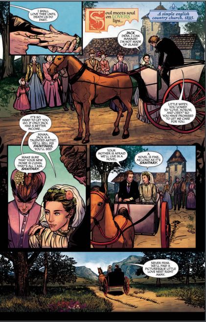
I love the way that this is being told. Sometimes an adaptation can alter the way the original story is meant to be read but with the original story in the back of the book you can see how much care Nancy takes in making sure she's telling as accurately as humanly possible. The story & plot development that we see through how the sequence of events unfolds and how the reader learns information is presented so beautifully. The opening and closing for the story as told by Mary and her creation are inadvertently creating this new late night double feature picture show hosts that scream to be seen time and time again. The character development we see is sensational and how we see them through the dialogue and how the act and react to the situations and circumstances really paints a picture of their personalities. The pacing is superb and as it takes us through pages it works with everything else to create this gorgeous ebb & flow to the book.
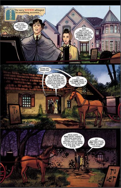
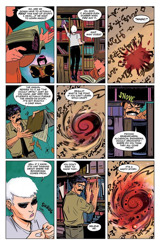
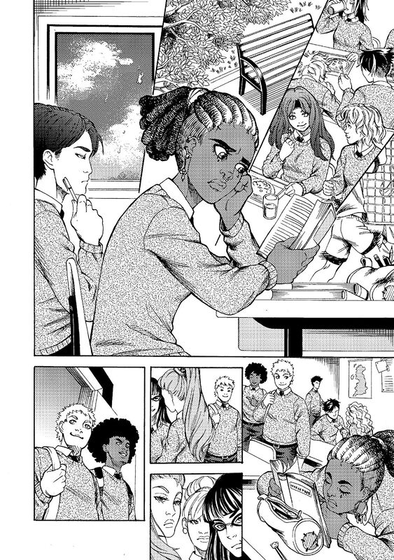
I am in love with Amelia's work on the interiors. The linework we see is phenomenal and how the varying weights are utilised to showcase this level and quality in the attention to detail is simply mindbogglingly great. From the different styles, sizes and places of the homes they look at, to the ways we see the clothing or backgrounds involved what we see is so well thought out and rendered. The backgrounds as seen within the composition in the panels bring us this depth perception, sense of scale as well as the overall size and scope of the story. The utilisation of the page layouts and how we see the angles and perspective in the panels show such a strong and masterful eye for storytelling. The colour work is exquisite! To see how the light sources are utilised and how the various hues and tones within all the colours to create the shading, highlights and shadow work is divinely rendered. I mean the mastery of colour and the understanding in how to utilise it is utterly remarkable.
There is a reason the stories are considered classics and unfortunately many aren't taught in schools any longer so to be able to see some like this one come to life and spark the readers' mind and imagination while fully engaging them will hopefully lead them to seek these and others out. History is rife with nearly forgotten works and this series spotlighting some of them is a reminder that some things should never be forgotten.
Man-Size in Marble by Edith Nesbit
Kymera Press 2018
Written by Nancy Holder
Illustrated by Amelia Woo
Coloured by Sandra Molina
Colour Seperation by Alejandro García
Lettered by Saida Temofonte
A young pair of newlyweds settling down into a small cottage in a quiet village are looking forward to a pleasant, pastoral life. The husband dismisses a superstitious maid’s tale of an ancient curse concerning the local church’s marble statues, statues who come to life each year on All Saint’s Eve to wreak revenge. But then, one fateful night…
I am a fan of this series. I am thankful to work with some wonderful PR people who send me series like these that I doubt I would have heard of otherwise. I am very thankful that this is one of the series that was brought to my attention too. Women who tell the stories that women of the past told before it was common or considered decent to tell them is empowering in any number of ways. For me this is just a stunning example of storytelling and it thrills me to no end that such a hauntingly beautiful story can be brought to life. There is also something inherently creepy about different era's in European history from the stories we have heard and yet combine the power of ones own imagination with folklore and legend and we tend to find ways to scare ourselves.
I love the way that this is being told. Sometimes an adaptation can alter the way the original story is meant to be read but with the original story in the back of the book you can see how much care Nancy takes in making sure she's telling as accurately as humanly possible. The story & plot development that we see through how the sequence of events unfolds and how the reader learns information is presented so beautifully. The opening and closing for the story as told by Mary and her creation are inadvertently creating this new late night double feature picture show hosts that scream to be seen time and time again. The character development we see is sensational and how we see them through the dialogue and how the act and react to the situations and circumstances really paints a picture of their personalities. The pacing is superb and as it takes us through pages it works with everything else to create this gorgeous ebb & flow to the book.
I am in love with Amelia's work on the interiors. The linework we see is phenomenal and how the varying weights are utilised to showcase this level and quality in the attention to detail is simply mindbogglingly great. From the different styles, sizes and places of the homes they look at, to the ways we see the clothing or backgrounds involved what we see is so well thought out and rendered. The backgrounds as seen within the composition in the panels bring us this depth perception, sense of scale as well as the overall size and scope of the story. The utilisation of the page layouts and how we see the angles and perspective in the panels show such a strong and masterful eye for storytelling. The colour work is exquisite! To see how the light sources are utilised and how the various hues and tones within all the colours to create the shading, highlights and shadow work is divinely rendered. I mean the mastery of colour and the understanding in how to utilise it is utterly remarkable.
There is a reason the stories are considered classics and unfortunately many aren't taught in schools any longer so to be able to see some like this one come to life and spark the readers' mind and imagination while fully engaging them will hopefully lead them to seek these and others out. History is rife with nearly forgotten works and this series spotlighting some of them is a reminder that some things should never be forgotten.


 RSS Feed
