READING WITH A FLIGHT RING
  • About
  • reviews
  • Contact
  • Cosplay of the Day 2
  • Company News
  • Entertainment Section
  • Convention News/Updates
  • original artwork
  • My Best Books of the Week
  • Cosplay of the day!
  • FCBD
  • Interviews
  • Webcomics

Today's reviews!

Reviews for 19-12-21 
​Reviews for 18-12-21 Reviews for 17-12-21 Reviews for 16-12-21
​Reviews for 15-12-21 Reviews for 14-12-21 Reviews for 13-12-21
​Reviews for 12-12-21 Reviews for 11-12-21 Reviews for 10-12-21
​Reviews for 09-12-21 Reviews for 08-12-21 Reviews for 07-12-21
​Reviews for 06-12-21 Reviews for 05-12-21 Reviews for 04-12-21
​Reviews for 03-12-11 Reviews for 02-12-21 Reviews for 01-12-21

Facebook Link

John Constantine Hellblazer #1

11/27/2019

0 Comments

 
Picture
John Constantine Hellblazer #1
DC Black Label 2019
Written by Simon Spurrier
Illustrated by Aaron Campbell
Coloured by Jordie Bellaire
Lettered by Aditya Bidikar


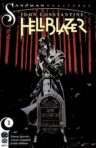
     John Constantine is back in London, back to his old tricks-and just in time, as things have become very dark indeed in his old stomping grounds. A small-time gang lord has found himself dealing with a big-time outbreak of supernatural weirdness...and without any allies to call on and nothing left to call his own, John doesn’t have much choice about taking a pay-cheque from one of London’s worst, or accepting the help of one of the gang lord’s would-be foot soldiers. But what should be an open-and-shut exorcism turns out to be nothing but...and the author of this madness may just be getting started on their terrible masterpiece!

     Alright so I like what Si is doing here with this as the original John Constantine is back and in a much younger body. John is in unfamiliar territory here he's out of time and has no mates and he's definitely not prepared for the way folks talk, act or the prices of a pack of fags either. I love this so damn much it's not funny. I mean there is this entire underlying humour going on throughout the book and it's amazingly well done to balance the awkwardness and the dark side of what he does. Si is the perfect guy to be writing this and if this first issue is setting the tone for the series, or his run, then hell yeah I am here for as long as it lasts.

     The way this is being told is pretty brilliant. The way we see the sequence of event unfold and how the reader learns information are extremely well done. I love how we see the introductions of the characters, some of whom will hopefully be regulars. The character development is on point as we see not only John in every stage here but Nat is a dream character come true and K-Mag well he's a giant enigma that will remain this way for a bit. The pacing is superb and with it we see how the twists and turns affect the ebb & flow of the book and how that captivates readers.

     I really taken by surprise at just how well this was written and how much slang even John didn't recognise. All of this transpired to really elevate the story to a whole new level for me. The way we traverse the pages here takes us on this wonderfully dark and bizarre journey through London that you'll never see in a guide book.

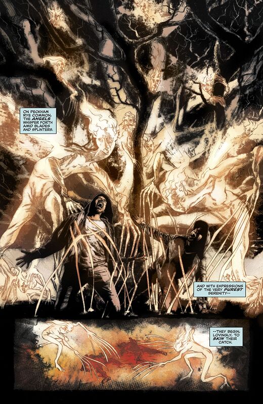
     I love Aaron's work and honestly I think he's outdone himself with this. He and Jordie, wow, ever single page is one wow moment after another. The scene at the tree, the first we see John and then inside K-Mags they take us on as much of a visual journey as the writing takes us on imagination fuelled journey. The linework here is exquisite and the varying weights utilised to bring abut this level of attention to detail is like looking at a master class of excellence. The to see Jordie lay down the colours on top of that so the buildings lit up in the distance or the way those angels shine is a gift from god. The utilisation of the page layouts and how we see the angles and perspective in the panels show such a masters eye for storytelling. When we see the backgrounds here and the composition inside the panels show depth perception, scale, bring a sense of size and scope to the book as they enhance the moments. The colour gradation and how we see the hues and tones being utilised is beyond what I have come to expect from Jordie.
​

     The craziness that is John's life really comes to life here. This is how you start off a new series as this is exciting, fresh and completely on point with who we all have known John Constantine to be.  ​

0 Comments

Killadelphia #1

11/27/2019

0 Comments

 
Picture
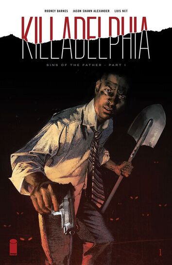
Killadelphia #1
Image Comics 2019
Written by Rodney Barnes
Illustrated by Jason Shawn Alexander
Coloured by Luis NCT
Lettered by Marshall Dillon


     “SINS OF THE FATHER,” Part One
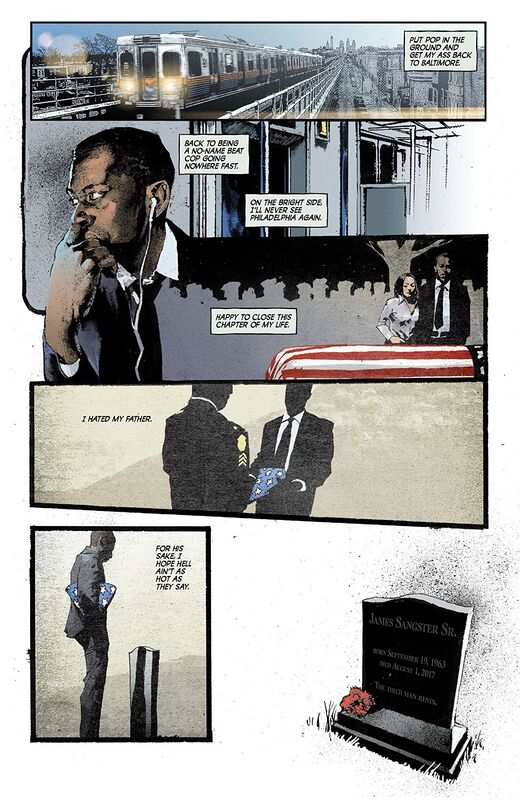
     When a small-town beat cop comes home to bury his murdered father—the revered Philadelphia detective James Sangster Sr.—he begins to unravel a mystery that leads him down a path of horrors that will shake his beliefs to their core. The city that was once the symbol of liberty and freedom has fallen prey to corruption, poverty, unemployment, brutality… and vampires. Welcome to KILLADELPHIA.
     Okay my first instinct was ooh okay this'll be good, in my mind I was thinking Philadelphia with Tom Hanks and Denzel Washington and yes this is a glimpse into the workings of my mind. So suitably intrigued by the title when I picked it up at the story and saw Jason's interiors I got even more excited, being a fanboy sometimes is fun. I had to read this three times before sitting down to this review. Because I had to everything I saw into my mind and process it so that I could adequately convey my feelings about this. So run, don't walk, corre, no camines, to your store and grab a copy before they are all gone because this is a sleeper hit, it'll blow up now that it's out and folks start talking about it, like I am here.

     So the way this is being told really is utterly sensational. The story & plot development and how we see the sequence of events unfolding, how the reader is given information and the overall way the book is structured is genius. The character development is amazing in how strong and steady it builds the characters. Seeing the son and what he thinks about his father and still the actions he takes it's such a great contradiction and it instils this need to know more. The pacing is so above par and how the twists and turns lead us into this cliffhanger ending leaves as exhausted like you ran a 10k marathon. The ebb & flow that we see is just mindbogglingly good.

     I mean ooh child what on earth possessed you to come up with this concept? Just the way that this is executed and how it makes the reader feel reading it, is such a powerful thing to have happen. The blending of this book with a cops working mind, a son who hates his old man and then the horror element that ties them all together this is madness, the kind that would gladly sit and have tea at the Hatter's table kind of madness.

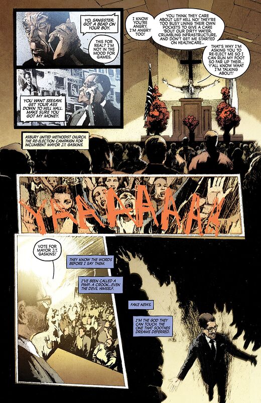
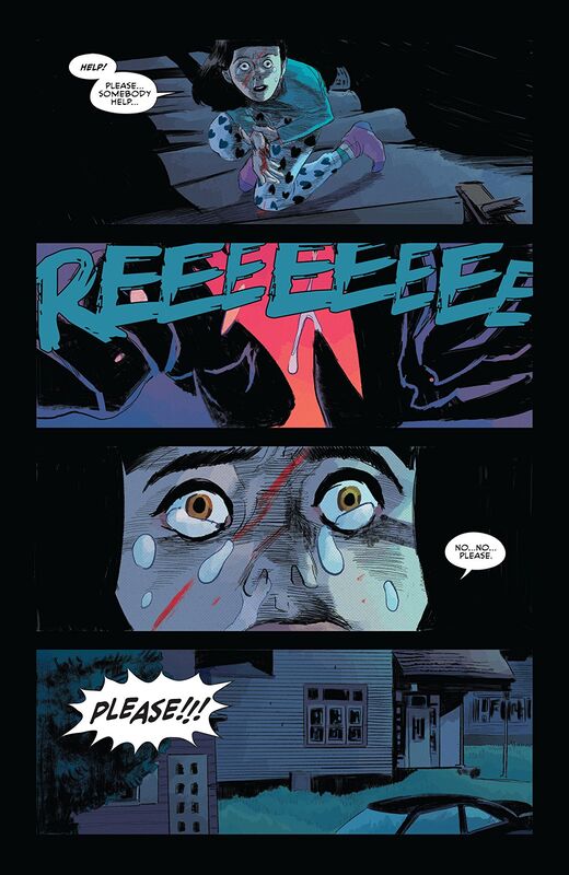
     I am a fan of Jason's work and this is pretty much shows you why. The linework we see here and the way he utilises the varying weights to bring this level of detail to life is just stupefying and sensational. The way we see the faces, facial expressions and body language here helps to further the characterisation, while at the same time brings so much emotion and feeling to life. The utilisation of the page layouts and how we see the angles and perspective in the panels show this superb eye for storytelling. When we see the backgrounds they have this mystifying effect on the reader and the first time you really go wow is when we see Harvest Green Homes for the first time. That view is scary good in how it's brought to life I mean dayum.

     The colour work is exquisitely gorgeous. I mean there are so many instances of shading or bleeding into white or even just seeing the cordon tape the moments pop like fireworks. Then there is how we see a main colour and it's various hues and tones within it to create this shading, highlights and shadow work that takes the breath away. The lettering here is absolutely phenomenal, from the cursive writing in the journal to the dialogue and narration boxes plus then there's the graffiti and such there are so many different examples of writing here and it leaves me extremely impressed.
​

     This book has so many different twists and turns to the story and how they are implemented and executed are so flawlessly done. I came into this not exactly sure what this was going to be about and came out of it with my jaw on the floor.

0 Comments

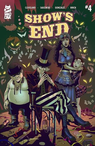
Show's End #4

11/26/2019

0 Comments

 
Picture
Show's End #4
Mad Cave Studios
Written by Anthony Cleveland
Illustrated by Jef Sadzinski
Coloured by Julian Gonzalez
Lettered by Justin Birch


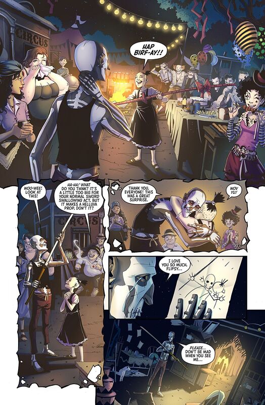
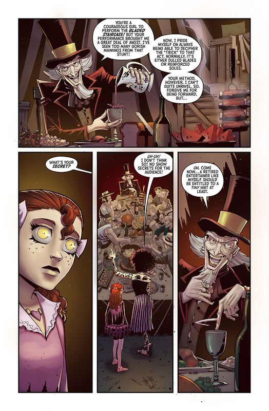
     After the devastating death of Flipsy and her subsequent burial at Show's End, Daxton Rickles' World Famous Circus of Oddities and Curiosities hits the road, and with the show running out of money, everything depends on Loralye and her "sharp" performance!

     First of all let me give a huge round of applause for the creation and execution of Corely. That man creeps the hell out of me and while he almost bought Loralye from her father it wasn't until this issue that his true and everlasting evil came into full fruition. It really couldn't have happened under any better circumstances either because this was extremely well done. This my friends and frenemies alike is a great example of what can happen when a company does a talent search.

     I love the way that this is being told, the writing is super strong and well executed here and there isn't a moment we do not understand what is going on. The story & plot development here is utterly marvellous to see as the sequence of events unfold for us as well as how the reader learns information. Super important as well that these things flow like they do. The character development is beyond my expectations. The way we see how they act and react to the situations that arise keeps their personalities growing and evolving in some terribly human ways. With the pacing here we see the twists and turns that take the story to places you would have never assumed it would go. All of this together really create a splendid ebb & flow to the book that just leaves you chuffed.

     There are so many different ways you can do a circus story, more so with the old school travelling shows. So the way this one is progressing is uniquely done and I have to say that I am more than impressed with the loyalty being shown. I also like that the crew is on the up and up and they aren't in the business of murder or deception so this angle isn't one we are used to seeing and applaud the direct that Anthony decided to take this one. If you all want to be thoroughly impressed you really need to be reading this and the other titles that Mad Cave have out.

     The interiors here are very interestingly rendered. I mean like the style that was chosen because it exaggerates their body proportions and brings out the circus freak angle to each individual person. It also helps make Corely as damn creepy as he needs to be and that's all really attributed to the linework and the attention to detail that Jef brings out. His eye for storytelling is phenomenal as we see the composition inside the panels as they show depth perception, scale, size and scope to the story as well as just an overall sense of the story itself. The backgrounds we see enhance the moments perfectly and contribute a lot more than just bringing that dimension to the story but to really bring out the creepy factor or every day life. The utilisation of the page layouts and how we see the angles and perspective in the panels are extremely nice to see. The colour work is so gorgeous. How we see the chose base colour and then the various hues and tones within it to create the shading, highlights and shadows is exceptionally well done. It really gives everything we see that extra punch.
​

     I hope that my reviews introduce you to books that you wouldn't normally know or think about and that you check these books out. This one is perfect for fans of AHS, it's great for those who want to experience something totally outside the box in it's thinking and execution. Mad Cave is a small but mighty publisher who really cares about the books they put out and it shows in the end product. You need to want to be a part of this troupe and once you start reading it you'll understand why.

0 Comments

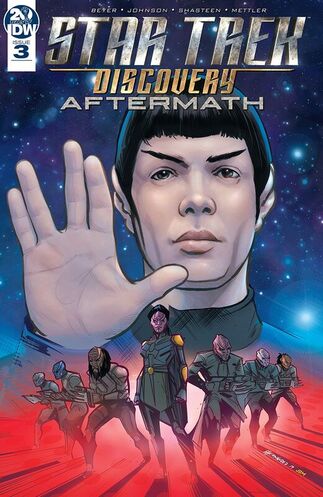
Star Trek Discovery: Aftermath #3

11/26/2019

0 Comments

 
Picture
Star Trek Discovery: Aftermath #3
IDW Publishing 2019
Written by Kirsten Beyer & Mike Johnson
Illustrated by Tony Shasteen
Coloured by J.D. Mettler
Lettered by Neil Uyetake


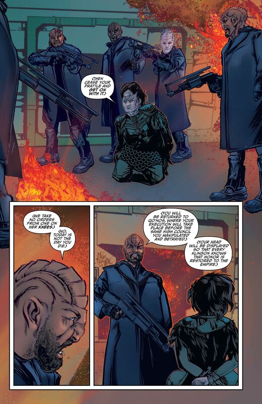
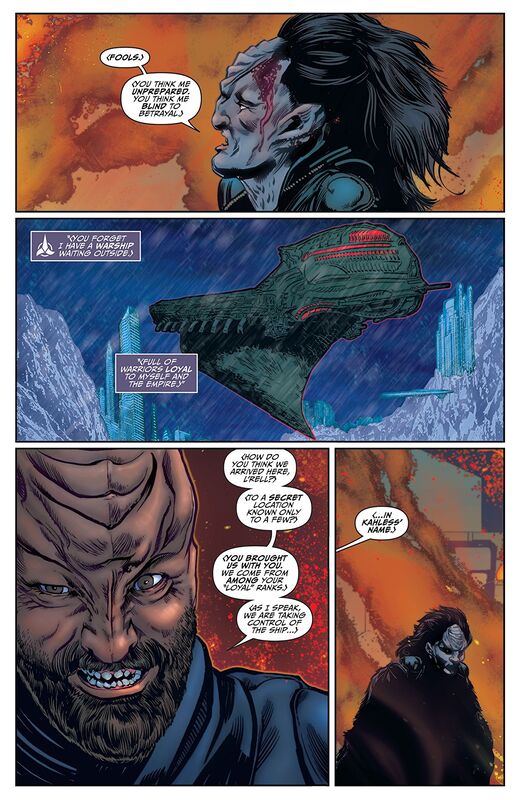
     You saw the stunning conclusion of the second season of Star Trek: Discovery—now prepare yourselves for the ending of the Aftermath! With the fragile peace between the Klingons and the Federation hanging by a thread, Spock, Captain Pike, and Chancellor L’Rell make a last stand against the forces threatening to ignite a new galactic war!

     I really like this story. I have been a fan of the new show and this is a perfect companion to that series. While this is a great stand alone story as well it does work so much better as a companion piece as the impact of the story we see and the actions taken is so much greater. Another thing about this that I really do like is that it covers ground that the original, nor anything after, covered and that's the bits of history that impacted the Star Trek Universe. Not just first contacts or when Pike saw his future but this first step in a peace between the Klingons and Federation. These are the moments that are the most important and we're finally getting to see them come to life.

     I really like the way that this is being told. The story & plot development easily read as if this were a television episode. With the sequence of events as well as how the reader learns information is extremely well done. The character development here is marvellous and it really feels like a progression of who they've been established as. The situations they find themselves in continue to help the change and grow in a natural way. The pacing here is excellent and the twists and turns we see along the way do wonders in helping to build tension and affect the story's ebb & flow. I like that these characters have this wonderful aspects of their personalities being brought out.

     I can honestly say that with this story I believe that L'Rell might be one of my absolute favourite characters right now. This is saying something since we've been introduced to quite a few remarkable characters and beings along the way. It is just the way that this is being written that impresses me with how the characterisation and the story itself is written and how the reader perceives it, this is just absofreakinglutely without a doubt one of the most amazing stories you'll see anywhere.

     I a huge fan of Tony and the work he does. He's a gifted illustrator and his linework is exquisite as he utilises the varying weights in the linework to bring some of the highest quality attention to detail you'll see. I mean look at the shot of L'Rell's ship and then how the city emerges from the ice, which in and of itself is beyond marvellously rendered. The composition within the panels and how backgrounds are utilised to show depth perception, scale and bring this sense of size and scope to the story. The utilisation of the page layouts and how we see the angles and perspective in the panels show a masters eye for storytelling. The colour is outrageous. From those mountains of ice and cities jutting skyward, the falling snow and all the rest the colour work is so beautifully done with the various hues and tones within the colours.
​

     If this is the kind of storytelling we're going to be getting out of this creative team let the stories keep coming. Personally I want to see more tales like this because I just can't enough, We slip and slide as we fall in love And I just can't seem to get enough of, We walk together, We're walking down the street, And I just can't get enough.​


0 Comments

Something is Killing the Children #3

11/26/2019

0 Comments

 
Picture
Something is Killing the Children #3
Boom! Studios 2019
Written by James Tynion IV
Illustrated by Werther Dell'Edra
Coloured by Miquel Muerto
Lettered by AndWorld Design


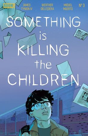
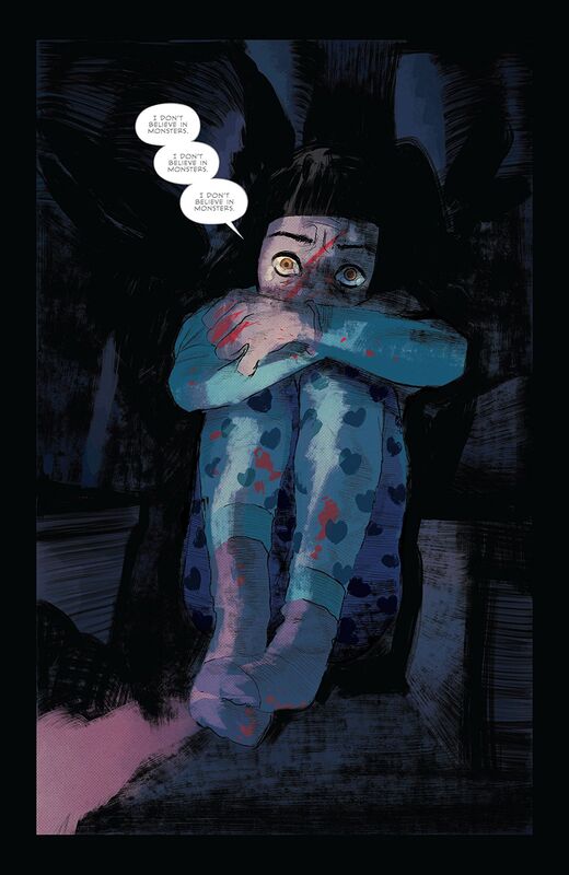
     Things in Archer’s Peak are only growing worse. Erica Slaughter is on the hunt, but the children are still dying. Angry and afraid, the inhabitants turn their suspicions on the stranger in their midst, the woman who arrived just as the killings began. Will Erica be able to save the town, or will the very people she is trying to protect turn on her?

     This is what I love about James writing, he never lets you think you know what is going on here. Erica's role in this is to stop the killings that much we know but the whole time she's at the jail with the Sheriff the way we see the dialogue is extraordinarily well done. I mean there's a whole lot said while nothing is really said at all and it's this that draws me to his writing. The exchanges they have and the way everything between is laid out if utterly brilliant to see on paper it's just that matter of fact simple.

     The story & plot development that we see through the sequence of events unfolding and how the reader is given information is exceptionally well done. The entire time we are reading this everything that we see feels as if it's right, normal or natural in how they occur and this is beautiful to see. The character development is phenomenal to see. How the situations that the characters find themselves in and how they react to that helps to define them and keep their evolution moving ever forward. With the pacing here, which is sublime, we see how the twists and turns give the book this unique ebb & flow. There is a way to tell this near slice of life way of storytelling that feels like a day in the life as the story needs room to grow and James does that beautifully here.

     The opening here is fantastic! It has everything it would need to grab the readers' attention, draw them in and leave them wanting to know more. Then of course there is what will become infamously known around the business as the interrogation scene that is one of if not THE best scenes in comicdom. Now if you think I say this lightly or that my opinion is skewed or somehow misplaced on that, you clearly haven't read it because once you do you'll understand, so say we all.

     Werther's work on the interiors is just perfectly done. His linework is nicely laid down and we do see this nice utilisation of the varying weights to bring some attention to detail. This issue it's really his utilisation of the page layouts and how we see the angles and perspective in them that really blows me away. These two-page spreads and how the panels are done with the conversational stuff just show is the beautiful eye for storytelling. Just the way he manages to utilise the story to flow through him and onto the pages like it spoke to him and said this is how it needs to be seen, granted it might not be that but in my minds eye it is. I am a fan of the colour work we see here as well. The scenes in different settings have different moods and tones to them thanks to the lighting or overall essence of what it's about and the colours mimic and set those perfectly.
​

     Overall there is just something that mesmerises the reader so acutely that it's eerie. James is a stupendous writer and he's got this talent that seems to ooze into every project he works on and it's always a damn good time.   ​

0 Comments

Headless #3

11/26/2019

0 Comments

 
Picture
Headless #3
Scout Comics 2019
Created & Written by Alexander Banchitta
Created & Illustrated by Robert Ahmad
Lettered by Fred C. Stresing


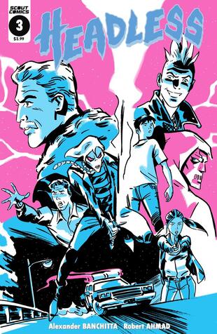
     Chris is saved from the Headless Horseman and Claw by his brother, Rick and Sarah, a Knight Templar gone rogue before they race off with an injured Chris to confront the Knights Templar and attempt to save the citizens of Salem before it's too late. They fail to recognise, though, the intense influence the headless horseman holds over Chris, and how dire the situation has become.

     I am a fan of this story. I like the idea of the Headless Horseman being some kind of Demon conjured up and exacting it's wrath or some kind of revenge upon the town of Salem. While it feels similar to Sleepy Hollow this version is much more complex. After all the Sheriff and most of the town have been made into Knights Templar of the most twisted sense. How we see this coming to life before our eyes and showing the basic folly of man is interesting and the whole power struggle of one man wanting so desperately to be the leader that his hubris could be their downfall is perfectly rendered.

     The story & plot development that we see is somewhat straight forward. The sequence of events we see unfold and how the reader learns information however show a complexity to the storytelling that is a sheer delight. The character development is super strong and the more we see of the characters the better start to know and understand them and what drives them. Like any good story the situations they find themselves in help them to grow and evolve as people. Plus a new character has been introduced here and his shall we say timely arrival is a great way to bring a cliffhanger ending to the issue. With the pacing, which is good by the by, we see the twists and turns come throughout help to create this marvellous ebb & flow to the book.

     Have you ever picked up a book and thought hmm I am not sure this is for me, but, the story content is something you rather enjoy reading about so you give it a shot? Now that we're in the third issue I have had the opportunity to really get to see Robert's work and while I would never have picked this up on his work alone, I have found myself somewhat enchanted by it. Going in with an open mind to read a book and then have the art or story grow on you till you find it's something you rather enjoy is why we take risks. Never judge a book by it's cover isn't that what they say and it's true so don't be so quick to dismiss something and instead give a proper go and you might find you have found some new creators to follow.

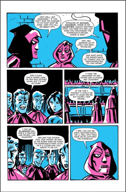
     Speaking of the interiors I have to say what separates this from say an all-ages book is the way that we see the colouring. The linework is nice, strong and laid down in some nice ways even if we don't see a lot variance in the weights. It's the colour choices and how they are utilised here that makes this what it is. They manage to create this creepy kind of eerie vibe that is perfect for the story content. The utilisation of the page layouts and how we see the angles and perspective in the panels show a good eye for storytelling. I personally would like to see more backgrounds being utilised because when we do see them the enhance the moments beautifully and bring a nice sense of size and scope to the book.
​

     This is wholeheartedly a truly entertaining story and it's got some layers to what we see and the characters in question are absolutely wonderfully fleshed out people. There is some mystery, drama, horror and maybe just maybe a hint of romance here that makes this a find addition to your reading list.

0 Comments

Bloodshot #3

11/25/2019

0 Comments

 
Picture
Bloodshot #3
Valiant Entertainment 2019
Written by Tim Seeley
Pencilled by Brett Booth
Inked by Adelso Corona
Coloured by Andrew Dalhouse
Lettered by Dave Sharpe


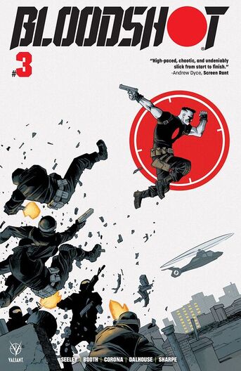
     Break out the popcorn before Bloodshot hits the big screen and witness the super-soldier unleashed! The origin issue of Eidolon, Bloodshot’s greatest nemesis in the making!

     Well this certainly isn't taking any kind of direction that I was expecting it to and that of course is a huge knock in it's favour! This is why I love Tim and what is able to do as he is such a master storyteller and the genre really doesn't matter much so long as he's enjoying what he does the work is going to be spectacular. Now the idea of all these government organisations all vying for control and taking what could be considered threats or obstacles to them is a good one for Bloodshot to be a part of. Normally I am down on the government conspiracy stuff but for this character is a completely appropriate angle or avenue to follow.

     I am a huge fan of the way that this is being told. The story & plot development and how we see the sequence of events unfold and how the reader learns information is extremely well done. After all the layering of this story already and it continues to grow in that sense makes for some genuinely interesting reading. The character development is on point here as we see Bloodshot, Ray, find new ways to deal with what he has been through and then apply that to his current situation is bloody brilliant to see. The pacing here is great and how the twists and turns that we see affect the ebb & flow to the books is so nice to see.

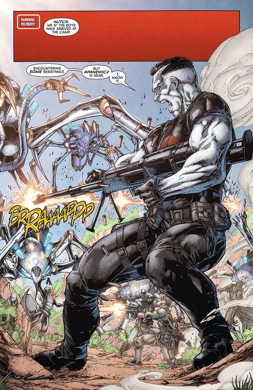
     From a flashback that's integral to the story which ties Ray and Eidolon together more closely than he could've imagined to the way we see this General Gayle trying to remain in control keeps the reader on their toes. I will say this much right here and right now, I want to see more of not only the creatures from the DNA Whisperer and Apanewicz because we don't see that he found him though he kept thinking the young woman was him so this needs more clarification please and than you. I love how we are introduced to characters new and returning, well returning from the first two issues anyway, in the book and how by playing their parts they become more integral to the story as it moves forward, now and later.

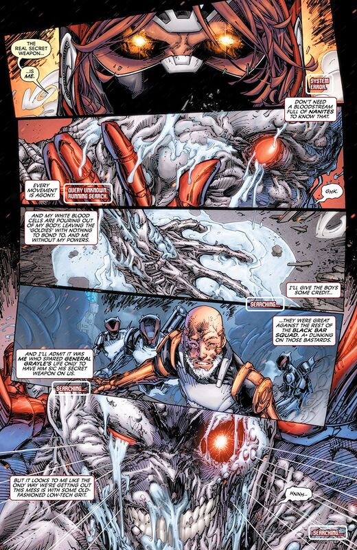
     I like Brett's pencils and how he loves to lay down his linework the way he does. He certainly doesn't shy away from the multiple variations in the linework to create this attention to detail that we see, and we see a lot of it. He has a very distinct style that hasn't varied much since he debuted in comics but I have noticed that his range in what he does has increased. The melting version of Ray is crazy good and it really makes one hell of an impact upon the reader. The utilisation of the page layouts and how we see the angles and perspective in the panels show a rather nice eye for storytelling. We see more than a fair amount of backgrounds being utilised here and it's marvellous as it helps to expand the moments and bring a sense of size and scope to the book. There is also some nice depth perception happening within these pages as well.

     Totally impressed with the inking done on top of that as well since I am sure it can't be easy to ink his work. Adelso is talented and what we see from him is outstanding. The colour work is brilliant to see. I love how we see a base colour and then the various hues and tones within it to show us the shading, highlights and shadows. The mask we see is hella awesome, the way whites are utilised along the blues and silvers all conspire to show off this bang on job with the colours shows some great knowledge of how the colours work.

     I am usually pretty stoked to see Bloodshot in any book that is his but Tim's approach, while yes a tie-in I suppose to the forthcoming feature film, is taking him in a bold new direction and that we've not seen anything quite like this before that has me through the roof with excitement.

0 Comments

You Are Obsolete #3

11/25/2019

0 Comments

 
Picture
​You Are Obsolete #3
Aftershock Comics 2019
Created & Written by Mathew Klickstein
Illustrated by Evgeniy Bornyakov
Coloured by Lauren Affe
Lettered by Simon Bowland


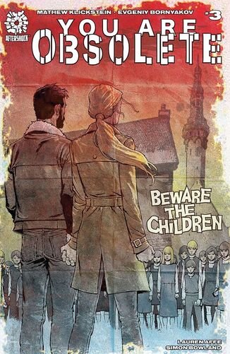
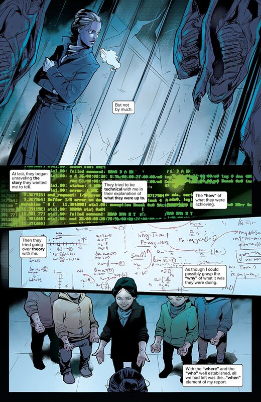
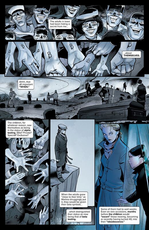
     Investigative reporter Lyla Wilton discovers the awful truth as to why the children on the island she’s been assigned to write about have brought her there. Will she help them with their devious plot...and does she even have a choice?

     With each new issue that comes out Mathew delves further and further into the mouth of madness. One of the things that I really appreciate in this story is the fact that it takes that concept of kids being evil and brings it into this extremely modern setting. While we have no real idea how the kids got this way to begin with and how they have managed to take over the island and shut the adults down it doesn't matter all that much because what's done is done. No what is scary as hell is that these kids are so damn smart that they've been able to come up with a way to use modern technology and use that to their advantage. They are manipulating everyone at every step along the way in ways that the scariest thing of all.

     The way that this is being told is beautifully done. The story & plot development in how we see the sequence of events unfold and how the reader is given information is expertly done. This is also non-traditional in the way we see things and I love that because we really do have to read the book and the story to follow along. There is no coasting or flipping through this you have to pay attention. The character development is fantastic and to see Lyla unable to maintain her cool or how we see Kad living his life his way on the island and the kids well at least Martina, have this really amazing attention given. The way we see the pacing bringing us these twists, turns and possibly a few revelations affects the ebb & flow in some unique ways.

     There really is this weird thing happening here and Lyla she is like two different people throughout the entire book. Again this is her characterisation and it is important to see her going through what she does to try and understand this behaviour. She thought this was something of a fluff piece coming in and now she up to her tits in gin as it were. She has no real control over herself let alone anything else and there's a reference in this that sums up the reasoning she was chosen and it blew me away.

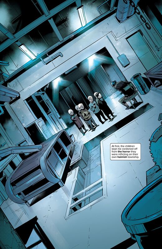
     I've already said I am in love with Evginy and I still am because the boy can draw. His linework is so exquisite and the way he's able to utilise the varying weights to bring out the attention to detail is magnificent. His faces and facial expressions, the body language that we see, and just the overall aesthetic, or how good looking a character is, adds to the way we see, view and helps the characterisation in ways words alone cannot do. The utilisation of the page layouts and how we see the angles and perspective in the panels show an amazing eye for storytelling. The composition we see inside the panels with how the backgrounds are utilised in showing depth perception, scale, size and scope it brings to the story is really impressive to me. The colour work is beautiful. The shading we see and how the various hues and tones are utilised in bringing them out is gorgeous. That bandage on Martina's head and the colour of it, whether it's legit or for show (the placement is off) that reds and browns are sensationally utilised.
​

     I am always riveted to the page when reading this book. I have to turn off anything that might cause a distraction because I don't miss a thing. The way the story is being told, the way we see events happen and the cliffhanger ending that we see just make me shiver. This is why I love Aftershock Comics, this is why creators who need a place to tell their stories come to them. Also thank goodness for showcasing the artists out of North America and from other parts of the world. This puts the FUN back in reading is fundamental and damn if there were around when I was a kid school would've been a whole lot more interesting.

0 Comments

Josie and the Pussycats in Space #2

11/25/2019

0 Comments

 
Picture
Josie and the Pussycats in Space #2
Archie Comics/ComiXology Originals
Written by Alex de Campi
Illustrated by Devaki Neogi
Coloured by Lee Loughridge
Lettered by Jack Morelli


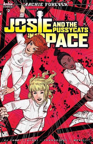
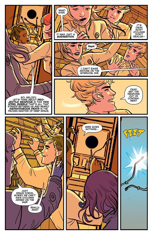
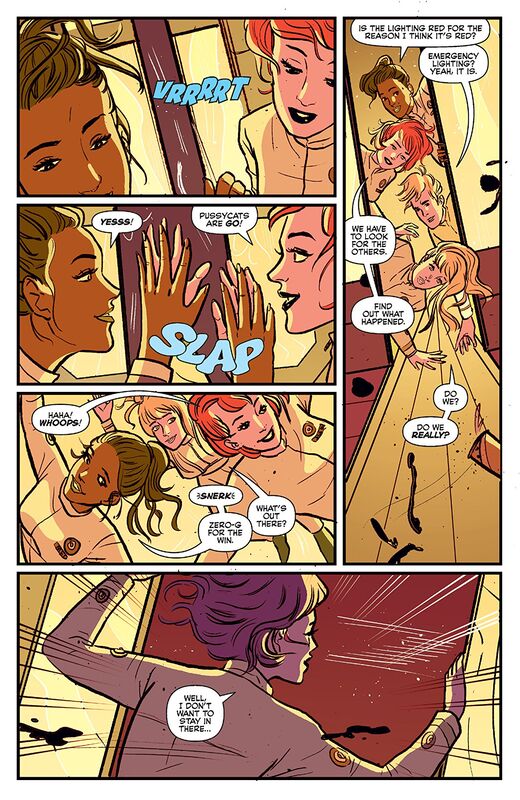
     Josie, Valerie and Melody awaken from their cryo-sleep to learn that they're way off course! Meanwhile, a strange, hostile alien substance has gotten loose and has taken over the ship!

     Oh I am really enjoying this story. Thankfully it really isn't like the cartoon was and that it has more of this whole Alien vibe going on instead. I don't know why we never did get a dark take on the girls but this is a whole lot better. While I do miss their crime solving ways this is a different set of problems that need solving so in a way we still get to see them kind of outsmart their foe by well being Pussycats. Also with Alan being Captain Hot Stuff and the introduction of a few more characters this issue I can definitely say with the utmost confidence that this truly is a nod, or homage, to my first experience with the pussycats.

     The way that Alex is telling this is so phenomenally well done. I kind of like that Melody has this thing about being touched as it adds another dimension to her that she's been lacking before now. The idea that they are in space flying from one gig to the next in a cryo-sleep apparatus when something goes horribly wrong is a great scenario. There really are so many different ways this could play out and the one we are seeing here is among the routes I could possibly think of. The story & plot development we see through the sequences of events that unfold and how the reader learns information is extremely well done. The character development is simply stunning and the more we see the characters and the more we see how they act and react to situations show us new sides of their personalities. With the pacing here, which is super strong, we see the twists and turns and how they affect the ebb & flow of the book. Every aspect of the story that we see unfolding here is utterly sensational and it just grabs the reader, draws them in and engages them in some of the most unusual of ways. Trust me unusual is the right choice of word and if you need proof get over to Comixology and see.

     The more I see Devaki's work the more impressed with it I become. The linework is nice and interesting and she has a style all her own. The way that the linework is utilised to bring out the attention to detail is nicely done. I am enamoured with the faces and facial expressions that we see throughout the book and alongside the body language we see really furthers the characterisation in ways words alone cannot do. Also the way that we see three different looks within this one issue is handled with aplomb! That horror, the red lights and the outer space rescue operation all have their own unique qualities we don't see in the others. The utilisation of the page layouts and how we see the angles and perspective in the panels show a good, strong, solid eye for storytelling. The colour work is wonderful and is a great representation of classic Archie comics. The choice of colours is absolutely fantastic an then to see the different hues and tones to create the shading and shadow work is really well done.
​

     I am excited by this and for what's still to come. Now if only Sebastian would find a way to make an appearance I'd be super happy. Still this is one of the more original and unusual takes on the characters that I have ever seen and I want Alex to write more of these types of stories featuring the girls. This is supercalifragilisticexpialidocious! ​

0 Comments

Warrior Nun: Dora #2

11/25/2019

0 Comments

 
Picture
Warrior Nun: Dora #2
Avatar Press 2019
Written by Pat Shand
Illustrated by Daniel Gete (main) & Esad Ribic (backup)
Coloured by Juan Rodriguez
Lettered by Kurt Hathaway


     About: Warrior Nun
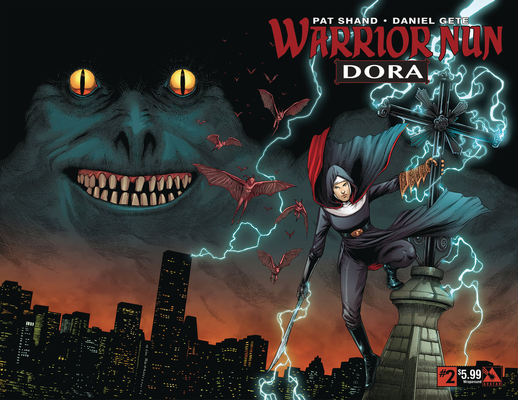
     Now a Netflix original series, re-launches this summer for readers of all kinds with a new Nun and new attitude! Dora has stumbled across an ancient order, and a new threat thrusts her into a role she never imagined - defender of humanity!

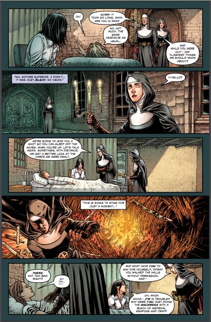
     I missed my opportunity to review the first issue as I didn't get my hands on a copy till much later than it came out. After I read it, I loved it and knew I had to get a review out there for this story. I have been a fan of the work at Avatar Press for a long time but in recent years I have kind of strayed and really only reading one title. It's harder for me to get them in for some reason at my local shop and having to order them online isn't always convenient for me but this one, this one is worth finding no matter what it takes. What an amazing story this is and to see Dora as a modern teenage girl who has absolutely no desire whatsoever to be there is portrayed beautifully by Pat. There is this great sense of authenticity to his characterisation and it's one of the main reasons I enjoy reading his work.

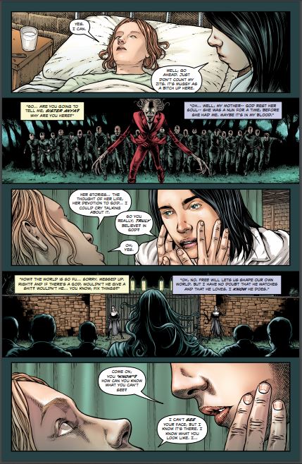
     I am thoroughly enjoying the way that this is being told. The story & plot development that we see through the sequence of events unfolding before us as well as the release of information to the reader. Hey we're dealing with Nun's here and they are strict about loose lips in a lot of ways. The character development that we see here is superb. The entire time Dora and Anya are talking and getting to know one another you can feel the bond which they are forming with one another. The pacing which is pretty amazing takes us through the story seeing the twists and turns that create this strong, interesting ebb & flow to the book. The dual storytelling that we see happening simultaneously is really well done. This is an impressive book, story, with how it's being told.

     While I know this is a prequel to the Netflix program I would very much like to see more from this creative team on any Warrior Nun book, though more Dora is always preferable. There is something special we see here when the creators just click with each other and bring us such a superb level of storytelling.

     By all that heaven allows is the interior artwork here that good. The linework we see is exquisite and how the varying weights are utilised to bring about this level of attention to detail is beyond stunning. From the softness of teenage faces to the wizened look of the nuns and the horrific visage of the demons everything is so distinct and interesting to see. The composition inside the panels is perfectly done as we see the backgrounds being utilised to their fullest in demonstrating depth perception, scale, as it enhances the moments and brings us a sense of size and scope to the book. The rocks utilised to create the walls are so authentic looking and it screams old like a secret society of warrior nuns should be housed in. Then there are the windows and god almighty that just mesmerises the reader. With the colour work here we see everything at new heights. The way that we see the base colour and then the various hues and tones within it creating shading and shadows, or highlights is magnificent. The page and the panels are utilised to their fullest here and the eye for storytelling that we see is a masters at work.
​

     So there are some things that made me giggle and the entire time the nuns were say “I Rebuke You” and “Be Gone” were a tad over the top. I mean fallen angels who become demons are beings I don't see being banished that way, it sounds more like it comes from popular culture. But hey what does a nice Jewish boy like me know about that stuff? What I do know is that this is first class, top notch, head of the class storytelling that needs to be go on after this arc.
0 Comments
<<Previous
Forward>>

    Archives

    December 2021
    November 2021
    October 2021
    September 2021
    August 2021
    July 2021
    June 2021
    May 2021
    April 2021
    March 2021
    February 2021
    January 2021
    December 2020
    November 2020
    October 2020
    September 2020
    August 2020
    July 2020
    June 2020
    May 2020
    April 2020
    March 2020
    February 2020
    January 2020
    December 2019
    November 2019
    October 2019
    September 2019
    August 2019
    July 2019
    June 2019
    May 2019
    April 2019
    March 2019
    February 2019
    January 2019
    December 2018
    November 2018
    October 2018
    September 2018
    August 2018
    July 2018
    June 2018
    May 2018
    April 2018
    March 2018
    February 2018
    January 2018
    December 2017
    November 2017
    October 2017
    September 2017
    August 2017
    July 2017
    June 2017
    May 2017
    April 2017
    March 2017
    February 2017
    January 2017
    December 2016
    November 2016
    October 2016
    September 2016
    August 2016
    July 2016
    June 2016
    May 2016
    April 2016
    March 2016
    February 2016
    January 2016
    December 2015
    November 2015
    October 2015
    September 2015
    August 2015
    July 2015
    June 2015
    May 2015
    April 2015

    RSS Feed

    Categories

    All

    RSS Feed

Powered by Create your own unique website with customizable templates.