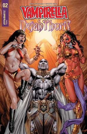
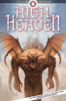
Vampirella Dejah Thoris #02
Dynamite Entertainment 2018
Written by Erik Burnham
Illustrated by Ediano Silva
Coloured by Dinei Ribeiro
Lettered by Troy Peteri of A Larger World Studios
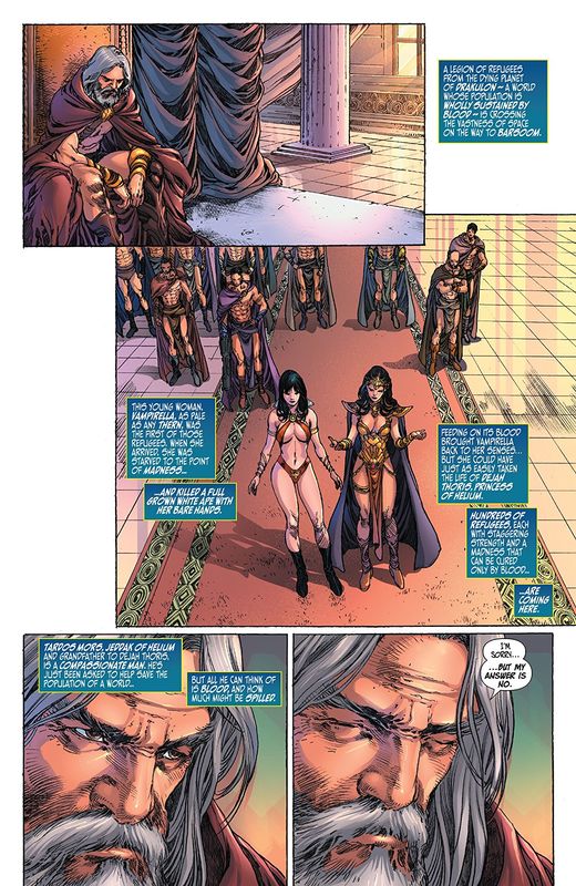
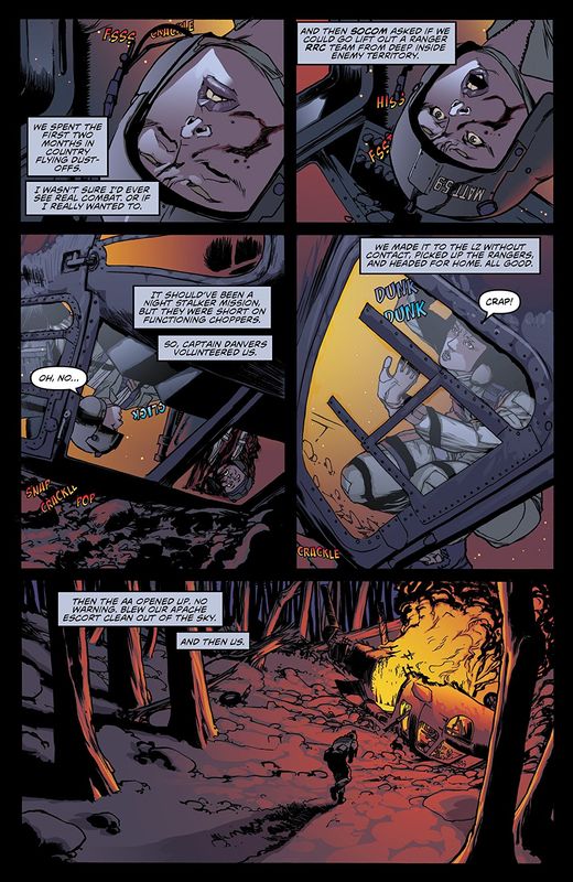
For centuries, the various tribes of Mars have stood on the doorstep or armed conflict and even global war. Only the spectre of a war without a victor has kept things in check. For centuries, the vampiric people of Drakulon have existed in peace, but now a global catastrophe has taken a massive toll. Spurned by desperation, one woman will attempt a near-impossible feat to save her people, taking her on a collision course with a princess equally devoted to her populace….
Oh good lord have mercy on me because this story that Erik keeps unfolding before us is something extraordinary. These two women who break the mould of the way we traditionally see strong female characters who are meeting here for the first time is sensationally well done. As different as night and day yet fundamentally the same in their desire to be the best they can be and beset by those who think they should have a different place in their worlds well yeah that’s something all too common in the battle of the sexes. Yes Vampirella says her people are all equal but she’s rarely among them so she’s judged by the standards of those whom she is.
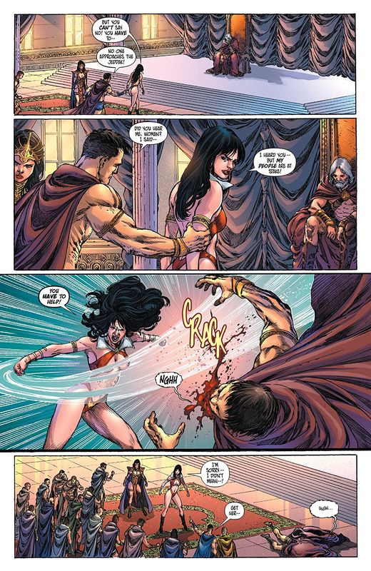
So after last issue we open this one with Vampirella and Dejah Thoris recounting everything for the Jeddak. Here we see the weight of the decision of what is about to happen on his face. Seriously on his face and through his furrowed brow. This is when the story this issue actually hits the fan and not in the ways I was really expecting. I really like Gur Tus but man is he not comfortable with his sexuality if he feels this emasculated. Not going to lie either Erik needs to write a story with him in the lead and explore who he is while keeping his (Erik’s) surprises coming at us. The characterisation here is above and beyond what we’ve come to expect and this is the standard here so sorry so-called “Big 2” but not sorry.
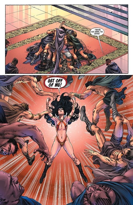
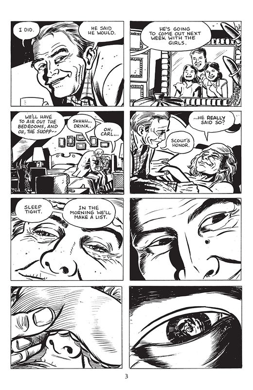
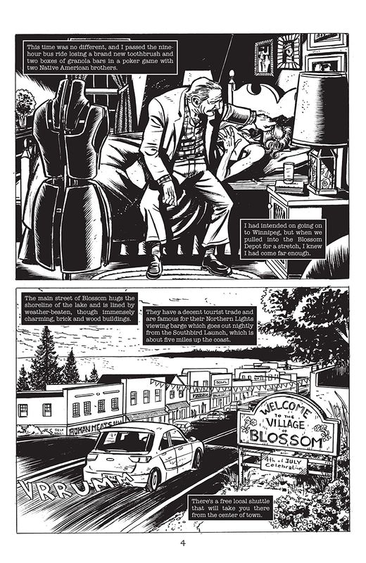
The interiors here are utterly marvellous to behold. The manipulation of the varying weights of the linework to create such subtlety is so damn good. The hair, the stubble or facial hair, the powerful yet sexy way the girls look all of is done through such a talented eye and hand that it reminds you what an artist is truly capable of. I wish that Dejah and her people were red instead a more healthy flesh tone because I think that’s a huge part of how she’s been described and our expectations. The way that we see backgrounds here being utilised is delightful and the creativity and imagination we see here is fantastic. The utilisation of the page layouts and how we see the angles and perspective in the panels shows a really solid eye for storytelling. The colouring we see is actually really nice and the whole gradation so highlights and lowlights are seen the way they are are quite impressive.
From where we started to where we end up are two totally different places and you have to see it to understand that fully. I think the structure of this book, it’s pacing and how we get this amazing flow to the story is so well done. I like how we see the obstacles they have to face are placed before them, they don’t feel forced but a natural progression to the story at hand. It will take these two women to work side by side using might and mind to not only save Vampirella’s people but to make it out of this alive.
Dynamite Entertainment 2018
Written by Erik Burnham
Illustrated by Ediano Silva
Coloured by Dinei Ribeiro
Lettered by Troy Peteri of A Larger World Studios
For centuries, the various tribes of Mars have stood on the doorstep or armed conflict and even global war. Only the spectre of a war without a victor has kept things in check. For centuries, the vampiric people of Drakulon have existed in peace, but now a global catastrophe has taken a massive toll. Spurned by desperation, one woman will attempt a near-impossible feat to save her people, taking her on a collision course with a princess equally devoted to her populace….
Oh good lord have mercy on me because this story that Erik keeps unfolding before us is something extraordinary. These two women who break the mould of the way we traditionally see strong female characters who are meeting here for the first time is sensationally well done. As different as night and day yet fundamentally the same in their desire to be the best they can be and beset by those who think they should have a different place in their worlds well yeah that’s something all too common in the battle of the sexes. Yes Vampirella says her people are all equal but she’s rarely among them so she’s judged by the standards of those whom she is.
So after last issue we open this one with Vampirella and Dejah Thoris recounting everything for the Jeddak. Here we see the weight of the decision of what is about to happen on his face. Seriously on his face and through his furrowed brow. This is when the story this issue actually hits the fan and not in the ways I was really expecting. I really like Gur Tus but man is he not comfortable with his sexuality if he feels this emasculated. Not going to lie either Erik needs to write a story with him in the lead and explore who he is while keeping his (Erik’s) surprises coming at us. The characterisation here is above and beyond what we’ve come to expect and this is the standard here so sorry so-called “Big 2” but not sorry.
The interiors here are utterly marvellous to behold. The manipulation of the varying weights of the linework to create such subtlety is so damn good. The hair, the stubble or facial hair, the powerful yet sexy way the girls look all of is done through such a talented eye and hand that it reminds you what an artist is truly capable of. I wish that Dejah and her people were red instead a more healthy flesh tone because I think that’s a huge part of how she’s been described and our expectations. The way that we see backgrounds here being utilised is delightful and the creativity and imagination we see here is fantastic. The utilisation of the page layouts and how we see the angles and perspective in the panels shows a really solid eye for storytelling. The colouring we see is actually really nice and the whole gradation so highlights and lowlights are seen the way they are are quite impressive.
From where we started to where we end up are two totally different places and you have to see it to understand that fully. I think the structure of this book, it’s pacing and how we get this amazing flow to the story is so well done. I like how we see the obstacles they have to face are placed before them, they don’t feel forced but a natural progression to the story at hand. It will take these two women to work side by side using might and mind to not only save Vampirella’s people but to make it out of this alive.


 RSS Feed
