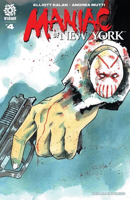
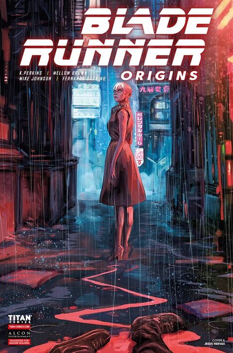
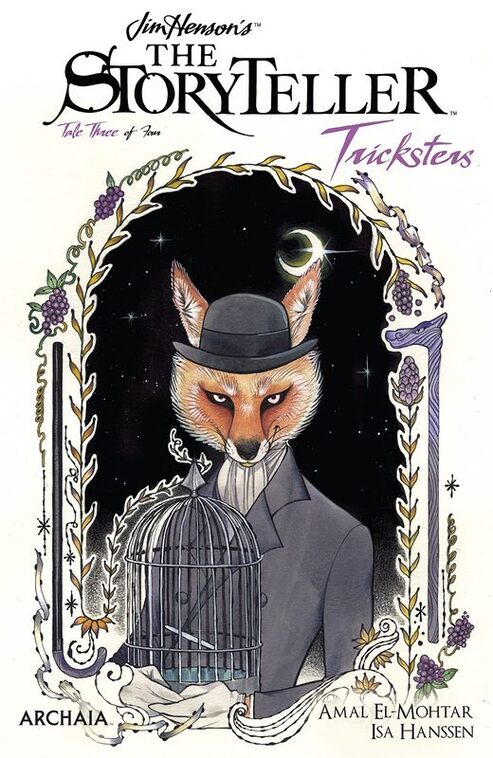
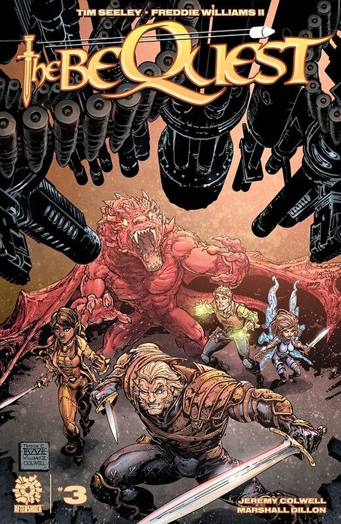
Radiant Black #4
Image Comics 2021
Written by Kyle Higgins
Illustrated by Marcelo Costa
Coloured by Rod Fernandes
Lettered by Becca Carey
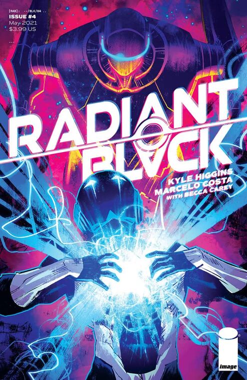
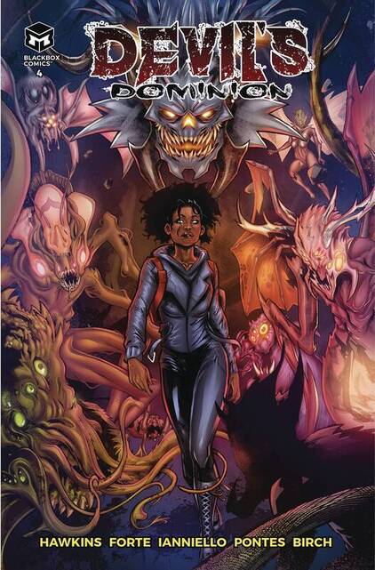
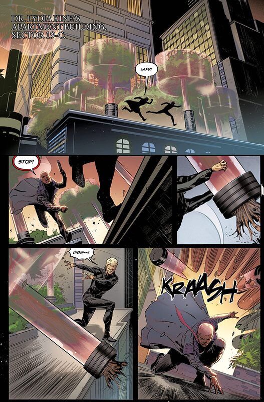
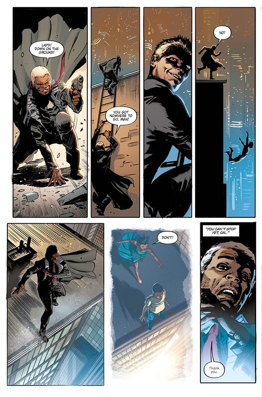
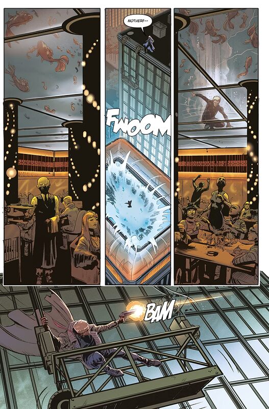
It was always going to come to this: Radiant Black vs Radiant Red in a knock-down drag-out fight across the city of Lockport! And believe us when we say that after this fight, nothing will ever be the same again. For Lockport or for Radiant Black. We actually mean it.
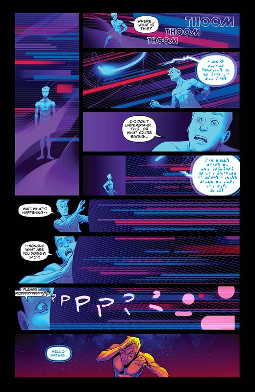
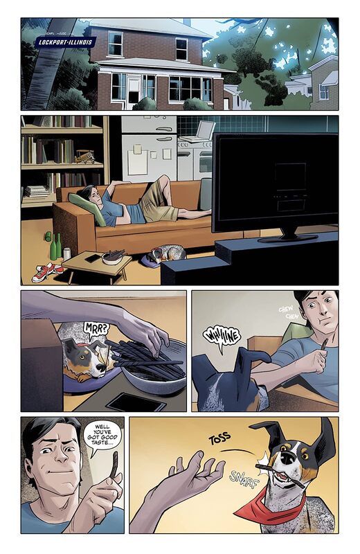
Not going to lie I’m a little disappointed that the opening page had to conspicuously cover up his junk. I mean haven’t we reached a point where that isn’t necessary anymore? Besides it is such an obvious cover up it looks weird as if it were added to ensure it was covered up. Alright mini rant over. One of the things that I really like about this is the fact that Kyle approaches this so that Nathan has no idea how to fully work his suit. He needs to go out and practise if he’s going to get any good with it aside from pure instinct and what Marshall has told him. So that this issue the pair are out there working together is a great thing to see. Also the Grey Raven is a great nod as well.
I am very much enjoying the way that this is being told. The story & plot development we see through how the sequence of events unfold as well as how the reader learns information is presented exceptionally well. The character development is phenomenal and as we see the dialogue, the character interaction and how they act and react to the situations and circumstances that they encounter continue to flesh them out beautifully. The pacing is superb and as it takes us through the pages revealing the twists & turns along with more and more of the story it’s easy to be drawn deeper and deeper in to what is occurring.
I am very much enjoying the way that we see this being structured and how the layers within the story continue to grow, evolve and strengthen while new ones emerge. It is these layers that makes the story more complex and interesting. They weave around the main arc and generate the excitement and intrigue factors beautifully. How we see everything working together to create the story’s ebb & flow as well as how it moves the story forward is achieved exceedingly well.
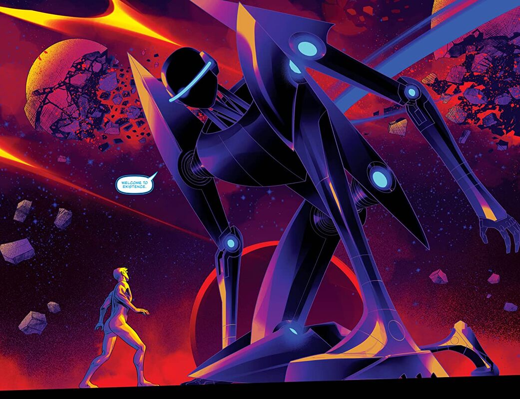
I really love the linework that we see here. It’s got such a great feel to it and how the varying weights and techniques are being utilised to create this gorgeous attention to detail. I just wish we’d see backgrounds utilised a lot more, they really do enhance the moments and if they were paid as much attention to as the people this would be visually astonishing. The depth perception, sense of scale and the overall sense of size and scope of the book is showcased. The utilisation of the page layouts and how we see the angles and perspective in the panels shows a strong, talented eye for storytelling. The colour work is sensational. How the various hues and tones within the colours being utilised to create the shading, highlights and shadow work shows a very talented eye for how colour works.
I love what we see and learn this issue and how that changes things as they will move forward. Nathan’s life is taking a much different turn than he’d bargained for that’s for sure but at the same time he thinks he knows what he needs to do but can even that prepare him for the reality of the situation. Meanwhile the dude in the red suit is full of bravado but when the chips are down can he be relied upon to pull himself together and help Nathan or will Nathan have to do the unthinkable? The writing here is completely and utterly engaging, witty, sarcastic and full of moments that just sneak up on you letting you know that you that you cannot let your guard down because you don’t know what’s around any given corner.
Image Comics 2021
Written by Kyle Higgins
Illustrated by Marcelo Costa
Coloured by Rod Fernandes
Lettered by Becca Carey
It was always going to come to this: Radiant Black vs Radiant Red in a knock-down drag-out fight across the city of Lockport! And believe us when we say that after this fight, nothing will ever be the same again. For Lockport or for Radiant Black. We actually mean it.
Not going to lie I’m a little disappointed that the opening page had to conspicuously cover up his junk. I mean haven’t we reached a point where that isn’t necessary anymore? Besides it is such an obvious cover up it looks weird as if it were added to ensure it was covered up. Alright mini rant over. One of the things that I really like about this is the fact that Kyle approaches this so that Nathan has no idea how to fully work his suit. He needs to go out and practise if he’s going to get any good with it aside from pure instinct and what Marshall has told him. So that this issue the pair are out there working together is a great thing to see. Also the Grey Raven is a great nod as well.
I am very much enjoying the way that this is being told. The story & plot development we see through how the sequence of events unfold as well as how the reader learns information is presented exceptionally well. The character development is phenomenal and as we see the dialogue, the character interaction and how they act and react to the situations and circumstances that they encounter continue to flesh them out beautifully. The pacing is superb and as it takes us through the pages revealing the twists & turns along with more and more of the story it’s easy to be drawn deeper and deeper in to what is occurring.
I am very much enjoying the way that we see this being structured and how the layers within the story continue to grow, evolve and strengthen while new ones emerge. It is these layers that makes the story more complex and interesting. They weave around the main arc and generate the excitement and intrigue factors beautifully. How we see everything working together to create the story’s ebb & flow as well as how it moves the story forward is achieved exceedingly well.
I really love the linework that we see here. It’s got such a great feel to it and how the varying weights and techniques are being utilised to create this gorgeous attention to detail. I just wish we’d see backgrounds utilised a lot more, they really do enhance the moments and if they were paid as much attention to as the people this would be visually astonishing. The depth perception, sense of scale and the overall sense of size and scope of the book is showcased. The utilisation of the page layouts and how we see the angles and perspective in the panels shows a strong, talented eye for storytelling. The colour work is sensational. How the various hues and tones within the colours being utilised to create the shading, highlights and shadow work shows a very talented eye for how colour works.
I love what we see and learn this issue and how that changes things as they will move forward. Nathan’s life is taking a much different turn than he’d bargained for that’s for sure but at the same time he thinks he knows what he needs to do but can even that prepare him for the reality of the situation. Meanwhile the dude in the red suit is full of bravado but when the chips are down can he be relied upon to pull himself together and help Nathan or will Nathan have to do the unthinkable? The writing here is completely and utterly engaging, witty, sarcastic and full of moments that just sneak up on you letting you know that you that you cannot let your guard down because you don’t know what’s around any given corner.
 RSS Feed
