READING WITH A FLIGHT RING
  • About
  • reviews
  • Contact
  • Cosplay of the Day 2
  • Company News
  • Entertainment Section
  • Convention News/Updates
  • original artwork
  • My Best Books of the Week
  • Cosplay of the day!
  • FCBD
  • Interviews
  • Webcomics

Today's reviews!

Reviews for 19-12-21 
​Reviews for 18-12-21 Reviews for 17-12-21 Reviews for 16-12-21
​Reviews for 15-12-21 Reviews for 14-12-21 Reviews for 13-12-21
​Reviews for 12-12-21 Reviews for 11-12-21 Reviews for 10-12-21
​Reviews for 09-12-21 Reviews for 08-12-21 Reviews for 07-12-21
​Reviews for 06-12-21 Reviews for 05-12-21 Reviews for 04-12-21
​Reviews for 03-12-11 Reviews for 02-12-21 Reviews for 01-12-21

Facebook Link

Red Sonja: Age of Chaos #01

2/24/2020

0 Comments

 
Picture
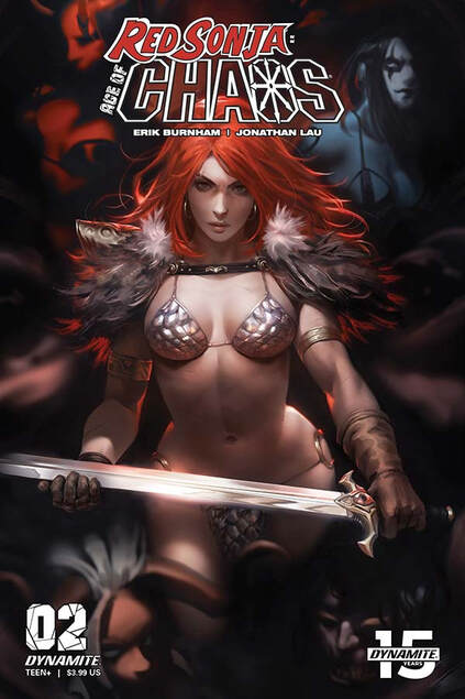
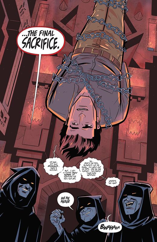
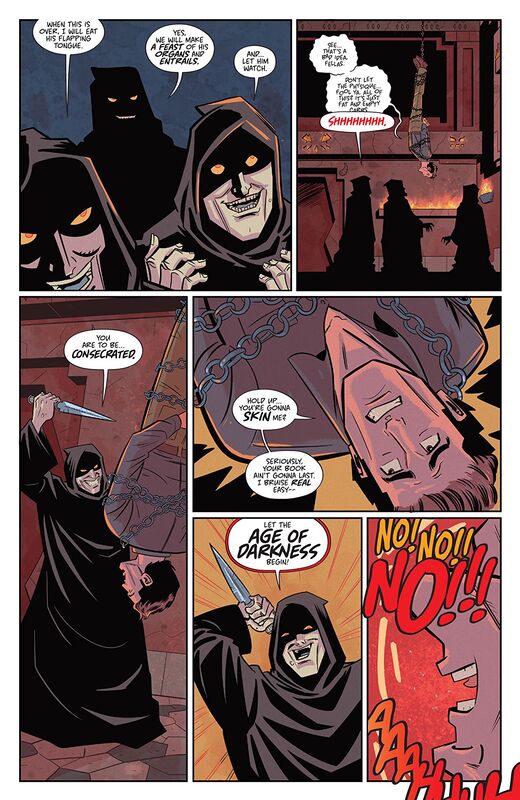
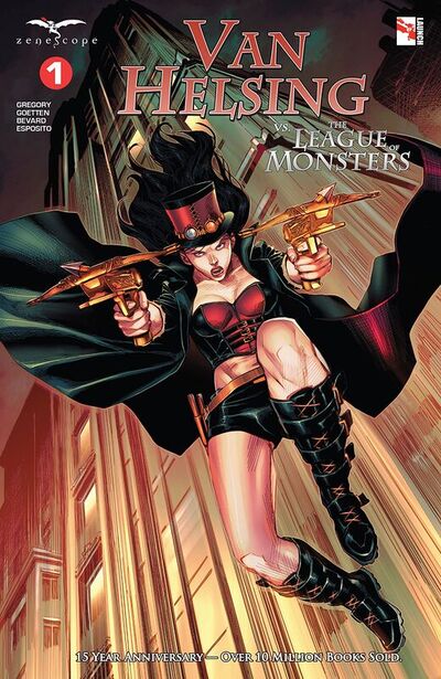
Red Sonja: Age of Chaos #02
Dynamite Entertainment 2020
Written by Erik Burnham
Illustrated by Jonathan Lau
Coloured by Andrew Dalhouse
Lettered by Carlos S. Mangual


     Red Sonja is fully made to understand that her victory over Kulan Gath not only led to the invasion of her world by a whole new kind of evil. but may cause time itself to end... much to the delight of the goddess of death, Mistress Hel. Only Sonja can set things right -- but what she needs to do so will cost her a bargain with Lady Demon, as well as a personal quest her ego doesn't want to accept. Thankfully she has backup in the form of the half-vampire, Chastity -- and a good thing, too. To fix the path of fate, Sonja will need all the help she can get!

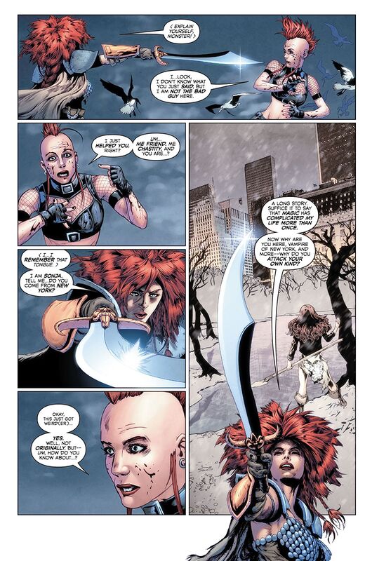
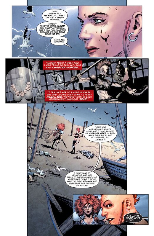
     I love this, the whole idea here is utterly fantastic! Except this choppy cut hair she's got going that I can't understand. So seeing how last issue ended and how/why Chastity ends up in this time period is where we pick up here. Erik is writing a hell of a good story here and while I am usually not a fan of time travel storytelling in this case it isn't so much as time travel as it is a case of being tossed through time and the distinction not seem like much but it is there. Another thing that Erik is doing is he's utilising Sonja's past, when she ended up in New York City thanks to Amy Chu, and tying that into her experiences and which allows her to understand and speak English. It's the little things like this that sometimes go unnoticed or happen without an explanation that lesser writers will do when they need a “fix.”

     I think the way that this is being told is sensational! The story & plot development we see through how the sequence of events unfold as well as how the reader learns information is presented beautifully. Of all those who were at the museum I find it increasingly fascinating that it's Chastity who ends up by Sonja's side. There is a large part of me that wishes it were Ernie because he and his pin alongside Sonja would be one of the most delightful interactions, the dialogue alone, ever to be seen. The character development is superb to see. Sonja's brash no nonsense approach to life and her way of speaking is so telling and the Chaos women are utilised just as they should be. The pacing that we see here as it takes us through the pages revealing the twists and turns along the way just seem to heighten the way we enjoy the story. All of this works together to create this really good, strong ebb & flow to the book.     

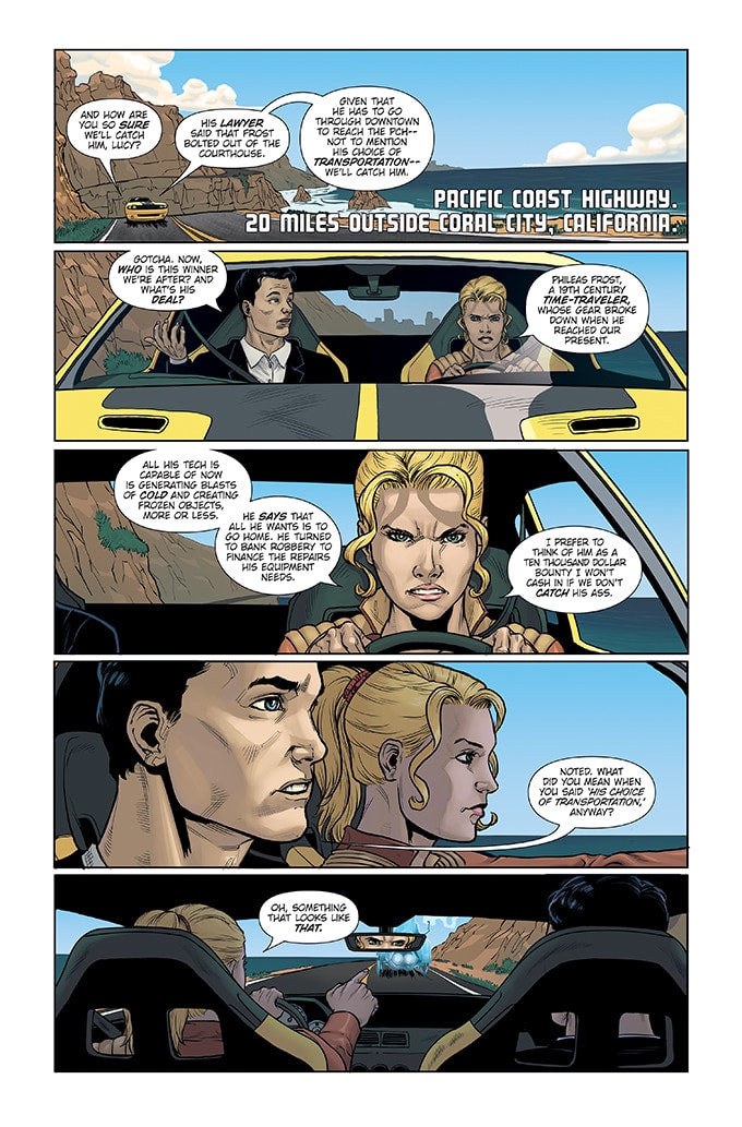
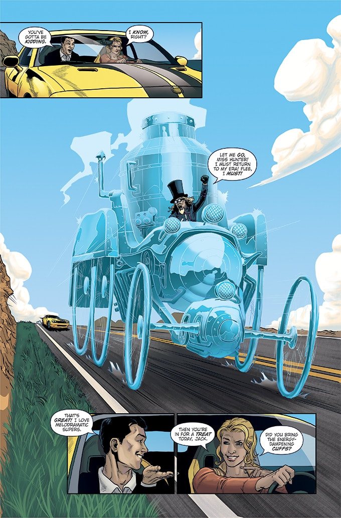
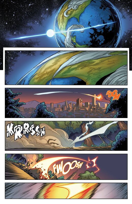
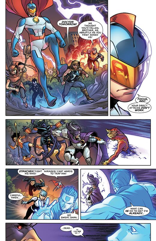
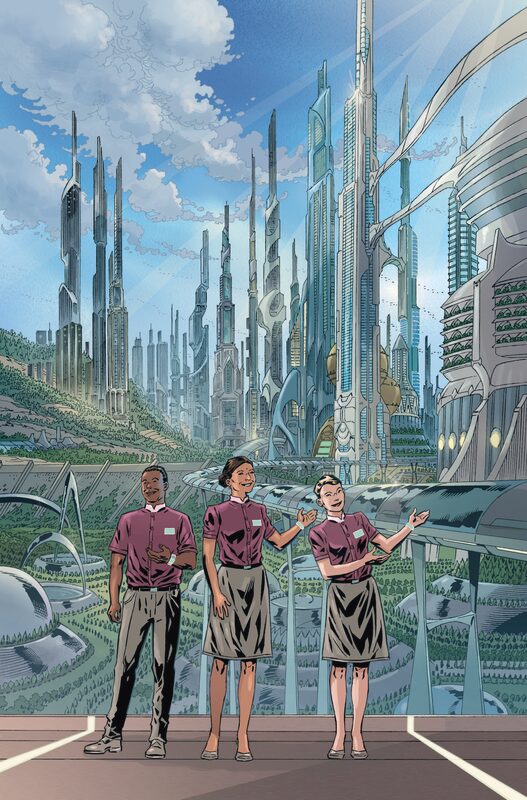
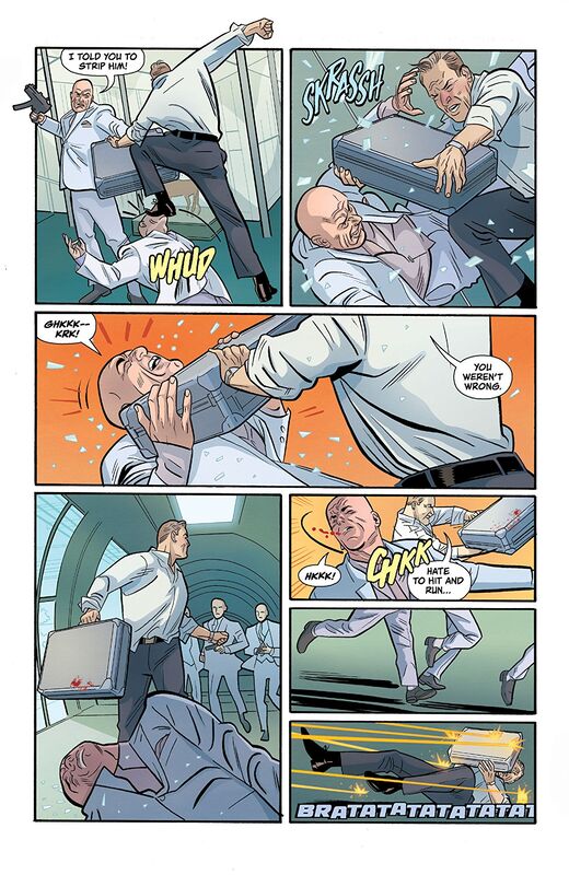
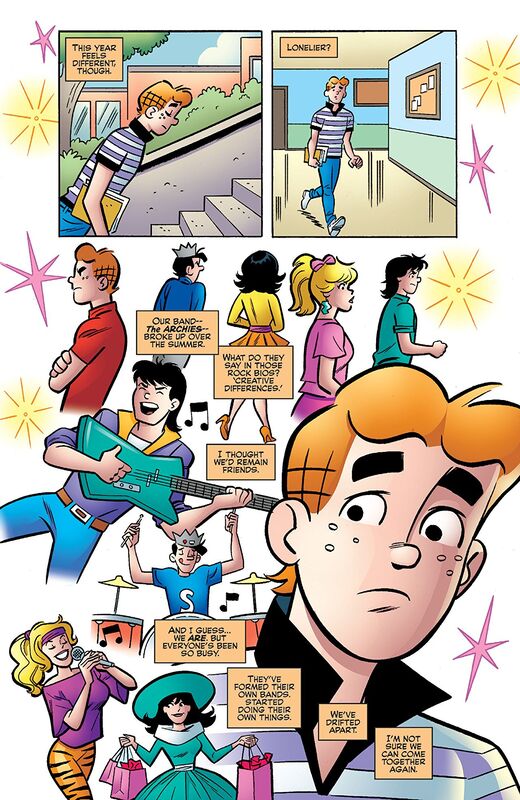
     Jonathan's work on the interiors is pretty amazing, sans Sonja's hair. Seriously though what the hell it looks like someone took a sword or dagger and chopped it but good. As per usual I would like to see backgrounds utilised a bit more. That panel with NYC is phenomenal and I'd like to see that more not New York but the utilisation of the panels. The characters body's and body modifications are so incredibly well done, I mean Lady Demon and her horns phew wow. Also that page we see Hel, the continents an the museum again that's such a phenomenal scene and it's breathtaking. The utilisation of the page layouts an dhow we see the angles and perspective in the panels show this marvellous eye for storytelling. The colour work is devilishly good. The gradation we see through the various hues and tones within the colours is so exceptionally well rendered. Then the reds or Lady Demon's eyes they all have this effect upon the reader that's hard to escape.
​

     This book feels like the Sonja and the characters of Chaos! were always meant to be side by side. The guys have merged this story and franchises into one another in such a way that we really do get to see how a crossover such as this should be done. Trust me when I say that there are a lot of twists that we don't see coming and we have to wonder what Lady Demon's real motivation is here because foiling Hel isn't really the only thing she has in mind. Engaging, delightful and tension filled storytelling throughout make this a heck of a read!

0 Comments

The Catch #1

2/23/2020

0 Comments

 
Picture
The Catch #1
Atomic Tiki Studio 2019
Written & Lettered by Steve Bryant
Illustrated by Ismael Canales
Coloured by Roger Surroca


     When super-villains like Galactoid, Dron the Conqueror, or Professor Kill are defeated, they're sent to a government maximum security facility. But what about small-timers like Phileas Frost, The Grappler, or the random jump-suited agents of H.A.R.M.? What happens to the bank robbers, jewel thieves, and anonymous henchmen? They post bail. And sometimes, they skip town afterwards. That's where Lucy Chase comes in. Keeping super-powered lowlifes in line is a dangerous job; especially when you don't have super-powers yourself. Bounty hunters who specialize in supers are few and far between, keeping Lucy in high demand.

     This is all kinds of fun. The concept alone is great a non-powered super-villain bounty hunter for bail jumpers is something few could or would ever think of. The opening here is fantastic and it gives the reader their first look at the mood, tone and feel of the series as well as our introduction to Lucy and Jack. Now Jack isn't a bounty hunter but he is a Deputy Marshall and has toys that Lucy doesn't have access to. Plus if I am reading this correctly a bit of a crush on Lucy as well. This may be an introductory issue but it feels like so much more than that to me and Steve really doesn't waste any time in getting things up and running.

     I am a huge fan of the way that this I being told. The story & plot development that we see through how the sequence of events unfold as well as how the reader learns information is presented in a way that is as entertaining as it is informative. The character development we see is phenomenal and I like how we get these looks at the characters as if they are fully formed and we are just getting to know those personalities. This really feels like an established world that has finally opened it's doors to us and like birthday present with a big bow waiting to be unwrapped it gives off that kind of excitement. The pacing is superb and as it takes us through the pages revealing the story as it goes along, there aren't many twists and turns as it's pretty straightforward well until the ending. All of this works together to create a really good ebb & flow making this feel as if it's kind of like Cameron Chase, with dysfunctional family, as a freelancing bounty hunter.

     The interiors here are really fantastic. The linework we see it mindbogglingly exquisite and how the varying weights are utilised to showcase the level and quality of the attention to detail is truly stunning. This is beyond top quality work here people, it's the kind of work that makes us wish everything we read was this well rendered. The character designs are utterly brilliant and I am sorry but Phileas is a dream come true in the uniqueness department as well as what we see of how he utilises his abilities. The way backgrounds are utilised and how they work within the composition in the panels show depth perception, scale and that overall sense of size and scope to the story rather brilliantly. The utilisation of the page layouts and how we see the angles and perspective in the panels show this masterful eye for storytelling. Now the colour work we see is just as brilliant. To see the ice chariot, steampunk version and all, in the colour scheme works perfectly. How we see the various hues and tones within the colours utilised to create the shading, highlights and shadow work is beautifully done. Plus I really like the shading/shadows in the flesh tones that also work in defining parts of the body.
​

     These are phenomenal characters and hell even I have a crush on Jack at this point and how we see their complicated histories with each other is really well thought out. The writing here is bloody well brilliant to see in how it manoeuvrers through the book with the layering and complexities. This is the kind of book that you expect to see out of a major company and that it was funded on kickstarter is both a joy and a shame. Folks you really need to find a way to get a hold of one of these and future issues in the series that come out, you might just find yourself swearing off the big guys in favour of The Catch!

0 Comments

Doctor Tomorrow #01

2/23/2020

0 Comments

 
Picture
Doctor Tomorrow #01
Valiant Entertainment 2020
Written by Alejandro Arbona
Illustrated by Jim Towe
Coloured by Diego Rodriguez
Lettered by Clayton Cowles


     Teen hothead and star athlete, Bart Simms, is about to meet the Valiant Universe's greatest hero... himself! The can’t-miss superhero adventure of 2020 starts here!

     The opening here is great and mainly because we have absolutely no idea what's going on. It's as if the entire Valiant Universe is involved in a major event and Doctor Tomorrow is in the thick of it. So what this does mean? It could mean a number of things and at first I thought we were reading a comic book with someone though that turned out not to be the case. Is this the future, a possible future or a different timeline altogether is something we don't know yet. That we don't know and that it engages the reader so our minds try to figure out what's happening and that is full of weird possibilities.

     The main part of the story introduces us to Bart. It is a set-up issue really because this is a different version of Bart than the one that was first introduced. If I am completely honest I am not sure why we don't go back to him because his origin and when he comes from is super intriguing to me and I would've preferred to see that. Since that isn't the case lets talk about what we do see. I love seeing Gretchen not only pitch to Bart but as they do this they talk about physics. It's a tutoring session that happens around a sport they both love and I have to tell you if more people did this kind of tutoring kids wouldn't be as mentally challenged as they are. Plus what we see here, the physics, is a theme that plays out one way or another throughout the entire book and I thing how Alejandro does that is pretty damn genius.

     The way that this is being told and how we see the story & plot development through how the sequence of events unfold as well as how the reader learns information is presented well. While the opening garners interest it still remains an oddity to the rest of the story so far and that's disappointing. If we had just stuck with getting to know Bart it would've been more coherent. The Bart sequence flows really well through the pages and really brings out some nice character development in he and Gretchen. The pacing is pretty good and the ebb & flow that it creates makes this easy to fly through the issue.

     The interiors here are nice and they look like an elevated version of an all-ages book in a more traditional comic book style. Kind of like the old Young Justice or Impulse books. Not generally my thing as I actually like to see hair done that doesn't look like a stiff wig but the faces we see and the facial expressions are extremely well done. That we see backgrounds utilised in some panels, I would like to see them in more, they do work within the composition in the panels to bring us depth perception, scale and a sense of size and scope to the book. The utilisation of the page layouts and how we see the angles and perspective in the panels show a decent eye for storytelling. With the way we see the faces and some other sharp detail versus things like the hair and such kind of compete against one another. The colour work is well rendered. I like seeing the various hues and tones within colours to create the shading, highlights and shadow work.
​

     There is definite potential here and it's kind of cute and fun. I am not sure if this a YA or all-ages geared book and the talk of physics doesn't help determine that either. Regardless what we see of young Bart and Gretchen is the groundwork with which to work upon, build and grow this series. While not normally a fan of time travel adventures however the last page really does have me rather excited to see what's coming next!

0 Comments

Death To The Army of Darkness #001

2/22/2020

0 Comments

 
Picture
Death To The Army of Darkness #001
Dynamite Entertainment 2020
Written by Ryan Parrott
Illustrated by Jacob Edgar
Coloured by Kike J. Diaz
Lettered by Hassan Otsmane-Elhaou


     It’s been six months since the events of the Army of Darkness film…Ash is just trying to settle down and get back to his groovy ways. But dammit, DEADITE-POSSESSED strangers keep attacking him at every turn. Why is evil following everywhere he turns, and what happens when an awful splinter spell causes Ash to become…TEAM ASH!? And, because it’s February, we’re celebrating Valentine’s Day with a special variant by artist Sebastian Piriz!

     I am a huge fan of Ryan's and that was a huge factor in my trying this. The other is that I love the Ash vs. The Evil Dead series on Stars, which I am sad as hell that's over. So I am all for this and after reading it Ryan once again impresses with me just how well he knows and understands the source material of what he writes. This feels like it could bridge the the path between those films and with the show on telly. That it feels so on point in what could be the timeline of the franchise. If that isn't enough for you that's okay because you can still read this as a brand new reader and not feel like you are missing anything making it a great jumping on point.

     I love the way that this is being told. It feels like the end of the story is the opening and we have to go back and see the events that have led up to this point. It is a good way of showing that this isn't an ongoing and just an arc so we know when we approach what we see happening here and then how that ends to finish things up. The story & plot development that we see through how the sequence of events unfold as well as how readers learn information is presented beautifully. The character development that we see is completely on point. While Bruce and this role aren't all that hard to nail down making him seem like his own person, a separate entity if you will, is something else altogether, the pacing is fabulous and as it takes through pages revealing the twists and turns along the way and how it works with everything else helps create the books ebb & flow.

     The interiors here aren't what I was expecting to see but ya know what that's always a good thing in my book. The linework is fantastic and how the varying weights are utilised to bring us the attention to detail is great to see. There is something really interesting about the hard angles that we see and more so in the face and it creates this almost exaggerated feel that's between an animated style and traditional comics. This gives it this unique feel and with a franchise like this that's a huge factor in setting it apart. The utilisation of the page layouts and how we see the angles and perspective in the panels show a strong, solid eye for storytelling. The colour work is just as interesting. The backgrounds seem to have this nice overlay where the colours are rendered differently than on the people and that add that certain something that helps the linework make that impression upon the reader.
​

     This is a phenomenal book and it has tall the right notes of humour and horror blended in ways that make it feel like the cheesiness of the films. There is a reason this has such a cult following and what Ryan and company do here should make all those involved in the franchise feel proud as punch at how well the tone, mood and feel has been captured.

0 Comments

Canopus #1

2/22/2020

0 Comments

 
Picture
Canopus #1
Scout Comics 2020
By Dave Chisholm
Colour Flats by Dustyn Payette


     Helen wakes up marooned on a lifeless alien planet 300 light years from Earth with no memories beyond a hazy sense of extinction-level urgency to return to Earth. Joined by Arther, her strange robot companion, she explores the planet to find materials necessary to repair her ship. However, circumstances are not as straightforward as they seem. Along the way, Helen's most painful memories return as monstrous manifestations hell-bent on her destruction.

     Well first I have to say thing, Damn you Dave for this! I mean I have no idea what the hell I just read but it really feels like something less than straight forward. So what Dave does in such spectacular fashion is he engages the reader almost immediately so they, we, have to use their minds to think of what is beyond the page, beyond what's presented and into their own realm of knowledge to find a way to make the pieces of the puzzle work together. I am completely and utterly impressed with the level and quality of the writing here. This goes so far above and beyond what you may think it will and that for me showcases why I hold Scout Comics in such high regard.

     I really am enjoying the way that this is being told. How we see the story & plot development through how the sequence of events unfold and how the reader learns information is presented in a great fashion. From the moment the book opens and the story begins we have to question everything that we see. The way this is presented to the reader creates this amazing amount of interest and how it flows so seamlessly is superb to see. The character development is sensational and how we see Helen act and react to the things around or what she encounters is so telling of her nature and who she is. The way the pacing takes us through the pages revealing the twists and turns along the way helps to create this really intriguing and odd ebb & flow to the book.

     I am thrilled with this so far. It is odd and has these quirky moments that make you raise the eyebrow and feel a puzzled Spock. It has this endearing quality mixed with this whole what the hell mentality to what we see that makes this really something different.

     The interiors are really nice as well. Though I will say I think Dave's strength is in his writing but the interiors here are interesting. The linework is really nice and seeing how the varying weights are utilised to bring out the attention to detail is superb. The backdrop for what we see is gorgeous and I love the attention that's given and how in the vastness of space in this supposed deserted setting it is able to bring depth perception, scale and that overall sense of size and scope. The utilisation of the page layouts sand how we see the angles and perspective in the panels shows a great eye for storytelling. The creativity and imagination that is on display here is so gosh darn exciting and fresh to me. I like the colour work that we see. There is the illusion of colour blocking, bleeding or gradation in the space we see but it's really overlay and that is impressive. The way that the various hues and tones are utilised to create the shading, highlights and shadow work is really delightful.
​

     This is a great first issue to an assuming story that has more depth and layers to it than full colour pride cake. It has a stellar premise, it completely engages the reader and takes us on a mental as well visual journey you won't soon forget.  ​

0 Comments

Van Helsing vs. The League of Monsters #1

2/22/2020

0 Comments

 
Picture
Van Helsing vs. The League of Monsters #1
Zenescope Entertainment 2020
Written by Raven Gregory
Illustrated by Deivis Goetten
Coloured by Robby Bevard
Lettered by Taylor Esposito of Ghost Glyph Studios


     Part 1 of 6
     Van Helsing is still reeling from the revelations of recent events after her world came crashing down around her. But she won’t have time to catch her breath as something catastrophic is heading her way. Will she be able to handle some of the deadliest creatures in all existence? Alone any of these would be formidable foes, and Liesel will have the ultimate challenge laid before her, with taking them on all at once. The odds are not in her favour, and it doesn’t look good for the legendary vampire hunter.

     I am such a fan of this franchise and I have said this repeatedly. I love the direction that Raven is taking this in and then again how he's keeping one arc leading into the next so that they could be stand alone arcs a well as the continuing story, of Another World, for the continuity of regular ongoing series. This is for new fans and stalwart ones and the way that this is written is utterly fantastic.

     This is kind of what I was hoping for elsewhere so seeing this gets my hopes up. So Dracula is resurrected by his daughter, see last arc, and they all realise that alone they have no hope of taking out Liesel. I love this for a myriad of reasons but chief among them is the fact that she's feared and seen as a formidable opponent. Now I find it incredibly interesting where this Maximum Security Global Threat Institution is located. My only wish was we get to see who else was there, I mean all this isn't for one person and I wonder if anyone else was let free. Raven does a great job here in showcasing the different personalities and the animosity of one against another while still making the enemy of my enemy a real deal. It isn't the bad guys either there is a great mix of other characters being shown as well.

     The way this is being told is awesome. The story & plot development we see through how the sequence of events unfold and how the reader learns information is beautifully presented. There are several segments featuring different sets of characters and the flow of this doesn't skip a beat once. Raven shows us why he's such a talented writer with the way the book is structured. The character development is sensational. I like how we see and understand who they are while leaving room for them to anticipate and react to situations and circumstances yet to come. The pacing is great and as it takes us through the pages revealing the twists and turns along they it works with everything else to create the books ebb & flow which in itself is impressive.

     The interiors are really nice to see. The linework is solid and how the varying weights are bing utilised to bring out the attention to detail we see is well rendered. One thing though what's up with the empty picture frames, it looks well stupid to put it bluntly. If you are going to take the time to make them then you've got time to put something in them and if you don't use a computer to add images. Speaking of backgrounds what's up with seeing Liesel in silhouette against a blue background? Don't use props in some panels and then decide to leave them out of others, to me that's just lazy. Now the tone of the book is pure classic comics and that I really like. The utilisation of the page layouts and how we see the angles and perspective in the panels show a decent eye for storytelling. The colour here is impressive to me. The gradation of the colour utilising the hues and tone within them is extremely well done. Also that we see this nice ranges of variation in the dark is more impressive so job extremely well done.
​

     God I love this, it is exciting and has this feeling of something epic coming into being. It is like the villains of Zenescope forming their own Legion of Doom and it doesn't feel like a rip-off or a copycat idea it feels like this is how this world is naturally heading towards. While the women, and there really are hardly any men though I want a gay male hero, are as keen as working in a group the team-ups are rather regular. Zenescope is a force to be reckoned in the super-hero genre these days and it's about time everyone sits up and takes notice.

0 Comments

Join The Future #1 Advance Review

2/21/2020

0 Comments

 
Picture
Join the Future #1 Advance Review
Aftershock Comics 2020
On Sale March 4th 2020
Written by Zack Kaplan
Illustrated by Piotr Kowalski
Coloured by Brad Simpson
Lettered by Hassan Otsmane-Elhaou


     The Future. Ultra-modern megacities reward millions of their citizens with a completely funded life, with every need met, from food to housing and healthcare, in order to compete in an economic power struggle in which population is key. But a few rural residents still cling to their independence in what last American small towns are left. When a nearby megacity pressures the people of a small town join up or else, a young teenage girl named Clem will learn how far she'll go to defend her principles.

     Welcome to a future that is being sold as utopia by those living in the city, the megacity in the Midwest of the United States. I have to say I was excited to read this when it was sent to me, I love Zack's writing and I always, always rave about Piotr's skill as an artist and illustrator. Plus anytime there is a future that looks too good to be true it usually is so finding that dark side is what I am sure most of us are going to be looking for. This is already off to a sensational start and when you read the book you realise that this isn't like anything else we've seen with similar vein or slant to it. Usually a future city like this will have mutated humans or the dregs of society, too dangerous to have around. So I really like how this is being presented.

     I really like the way that his is being told. For an introductory issue this is one of the best we've seen lately. The opening does what it needs to do and introduces us the new way of life in the megacity that seems to have no name. Our tour guides seem well practised in the art of the sales pitch as if they go through the motions rather really sell you on it. The meat of the story however is where the real tale begins. I like seeing that those living outside the city appear like they live out in the old western frontier instead of in the future. The way that these guys are able to really capture a not so apocalyptic future and merge it with elements that the reader can find familiar.

     The story & plot development that we see through how the sequence of events unfold as well as how the reader learns information is perfectly presented. This has a natural flow to how the events are seen and it makes for good strong reading. The character development is solid and as far as meeting them for the first time goes Zack does a magnificent job in getting us an immediate feel for the characters. The pacing is superb and as it takes us through the pages revealing the twists and turns it works with everything to create an intense and dramatic ebb & flow.

     Piotr is a bloody brilliant artist and as we see through the strength of his linework and it's varying weights showcasing this level of quality in the attention to detail. I don't know how he manages to do it but there is such a difference in the way we see the city compared to the towns on the outskirts. From this harsh, cold and sterile environment to this warm, inviting and alive feelings is mindbogglingly impressive work. The utilisation of the backgrounds is phenomenal and an integral part of this storytelling process. The way they work within the composition in the panels to bring out depth perception, scale and that overall sense of size and scope is impressive. The utilisation of the page layouts and how we see the angles and perspective in the panels show us this masters eye for storytelling. I really like the colour work we see here a well. Brad really is able to bring the futuristic and the grittiness of each sector to the work that helps us understand each one. The way that we see the various hues and tones within the colours create the shading, highlights and shadow work is astonishingly well rendered. Just to see how well he understands how colour works and which colours are needed and can be utilised is sublime.
​

     Everything you could possibly need to see how things work, escalate and the catalyst for how the books seems to need to move forward is right here. In what configuration well that's for you to discover when you pick up the book. This won't be anything you are expecting it to be and that alone shakes up the status quo considerably well. This is a creative team powerhouse and they've managed to put lighting in the bottle here and I cannot wait to see how the rest of this story unfolds!

0 Comments

Bloodshot #0

2/21/2020

0 Comments

 
Picture
Bloodshot #0
Valiant Entertainment 2020
Written by Tim Seeley
Illustrated by Marc Laming
Coloured by Andrew Dalhouse
Lettered by Dave Sharpe


     NOTES:
     Created by now-defunct military contractor Project Rising Spirit (PRS) for covert special ops, “Bloodshot” served for years as a near-unstoppable killing machine. He is infused with billions of “NANITES,” advanced nano-robots giving him a rapid healing factor, enhanced strength, speed, endurance, and the ability to temporarily alter his physical appearance. Now free of his former masters, Bloodshot has simply vanished. His whereabouts and current status remain unknown.

     I like this for a myriad of reasons and among them is that this isn't put into the series as the arc flows. By making this a zero issue that kind of stands alone and is a lead in to the series is something to appreciate. Another thing to appreciate here is Marc's work on the interiors which I will get to later but his style and attention to detail is marvellous. There are a few things that I found to be sensational about this story and that it recognises his history since Valiant rebooted itself was handled perfectly. Tim is so meticulous in his process, that's me guessing by the way, and that he's able to retain so much different information on his numerous books and makes this feel like it's the only he is working is kind of phenomenal when you stop to think about it. I don't think he gets the credit he deserves for his talent, skill and ability as a writer.

     I like the way that this is being told. The story & plot development that we see through how the sequence of events unfold and how the reader learns information is expertly presented to the reader. The character development here is utterly impressive! Seeing and hearing Ray talk about himself and his life and his desires, regrets, I've had a few, but then again, too few to mention, I did what I had to do and saw it all through without exemption, yeah he wants to do it his way. The pacing is great and as it takes us through the pages revealing the twists and turns along the way it works with everything else to create this intriguing ebb & flow. Intriguing, yes, because it makes you question things and see things that aren't in front of you, effectively taking you off script. That your mind is engaged and looks and see things that are and aren't there ensures not your enjoyment of the story but your commitment to reading the series.

     Marc's interiors are absolutely amazing to see. The linework is so damn good and how we see the varying weights utilised to create this level and quality of attention to detail is stunning. The way that we see faces, facial expressions and body language do wonders in furthering the characterisation in ways words alone cannot do. I love that Marc knows and understands the value of utilising backgrounds. They really do bring us into the bar, onto the streets of the town as they completely just complete the picture of what we see. It also works within the composition in the panels to bring us this depth perception, sense of scale and that overall sense of size and scope to the book. And the detail throughout is just mindbogglingly good. The utilisation of the page layouts and how we see the angles and perspective in the panels, of which the continuation of the backgrounds and such that we see from one panel to the next sigh, show one of the best eyes for storytelling in the business. The colour work is delightful to see. How the various hues and tones within the colour are utilised to create the shading, highlights and shadow work is expertly rendered. Also to see the same on the red page is super impressive as is the blue and white areas throughout.
​

     Bloodshot is an amazing character with a rich, full background that is continuing growing and evolving. This allows for so many different avenues of storytelling in which he could go so to see Tim take a route that feels true to Ray and what he's been through and what he wants now feels more like Ray telling him what to write. This continues to showcase why Valiant has some of the absolute best storytelling on stands.

0 Comments

Bang! #1

2/20/2020

0 Comments

 
Picture
Bang! #1
Dark Horse Comics 2020
Written by Matt Kindt
Illustrated by Wilfredo Torres
Coloured by Nayoung Kim
Lettered by Nate Piekos of Blambot


     A best-of-the-best secret agent with memories he couldn't possibly possess, a mystery writer in her 60s who spends her retirement solving crimes, a man of action with mysterious drugs that keep him ahead of a constant string of targeted disasters, a seemingly omnipotent terrorist organization that might be behind it all . . . And they're all connected to one man: a science-fiction author with more information than seems possible, whose books may hold the key to either saving reality or destroying it. A mind-bending story that ties in with past Kindt works (Revolver). Action, mystery, and altered reality!

     This is utterly fantastic! Forget about it tying into Matt's past works at least for now because this, this is bloody amazing! The opening is stupendous and I love how we see this whole James Bond style action adventure bit and then how the storyline shifts. There is a uniqueness and a familiarity to the story and the dichotomy of it and how well it's presented showcases why Matt remains one of the most interesting and intriguing writers of our generation. He is able to draw us in, capture our attention and our imagination as we become engaged in the story.

     The way that this is being told really is brilliant. The story & plot development we see through the sequence of events unfolding and how the reader learns information is presented beautifully. I love the way the transition from the opening into the next part occurs leaving the reader wondering about what is going on. It engages the readers' mind and takes you off-script using what you know or what you think you know to fill in the blanks. It is kind of fun and thrilling and that Matt utilises this so well and so quickly is no surprise. The man has this knack, skill and talent when it comes to writing that it is nigh on impossible to not lose yourself in the story. The character development is amazing and all the word play and the actions and reactions due to circumstances and situations just helps give us a better picture of them. The pacing is sensational and as it takes us through the pages revealing the twists and turns along the way helps to create one hell of a great ebb & flow to the book.

     I really like Wilfredo's interiors here. The linework is extremely nice to see and the way that the varying weights are utilised to bring us some really good solid attention to detail. I am the guy who will always say this, this needs backgrounds. When we do see them they are beautifully utilised to show depth perception, scale and the overall sense of size and scope of the story I just wish that there weren't blanks in between two panels that have them. That is a pet peeve of mine. The utilisation of the page layouts and how we see the angles and perspective in the panels show a talented eye for storytelling. The colour work is nicely rendered as well. The colour blocking is effectively utilised with the shades and tones within the colours for the shading, highlights and shadow work.
​

     The layering we see in the story is brilliantly done and there are some moments that comes out as pure genius. I can't spoil what those are but they wonderfully delightful. I may be right and may be crazy and it just might be a lunatic Cord is looking for. Either way the whole idea here is really something and it doesn't become crystallised in your mind until the last few pages and then your curiosity becomes piqued even more if that's even possible, and yes it is. Matt has built a multiverse at Dark Horse and it is quite possibly one that has existed in his mind since his first book at Dark Horse.

0 Comments

Archie Meets the B-52s

2/20/2020

0 Comments

 
Picture
Archie Meets the B-52s
Archie Comics 2020
Written by Alex Segura & Matthew Rosenberg
Pencilled by Dan Parent
Inked by J. Bone
Coloured by Glenn Whitmore
Lettered by Jack Morelli


     It’s a rock and roll adventure for the ages as Archie and his friends cross paths with a real rock lobster—the B-52s! This epic crossover one-shot brings the B-52 gang into Riverdale in all their new wave glory—but can Archie get his band back together in time to jam with these legends, or will in-fighting and musical drama leave them in the dust? There’s only one way to find out!

     I don't care how often I have to say it, there is NOTHING better than an Archie book to brighten up the day! It will even make a good day better, that's my story and I am sticking to it. Archie has been around for so long there really isn't a recording artist where they haven't been published during their career so to see these folks taking full advantage of that and really deliver some great storytelling. That this story has Kevin and the B-52s and it's no big deal, no fanfare, it just is, shows us how Archie goes about business and that earns mad respect.

     The way this is being told is fantastic. The guys really bring that Archie drama in order to really make this work. The story & plot development that we see through how the sequence of events unfold as well as how the reader learns information is presented beautifully. The way the story flows and how we see the way things are set in motion is superb. The character development is so on point and while that's no surprise on the Archie's but the B-52's are as I remember them from interviews and such. The pacing is great and as it takes us through the pages and shows how inventive and originality to what we see. The books structure and the ebb & flow of the story is wonderful to see.

     I really like that gang are meeting bands that are more edgy and off the beaten path if you will. Love Shack got them noticed by the mainstream but they had a huge cult following before that happened. So if we're going to go with these types of groups I would love to see Eurasure, Pet Shop Boys and Bronski Beat I am just saying.

     I am a huge fan of Dan's pencils and J.Bone's inks on top of them. The look is perfect and the B-52s fit into the Archie world so perfectly here. Actually the whole thing makes me want to see an animated version of this book, drawn out of course. That is how powerfully the imagery resonates and makes us wish for more. Dan's linework is perfect and while the 80's fashions are horrid, and I lived through them so I know first hand, they are authentic and Dan's eye for that as he lived through it too. Though the lines and designs in the clothes are sensational and impeccable. The utilisation of the page layouts and how we the angles and perspective in the panels show a masterful eye for storytelling. I love Glenn's work as a colourist and I have said this repeatedly as well. This art team and how they bring this to life nails this like no one else could.
​

     More, all I want is more. This is brilliant and how they meet one another and how the story moves through the pages it feels like this is how it's supposed to have happened. The guys said okay this the idea and the characters said oh this is how it is and everything was done. Yeah not that easy but you get the idea. This has made this busy nightmare of a week a lot brighter and that's what it's supposed to do. ​

0 Comments
<<Previous
Forward>>

    Archives

    December 2021
    November 2021
    October 2021
    September 2021
    August 2021
    July 2021
    June 2021
    May 2021
    April 2021
    March 2021
    February 2021
    January 2021
    December 2020
    November 2020
    October 2020
    September 2020
    August 2020
    July 2020
    June 2020
    May 2020
    April 2020
    March 2020
    February 2020
    January 2020
    December 2019
    November 2019
    October 2019
    September 2019
    August 2019
    July 2019
    June 2019
    May 2019
    April 2019
    March 2019
    February 2019
    January 2019
    December 2018
    November 2018
    October 2018
    September 2018
    August 2018
    July 2018
    June 2018
    May 2018
    April 2018
    March 2018
    February 2018
    January 2018
    December 2017
    November 2017
    October 2017
    September 2017
    August 2017
    July 2017
    June 2017
    May 2017
    April 2017
    March 2017
    February 2017
    January 2017
    December 2016
    November 2016
    October 2016
    September 2016
    August 2016
    July 2016
    June 2016
    May 2016
    April 2016
    March 2016
    February 2016
    January 2016
    December 2015
    November 2015
    October 2015
    September 2015
    August 2015
    July 2015
    June 2015
    May 2015
    April 2015

    RSS Feed

    Categories

    All

    RSS Feed

Powered by Create your own unique website with customizable templates.