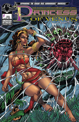
Princess of Venus #1
American Mythology Productions 2019
Written by Pat Shand
Illustrated by Alfret Le
Coloured by Emmanuel Ordaz
Lettered by Natalie Jane
At last, Duare, the Princess of Venus gets her own comic book origin story! The mysterious princess has prover herself a capable fighter alongside Carson Napier in the Edgar Rice Burroughs Universe, but how she obtained her fighting prowess has been a mystery... Until now! Before a strange Earthman named Carson crashed upon Amtor, a swashbuckling princess was forged, evolving from coddled royalty into a fiery fighter.
Well for reasons that you’ll realise when you read this book I started off singing Anything you can do I can do better, I can do anything better than you. What this did was condense something into a one-shot issue that expands the character and lets us see the events that lead us to how we see her today. I love that Pat does this, I mean he’s so good at knowing which moments to highlight so that what we see is going to have the most impact. Plus the man just knows how to write a darn good story and to see him play in Burroughs sandbox is something I would definitely like to see more of.
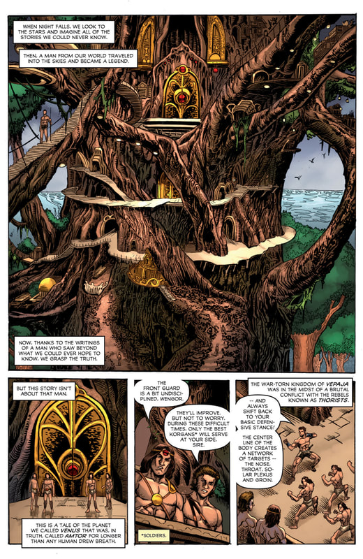
Oh yes the opening here is utterly marvellous to see. This is what the splash page was invented for to see the magnificent image and have the narration to go along with it as it all ushers us into this story. There is something old school and welcoming about the way that this has been done and it strikes this amazing chord within me as a reader that I hadn’t realised was missing from so many titles I am reading. Though if I am to be honest I really it as a full on splash page but it’s close enough since it does more than we could have hoped for.
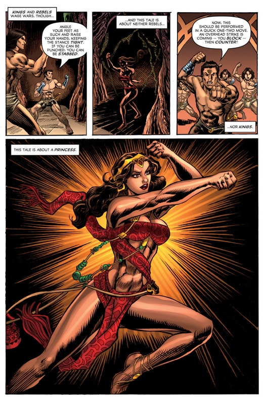
The way that Pat has structured this story is incredibly strong and that he can show the difference between the playing at and having to be aspects a person sometimes has to face is even more impressive. The ebb & flow of the story & plot development through the pacing here is such that it reads so easily and you are pulled into this world and begin to learn their language. Of course when we hit the last page of the story we are left wanting.
I am so thoroughly impressed with the level of quality and talent that I see in the interior artwork here. From that opening to the last there is this stellar utilisation of the varying weights of the linework that is utilised to create some magnificent attention to detail. I love that we see these men in their next to nothing outfits and being treated the same way women would be makes see this as so much more progressive. I do very much like and appreciate the way that we see the composition inside the panels and that backgrounds are utilised as much as they are makes me happy. Yes I wish that they would be in every panel but it’s alright they do wonders in expanding the moments and the size and scope of the story and this world. The utilisation of the page layouts and how we see the angles and perspective in the panels show a stupendous eye for storytelling. I also love the colour work here. I could do with less colour blocking and more instances of gradation but that’s a minor quibble. Light sources, shading and shadows are all used so appropriately.
From the writing to the interiors the creativity and imagination that is on display in these pages captures the heart, soul and essence of what Burroughs always represented. I want more pure and simple this team working on a few limited series arcs featuring the Princess would be a welcome addition to my life.
American Mythology Productions 2019
Written by Pat Shand
Illustrated by Alfret Le
Coloured by Emmanuel Ordaz
Lettered by Natalie Jane
At last, Duare, the Princess of Venus gets her own comic book origin story! The mysterious princess has prover herself a capable fighter alongside Carson Napier in the Edgar Rice Burroughs Universe, but how she obtained her fighting prowess has been a mystery... Until now! Before a strange Earthman named Carson crashed upon Amtor, a swashbuckling princess was forged, evolving from coddled royalty into a fiery fighter.
Well for reasons that you’ll realise when you read this book I started off singing Anything you can do I can do better, I can do anything better than you. What this did was condense something into a one-shot issue that expands the character and lets us see the events that lead us to how we see her today. I love that Pat does this, I mean he’s so good at knowing which moments to highlight so that what we see is going to have the most impact. Plus the man just knows how to write a darn good story and to see him play in Burroughs sandbox is something I would definitely like to see more of.
Oh yes the opening here is utterly marvellous to see. This is what the splash page was invented for to see the magnificent image and have the narration to go along with it as it all ushers us into this story. There is something old school and welcoming about the way that this has been done and it strikes this amazing chord within me as a reader that I hadn’t realised was missing from so many titles I am reading. Though if I am to be honest I really it as a full on splash page but it’s close enough since it does more than we could have hoped for.
The way that Pat has structured this story is incredibly strong and that he can show the difference between the playing at and having to be aspects a person sometimes has to face is even more impressive. The ebb & flow of the story & plot development through the pacing here is such that it reads so easily and you are pulled into this world and begin to learn their language. Of course when we hit the last page of the story we are left wanting.
I am so thoroughly impressed with the level of quality and talent that I see in the interior artwork here. From that opening to the last there is this stellar utilisation of the varying weights of the linework that is utilised to create some magnificent attention to detail. I love that we see these men in their next to nothing outfits and being treated the same way women would be makes see this as so much more progressive. I do very much like and appreciate the way that we see the composition inside the panels and that backgrounds are utilised as much as they are makes me happy. Yes I wish that they would be in every panel but it’s alright they do wonders in expanding the moments and the size and scope of the story and this world. The utilisation of the page layouts and how we see the angles and perspective in the panels show a stupendous eye for storytelling. I also love the colour work here. I could do with less colour blocking and more instances of gradation but that’s a minor quibble. Light sources, shading and shadows are all used so appropriately.
From the writing to the interiors the creativity and imagination that is on display in these pages captures the heart, soul and essence of what Burroughs always represented. I want more pure and simple this team working on a few limited series arcs featuring the Princess would be a welcome addition to my life.

 RSS Feed
