Midnight Sky #1 Advance Review
Scout Comics 2019
On Sale Sept. 25th 2019
Written by James Pruett
Illustrated by Scott Van Domelen
Coloured by Ilaria Fella
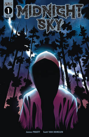
Fresh from the pages of Scout Presents: Midnight Sky Free Comic Book Day, Midnight Sky is Invasion of the Body Snatchers meets They Live. What would you do if you discovered your son wasn't really your son? He may look like him, act like him, but deep down in your soul you just know... he's been replaced. Then your worst fears are realized when the light hits his face just right and you accidentally see his true appearance for yourself. But he isn't the only one you discover... your neighbour, your friend, even your husband. Do you scream? Do you run? Or do you fight back? And how can it be that your daughter is the best and, perhaps, last hope for mankind?
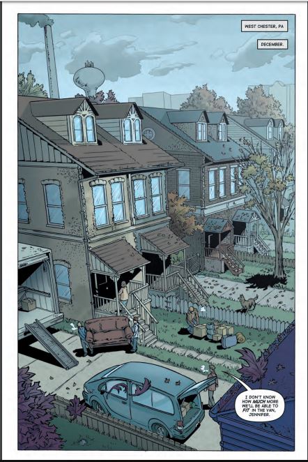
First let me say that a traditional splash page to open the book is a fantastic thing to see. I miss them and when we see them and see them done this well it's just a reminder that sometimes the classics shouldn't go away. The opening here is interesting to say the least. It definitely grabs the readers' attention and raises some eyebrows while the reader processes what they see. It also sets the stage characterisation wise for one character. It generates a lot of curiosity in the reader as well and what James does with this is really pull the reader in beautifully.
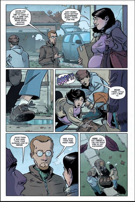
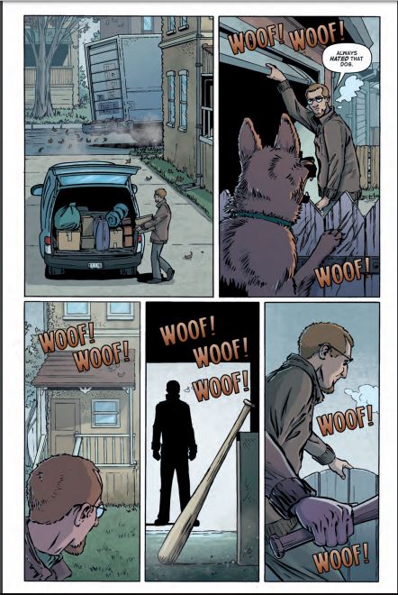
The way that this is structured is really well done. From the opening to the last page there is this really nice pacing of the story & plot development along with the character development. It has this way of moving through the pages creating that ebb & flow which kind of carries the reader along like the current of the ocean. Sometimes smooth, sometimes rough waters but always in motion and that's a nice thing to see in this. Also as the story moves forward, I did mention the strong pacing right, we get to see and learn a good deal about the world and what's going on which almost feels as if we are getting force fed but no not at all it all fits into the story somehow without that crowded feeling and again James impresses me with that.
The interiors here are really well done also. That first page splash page is your first look at the book and what we see is amazing. The attention to detail that we see here through the way that the varying weights of the linework are being utilised make this come to life exceptionally well. From the weathering of the buildings and the angle and viewpoint it has this near Norman Rockwell feel. This is also the same kind of work and intensity that we see throughout the issue and with the creativity and imagination this world comes to life before our eyes. The utilisation of page layouts and how we see the angles and perspective in the panels shows a really good eye for storytelling. While there are a fair amount of backgrounds being utilised I would like to see more, really flesh out the moments and bring that sense of size and scope. When you start with some then omit them the impact lessens. I do like the colour work here as well. The way light sources are utilised to create shading and shadows and the different tones that we see as a result are a great compliment to the linework.
James may be COO of Scout Comics but he has a great resume when it comes to writing and sometimes we may forget that. So I am thrilled he's back at the typewriter, god I'm old, bringing us a very unique and different take on a theme that's never been done enough. I mean this really has pod people with Independence Day vibe going on, hell even aspects of V so yeah this is why I love Scout. James showcases that great storytelling comes from everywhere and that Scout is a company you need to pay attention to! So make sure you order yours now.
Scout Comics 2019
On Sale Sept. 25th 2019
Written by James Pruett
Illustrated by Scott Van Domelen
Coloured by Ilaria Fella
Fresh from the pages of Scout Presents: Midnight Sky Free Comic Book Day, Midnight Sky is Invasion of the Body Snatchers meets They Live. What would you do if you discovered your son wasn't really your son? He may look like him, act like him, but deep down in your soul you just know... he's been replaced. Then your worst fears are realized when the light hits his face just right and you accidentally see his true appearance for yourself. But he isn't the only one you discover... your neighbour, your friend, even your husband. Do you scream? Do you run? Or do you fight back? And how can it be that your daughter is the best and, perhaps, last hope for mankind?
First let me say that a traditional splash page to open the book is a fantastic thing to see. I miss them and when we see them and see them done this well it's just a reminder that sometimes the classics shouldn't go away. The opening here is interesting to say the least. It definitely grabs the readers' attention and raises some eyebrows while the reader processes what they see. It also sets the stage characterisation wise for one character. It generates a lot of curiosity in the reader as well and what James does with this is really pull the reader in beautifully.
The way that this is structured is really well done. From the opening to the last page there is this really nice pacing of the story & plot development along with the character development. It has this way of moving through the pages creating that ebb & flow which kind of carries the reader along like the current of the ocean. Sometimes smooth, sometimes rough waters but always in motion and that's a nice thing to see in this. Also as the story moves forward, I did mention the strong pacing right, we get to see and learn a good deal about the world and what's going on which almost feels as if we are getting force fed but no not at all it all fits into the story somehow without that crowded feeling and again James impresses me with that.
The interiors here are really well done also. That first page splash page is your first look at the book and what we see is amazing. The attention to detail that we see here through the way that the varying weights of the linework are being utilised make this come to life exceptionally well. From the weathering of the buildings and the angle and viewpoint it has this near Norman Rockwell feel. This is also the same kind of work and intensity that we see throughout the issue and with the creativity and imagination this world comes to life before our eyes. The utilisation of page layouts and how we see the angles and perspective in the panels shows a really good eye for storytelling. While there are a fair amount of backgrounds being utilised I would like to see more, really flesh out the moments and bring that sense of size and scope. When you start with some then omit them the impact lessens. I do like the colour work here as well. The way light sources are utilised to create shading and shadows and the different tones that we see as a result are a great compliment to the linework.
James may be COO of Scout Comics but he has a great resume when it comes to writing and sometimes we may forget that. So I am thrilled he's back at the typewriter, god I'm old, bringing us a very unique and different take on a theme that's never been done enough. I mean this really has pod people with Independence Day vibe going on, hell even aspects of V so yeah this is why I love Scout. James showcases that great storytelling comes from everywhere and that Scout is a company you need to pay attention to! So make sure you order yours now.
 RSS Feed
