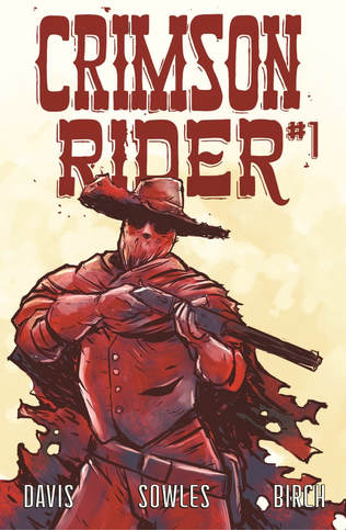
Crimson Rider #1
Zach Davis Comics 2018
Written by Zach Davis
Illustrated by Tyler Sowles
Lettered by Justin Birch
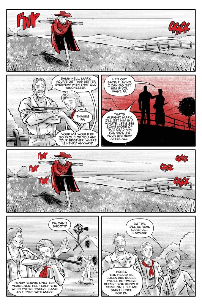
The comic is a public domain female western character, her name is Mary Bennon and on her 16th birthday a gang of bad folks kill her dad. She does what any of us would do, she puts on a creepy mask, cape and hat and hunts her fathers killers down.
So one of the pitfalls of doing all of this by myself is that sometimes things get overlooked or forgotten and sit in my queue until I have no idea what it is. So I sincerely apologise to Zach for this having taken so long to get out. I had no idea that this was originally a public domain character and I am all the more thrilled by that fact after finding out about it. Those old forgotten characters that have someone care enough to bring them back to prominence well yeah and to keep within the realm of the original is just icing on the cake.
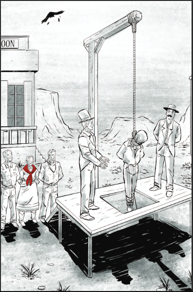
I love the way that this is structured. The end of the tale is where we start, supposedly, and then we get the telling of the story of the Crimson Rider from her own mouth. It is a strong tactic to take in storytelling when there is finite tale. A clear beginning and ending, again we’ll see, that makes for a perfect introduction of Zach’s storytelling ability. I am actually extremely impressed with this book I loved the ebb & flow and the language that is used. Speaking of the language is rougher and less educated to the eye and ear and that is exactly how it should be so kudos.
The opening is very well done as it’s eye catching, dynamic and completely captures the readers imagination. This is what it is supposed to do it makes you want to delve further into the story to see what’s happening, what’s potentially going to happen and all that jazz. It really has this presence about it that a self-published book usually doesn’t possess. This an exception and how is it that I haven’t run into Zach at a convention and been able to pick one of these up myself? Though I am thrilled that Zach thought to send it to me and that I finally figured out it was there to read and review.
I am big fan of Tyler’s work on the interiors here. Black and white is always a tricky way to go, for self-published it makes sense when it comes to costs, because it is brutal when it comes to showing off mistakes just as much as it rewards the sensational use of linework through varying weights. There is nothing really simple about this I love the faces and facial expressions that we see on the pages. The utilisation of page layouts and how we see the angles and perspective in the panels shows a very nice eye for storytelling. That we see so many backgrounds being utilised is wonderful to me and really helps to enhance the story and the size and scope of where they are. Also the use of red here as the only colour was brilliant as well as what it represents.
This is why I always urge everyone to go around the artist alley and see the folks who are doing what they love to do. This is a shining example of hard work, dedication and love for what one does and the creative here is exemplary. Seek out https://www.zachdaviscomics.com/ and make sure to order yourself one of these and help them make the rest of the run. This is what the industry needs.
Zach Davis Comics 2018
Written by Zach Davis
Illustrated by Tyler Sowles
Lettered by Justin Birch
The comic is a public domain female western character, her name is Mary Bennon and on her 16th birthday a gang of bad folks kill her dad. She does what any of us would do, she puts on a creepy mask, cape and hat and hunts her fathers killers down.
So one of the pitfalls of doing all of this by myself is that sometimes things get overlooked or forgotten and sit in my queue until I have no idea what it is. So I sincerely apologise to Zach for this having taken so long to get out. I had no idea that this was originally a public domain character and I am all the more thrilled by that fact after finding out about it. Those old forgotten characters that have someone care enough to bring them back to prominence well yeah and to keep within the realm of the original is just icing on the cake.
I love the way that this is structured. The end of the tale is where we start, supposedly, and then we get the telling of the story of the Crimson Rider from her own mouth. It is a strong tactic to take in storytelling when there is finite tale. A clear beginning and ending, again we’ll see, that makes for a perfect introduction of Zach’s storytelling ability. I am actually extremely impressed with this book I loved the ebb & flow and the language that is used. Speaking of the language is rougher and less educated to the eye and ear and that is exactly how it should be so kudos.
The opening is very well done as it’s eye catching, dynamic and completely captures the readers imagination. This is what it is supposed to do it makes you want to delve further into the story to see what’s happening, what’s potentially going to happen and all that jazz. It really has this presence about it that a self-published book usually doesn’t possess. This an exception and how is it that I haven’t run into Zach at a convention and been able to pick one of these up myself? Though I am thrilled that Zach thought to send it to me and that I finally figured out it was there to read and review.
I am big fan of Tyler’s work on the interiors here. Black and white is always a tricky way to go, for self-published it makes sense when it comes to costs, because it is brutal when it comes to showing off mistakes just as much as it rewards the sensational use of linework through varying weights. There is nothing really simple about this I love the faces and facial expressions that we see on the pages. The utilisation of page layouts and how we see the angles and perspective in the panels shows a very nice eye for storytelling. That we see so many backgrounds being utilised is wonderful to me and really helps to enhance the story and the size and scope of where they are. Also the use of red here as the only colour was brilliant as well as what it represents.
This is why I always urge everyone to go around the artist alley and see the folks who are doing what they love to do. This is a shining example of hard work, dedication and love for what one does and the creative here is exemplary. Seek out https://www.zachdaviscomics.com/ and make sure to order yourself one of these and help them make the rest of the run. This is what the industry needs.

 RSS Feed
