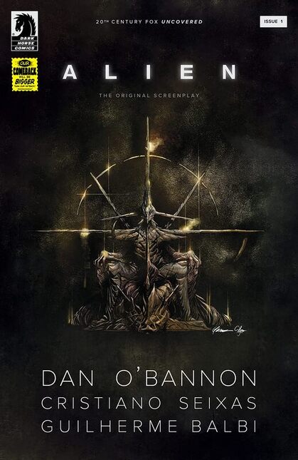
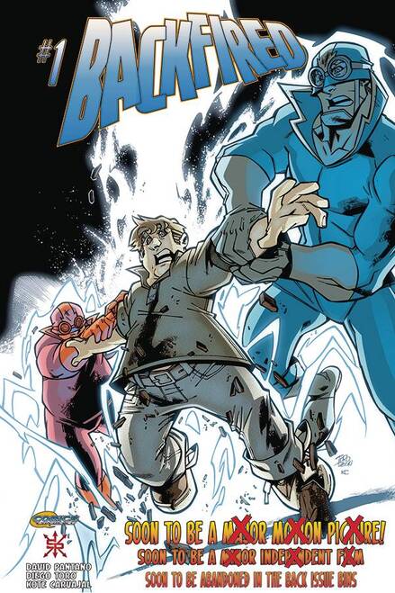
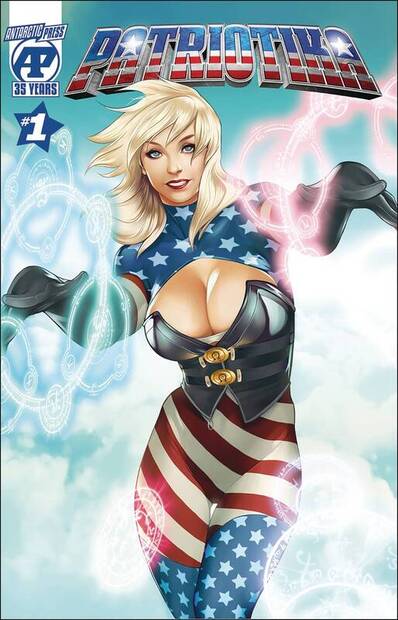
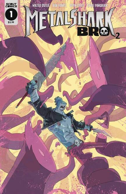
Alien The Original Screenplay #1
Dark Horse Comics 2020
Story by Dan O’Bannon
Adapted by Cristiano Seixas
Illustrated by Guilherme Balbi
Coloured by Candice Han
Lettered by Michael Heisler
An all new Alien with an all new Alien! En route back to Earth, the crew of the starship Snark intercepts an alien transmission. Their investigation leads them to a desolate planetoid, a crashed alien spacecraft, and a pyramidic structure of unknown origin. Then the terror begins . . .
I love these Screenplay editions and I am so stoked to see how different this one is from the film. I wish that after seeing this though that these actually get made because I’m much more interested than ever to see this take on the film. Dark Horse has been doing such an amazing job with these and keeping the franchise fresh, interesting and expanding in some great ways. This is one of my favourite reads on such a constant basis as they are all so incredibly well written and illustrated. On a side note I’m sad that we don’t see more of them coming out of their status because this is just a tease.
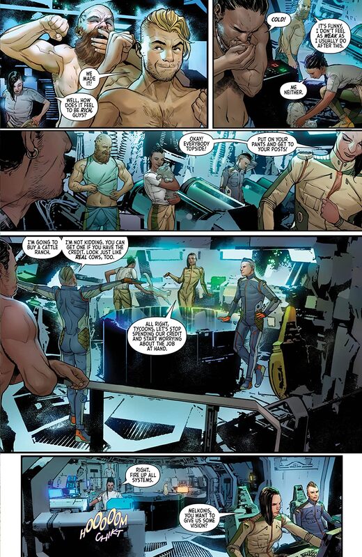
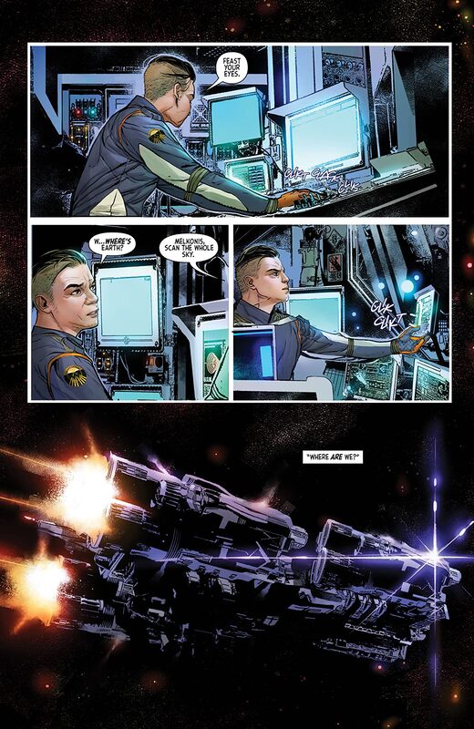
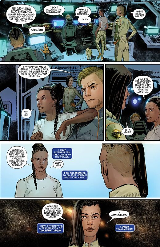
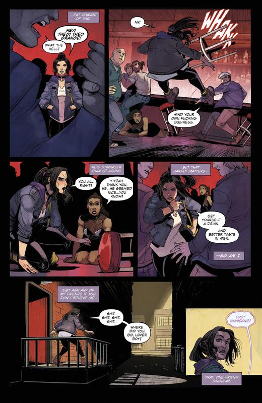
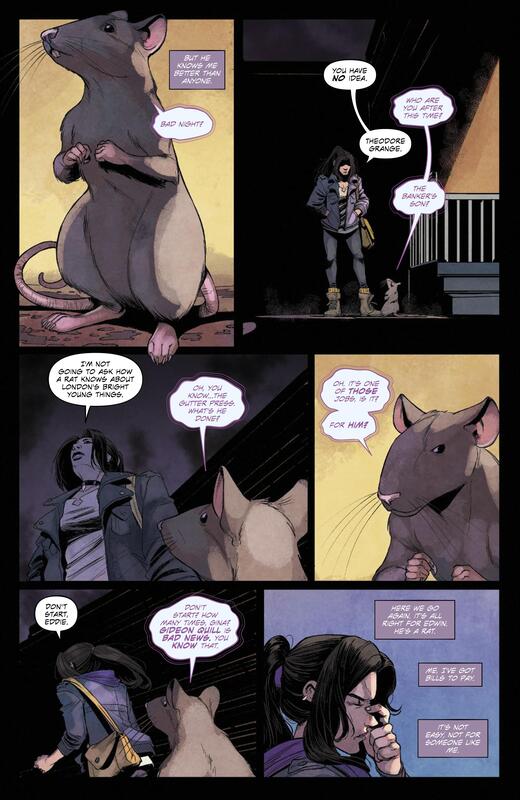
I love the way this is being told. I am mightily impressed with how Cristiano is able to adapt the screenplay to comics format. It takes some really good talent and know how to get us to see the objective and make it a seamless transition. The story & plot development we see through how the sequence of events unfold as well as how the reader learns information is presented beautifully. The character development we see here is phenomenal and to see the banter between the characters and even be able to see some friendly snarkiness, in perception anyway as this isn’t easy to do when it’s written down. Of course we are getting to know them and knowing the franchise it’s dangerous to get attached to any character we see lol. The pacing is superb and as it takes us through the pages revealing how this version plays out we see how it all works together to create a really great ebb & flow to the story.
I am enamoured with this and it makes me wonder if an entirely new script had to be written or if what we see is a prelude to what we already know of as the Alien film. If this is what we are missing then I will gladly redouble my statement that this needs to be brought to life.
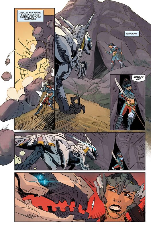
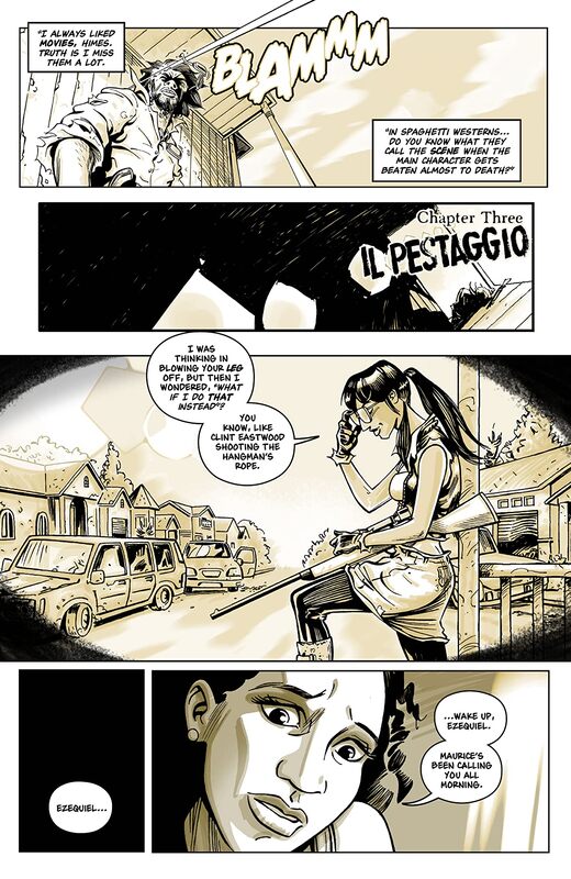
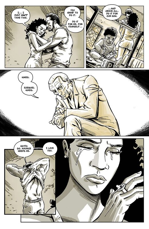
I adore the interiors here. The linework is exquisite and how we see the varying weights and techniques are being utilised and how they create all this marvellous detail throughout the book is divine. The way we see faces, facial expressions and body language help to further the characterisation in ways words alone cannot do. That we see the backgrounds utilised as they are is great as they provide us with some great depth perception, sense of scale and that overall sense of size and scope to the story. Plus they do actually make us feel enclosed and that’s key to a story like this. The colour work is incredible! When it needs to be it’s vibrant and alive or muted and sombre and I have to say that the myriad of hues and tones within the colours we see being utilised to create the shading, highlights and shadow work is perfectly rendered. The choices are beyond what I could have hoped for and to see such understanding of the range within a palette is extraordinary.
This is the kind of storytelling I live for. Sure it’s taken from an unused screenplay but that we even get to see it at all and done in such a way that blows me away like this does is why I get excited when I go to my local shop. This is adapted perfectly and the sheer amount and level of talent and quality of work that we see here is extraordinary.
Dark Horse Comics 2020
Story by Dan O’Bannon
Adapted by Cristiano Seixas
Illustrated by Guilherme Balbi
Coloured by Candice Han
Lettered by Michael Heisler
An all new Alien with an all new Alien! En route back to Earth, the crew of the starship Snark intercepts an alien transmission. Their investigation leads them to a desolate planetoid, a crashed alien spacecraft, and a pyramidic structure of unknown origin. Then the terror begins . . .
I love these Screenplay editions and I am so stoked to see how different this one is from the film. I wish that after seeing this though that these actually get made because I’m much more interested than ever to see this take on the film. Dark Horse has been doing such an amazing job with these and keeping the franchise fresh, interesting and expanding in some great ways. This is one of my favourite reads on such a constant basis as they are all so incredibly well written and illustrated. On a side note I’m sad that we don’t see more of them coming out of their status because this is just a tease.
I love the way this is being told. I am mightily impressed with how Cristiano is able to adapt the screenplay to comics format. It takes some really good talent and know how to get us to see the objective and make it a seamless transition. The story & plot development we see through how the sequence of events unfold as well as how the reader learns information is presented beautifully. The character development we see here is phenomenal and to see the banter between the characters and even be able to see some friendly snarkiness, in perception anyway as this isn’t easy to do when it’s written down. Of course we are getting to know them and knowing the franchise it’s dangerous to get attached to any character we see lol. The pacing is superb and as it takes us through the pages revealing how this version plays out we see how it all works together to create a really great ebb & flow to the story.
I am enamoured with this and it makes me wonder if an entirely new script had to be written or if what we see is a prelude to what we already know of as the Alien film. If this is what we are missing then I will gladly redouble my statement that this needs to be brought to life.
I adore the interiors here. The linework is exquisite and how we see the varying weights and techniques are being utilised and how they create all this marvellous detail throughout the book is divine. The way we see faces, facial expressions and body language help to further the characterisation in ways words alone cannot do. That we see the backgrounds utilised as they are is great as they provide us with some great depth perception, sense of scale and that overall sense of size and scope to the story. Plus they do actually make us feel enclosed and that’s key to a story like this. The colour work is incredible! When it needs to be it’s vibrant and alive or muted and sombre and I have to say that the myriad of hues and tones within the colours we see being utilised to create the shading, highlights and shadow work is perfectly rendered. The choices are beyond what I could have hoped for and to see such understanding of the range within a palette is extraordinary.
This is the kind of storytelling I live for. Sure it’s taken from an unused screenplay but that we even get to see it at all and done in such a way that blows me away like this does is why I get excited when I go to my local shop. This is adapted perfectly and the sheer amount and level of talent and quality of work that we see here is extraordinary.


 RSS Feed
