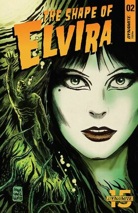
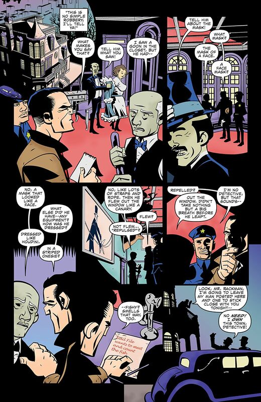
The Shape of Elvira #02
Dynamite Entertainment 2019
Written by David Avallone
Illustrated by Fran Strukan
Coloured by Maxim Simic
Lettered by Taylor Esposito
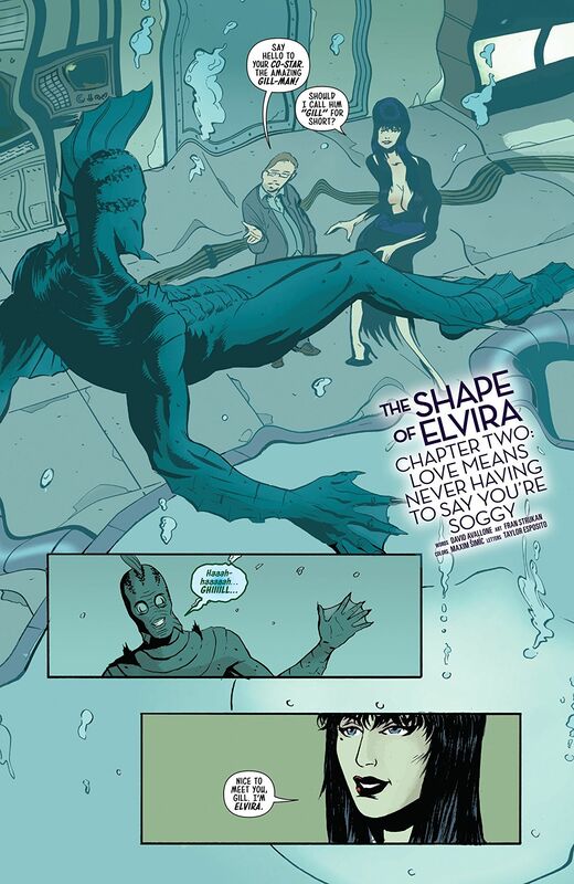
Filming begins on Elvira’s gill monster romance, and she has some questions about her scaly paramour. Why doesn’t he ever speak? Why is he never out of makeup? The Mistress of the Dark discovers that “Love Means Never Having to Say You’re Soggy”, in the second ridiculous issue of this special four-part miniseries.
Oh much fun is this series so far?!? I love the fact that David can take the mystique and persona that is Elvira and turn into something campy yet serious at the same time. That is a dichotomy you will not find very often and that he’s capable of that should tell you about his mad skills as a writer. This feels so much like one of those films you’ll find on say Svengoolie and I couldn’t be any more into this. This is the kind of series that you take when you learn Elvira is going to be a convention near you and have her sign them.
The way that the story is structured so the overall ebb & flow of the story and release or reveal of information is smoother than The Macallan 25 year old Sherry Oak. While this is only a limited series the story needs to keep moving and the opening doesn’t waste any time. I like it because it has that grab your attention factor that will, should, pull someone in as well picking right up where the previous issue left off. There really are so many quality aspects to this book and it centre’s around David’s writing and the talent and skill he possesses.
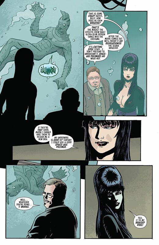
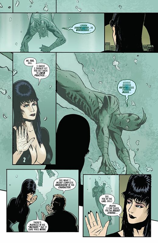
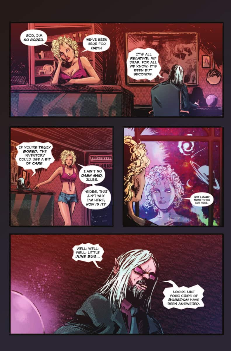
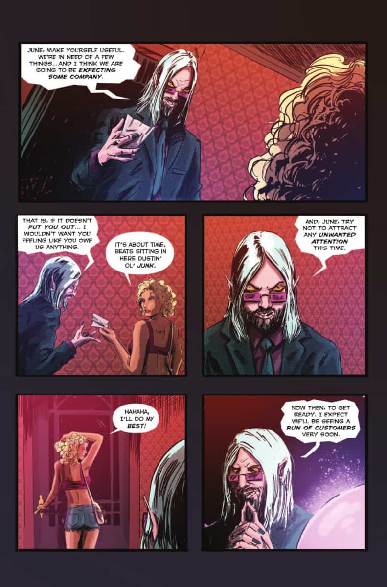
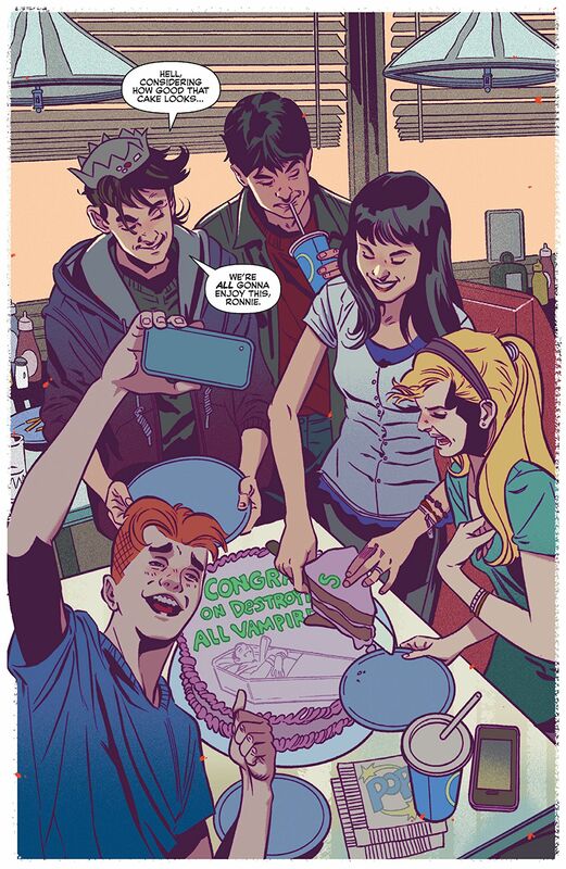
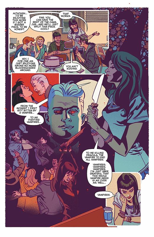
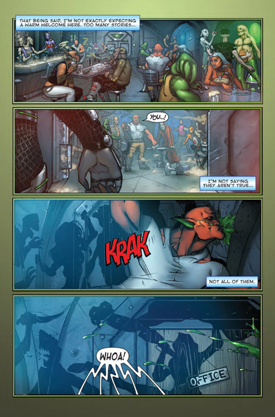
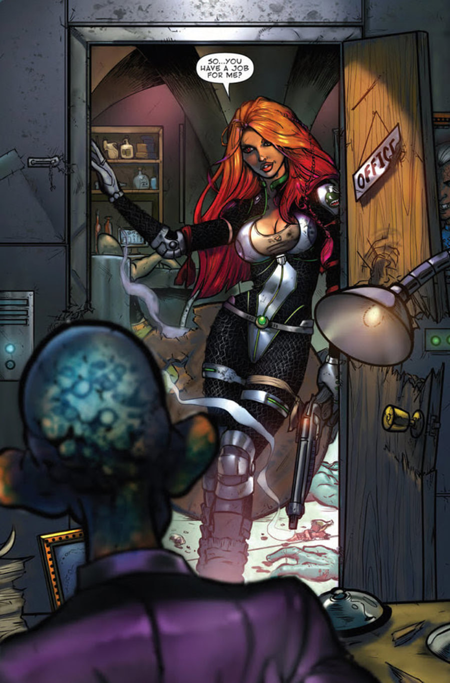
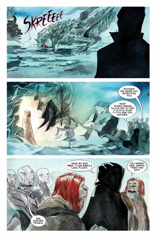
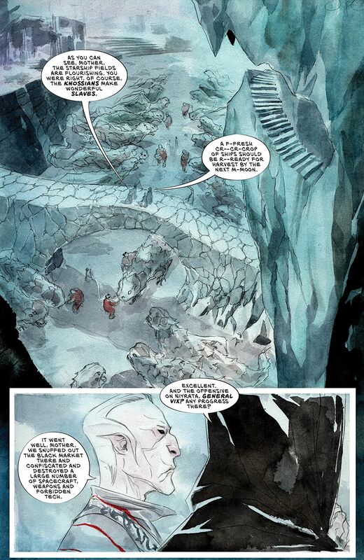
The way that this book is layered is rather exceptional as well. The idea that this is a film being made about a the Gill-Man starring Elvira as his love interest is definitely fun. Then to see these other people hanging about in that all too mysterious kind of way and with those in the ending which by the way made me crack-up we begin to see the more than meets eye aspects of what’s going on. David really slips that in and almost tries to keep in the background and yet also front and centre. There is a lot of great skill, talent and ideas being done on this story and it makes this stand out.
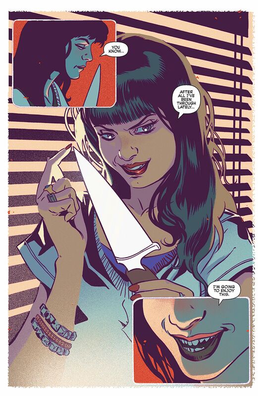
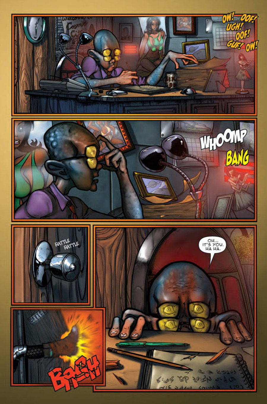
I do love the interiors here. Fran’s linework is crisp, clean and shows a solid hand and the way he is able to bring out the attention to detail here is utterly fantastic. While yes I would like to see more utilisation of backgrounds but with this quality of work I’ll let some of that slide because we do a fair amount. This leads into the way Fran manages to construct a panel and how we see that being utilised and I have to say that along with the utilisation of the page layouts and the angles and perspective we see show this really superb eye for storytelling. How we see the characters come to life visually and how he adds some extra characterisation using facial expressions really is a treat. The colour work here too is really well done. I love the way light sources are utilised for shading and the use of shadows. I’d like to see a tad more colour gradation but when the colours are muted or bright depending on the scene is expertly done.
There is this whole art imitating life thing that is going on here and there aren’t too many opportunities to say something like this any longer and mean it in a way that is correct. That this creative team is putting out such a complex, gorgeous and interesting story take Elvira to new heights and believe me you, you want to be a part of it!
Dynamite Entertainment 2019
Written by David Avallone
Illustrated by Fran Strukan
Coloured by Maxim Simic
Lettered by Taylor Esposito
Filming begins on Elvira’s gill monster romance, and she has some questions about her scaly paramour. Why doesn’t he ever speak? Why is he never out of makeup? The Mistress of the Dark discovers that “Love Means Never Having to Say You’re Soggy”, in the second ridiculous issue of this special four-part miniseries.
Oh much fun is this series so far?!? I love the fact that David can take the mystique and persona that is Elvira and turn into something campy yet serious at the same time. That is a dichotomy you will not find very often and that he’s capable of that should tell you about his mad skills as a writer. This feels so much like one of those films you’ll find on say Svengoolie and I couldn’t be any more into this. This is the kind of series that you take when you learn Elvira is going to be a convention near you and have her sign them.
The way that the story is structured so the overall ebb & flow of the story and release or reveal of information is smoother than The Macallan 25 year old Sherry Oak. While this is only a limited series the story needs to keep moving and the opening doesn’t waste any time. I like it because it has that grab your attention factor that will, should, pull someone in as well picking right up where the previous issue left off. There really are so many quality aspects to this book and it centre’s around David’s writing and the talent and skill he possesses.
The way that this book is layered is rather exceptional as well. The idea that this is a film being made about a the Gill-Man starring Elvira as his love interest is definitely fun. Then to see these other people hanging about in that all too mysterious kind of way and with those in the ending which by the way made me crack-up we begin to see the more than meets eye aspects of what’s going on. David really slips that in and almost tries to keep in the background and yet also front and centre. There is a lot of great skill, talent and ideas being done on this story and it makes this stand out.
I do love the interiors here. Fran’s linework is crisp, clean and shows a solid hand and the way he is able to bring out the attention to detail here is utterly fantastic. While yes I would like to see more utilisation of backgrounds but with this quality of work I’ll let some of that slide because we do a fair amount. This leads into the way Fran manages to construct a panel and how we see that being utilised and I have to say that along with the utilisation of the page layouts and the angles and perspective we see show this really superb eye for storytelling. How we see the characters come to life visually and how he adds some extra characterisation using facial expressions really is a treat. The colour work here too is really well done. I love the way light sources are utilised for shading and the use of shadows. I’d like to see a tad more colour gradation but when the colours are muted or bright depending on the scene is expertly done.
There is this whole art imitating life thing that is going on here and there aren’t too many opportunities to say something like this any longer and mean it in a way that is correct. That this creative team is putting out such a complex, gorgeous and interesting story take Elvira to new heights and believe me you, you want to be a part of it!


 RSS Feed
